DAX

Password Locking Publish to Web in Power BI

*WARNING - This technique will not provide data security (only obscurity), so please don’t use it with your confidential data. Always use your Pro/Premium license to share confidential data.

Last week, I had published a Power BI contest where you had to solve some clues to unlock a hidden tab. The underlying technique was inspired from a community post but I used a totally different approach using the new Sync Slicers feature. In this post, I am going to show you the technique behind locking a tab with a password/code while using the Publish to Web feature in Power BI.

image

Before I start, I want to make sure that everyone understands some points clearly:-

1) There is a reason I am mentioning this technique as “locking” and not “protecting”. This technique does not provide security, and Microsoft clearly states that you should not be publishing any confidential information using the Publish to Web feature. Even though it might look like it does the job from the outside, there could be a method unknown to us in which the code can be obtained or even worse, the entire data can be obtained. Lukasz (Power BI PM) summarizes it pretty well in the tweet below

image

2) If you want security, please buy a Pro license (or a Premium license depending on your consumer base), it costs less than 3 cups of coffee per person a month. And with new and more strict regulations like General Data Protection Regulation (GDPR) coming, the fines for non-compliance can run into tens of millions (if not more). Please remember that Power BI changes every month; a new feature or a change in the way it works currently can easily render this approach useless and you will not want your confidential data to be exposed to the whole world. The only intent of this post is to talk about this approach and see if it might inspire other creative approaches like the Power BI puzzle I created (and not to bypass any licensing restrictions).

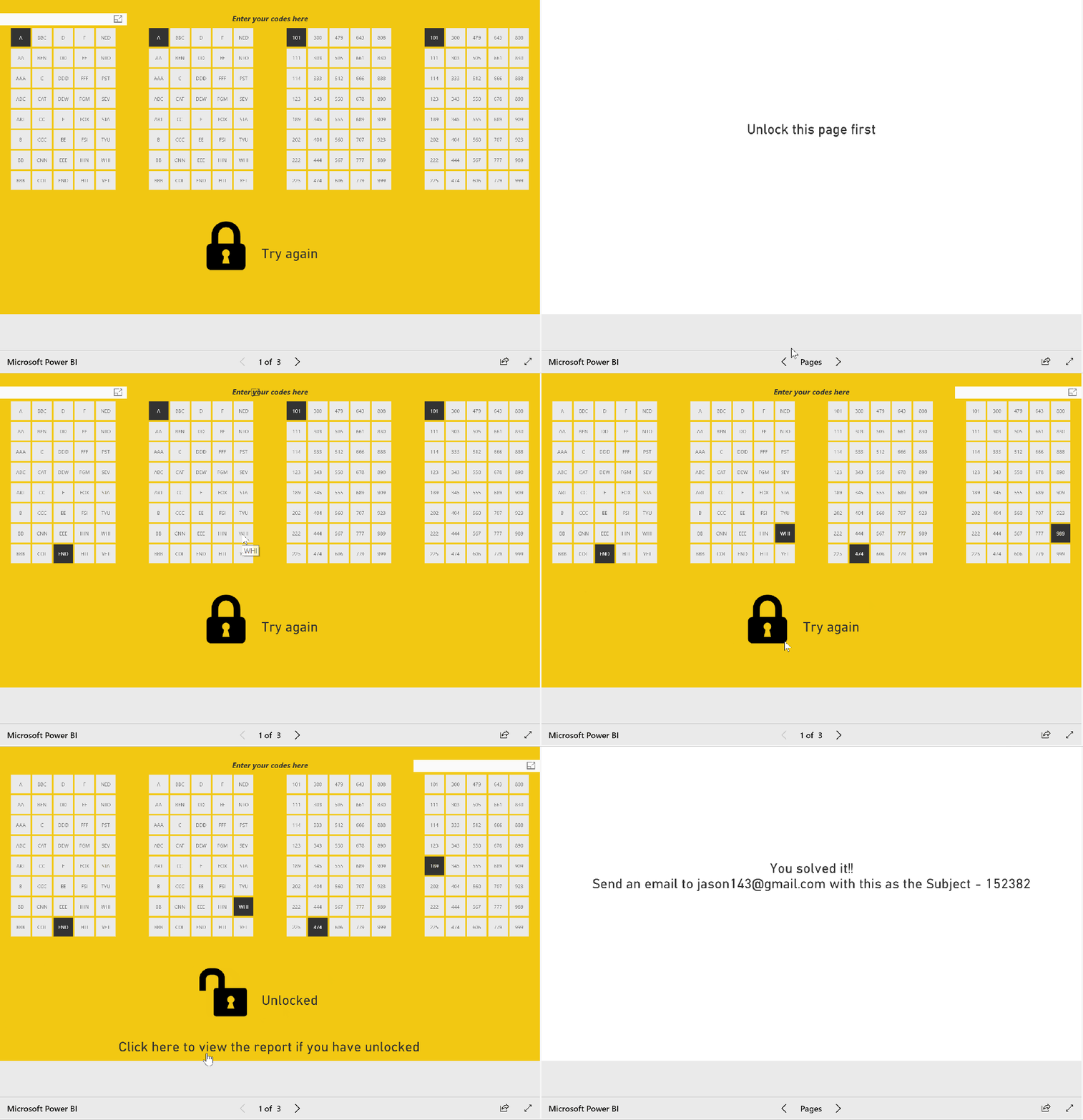
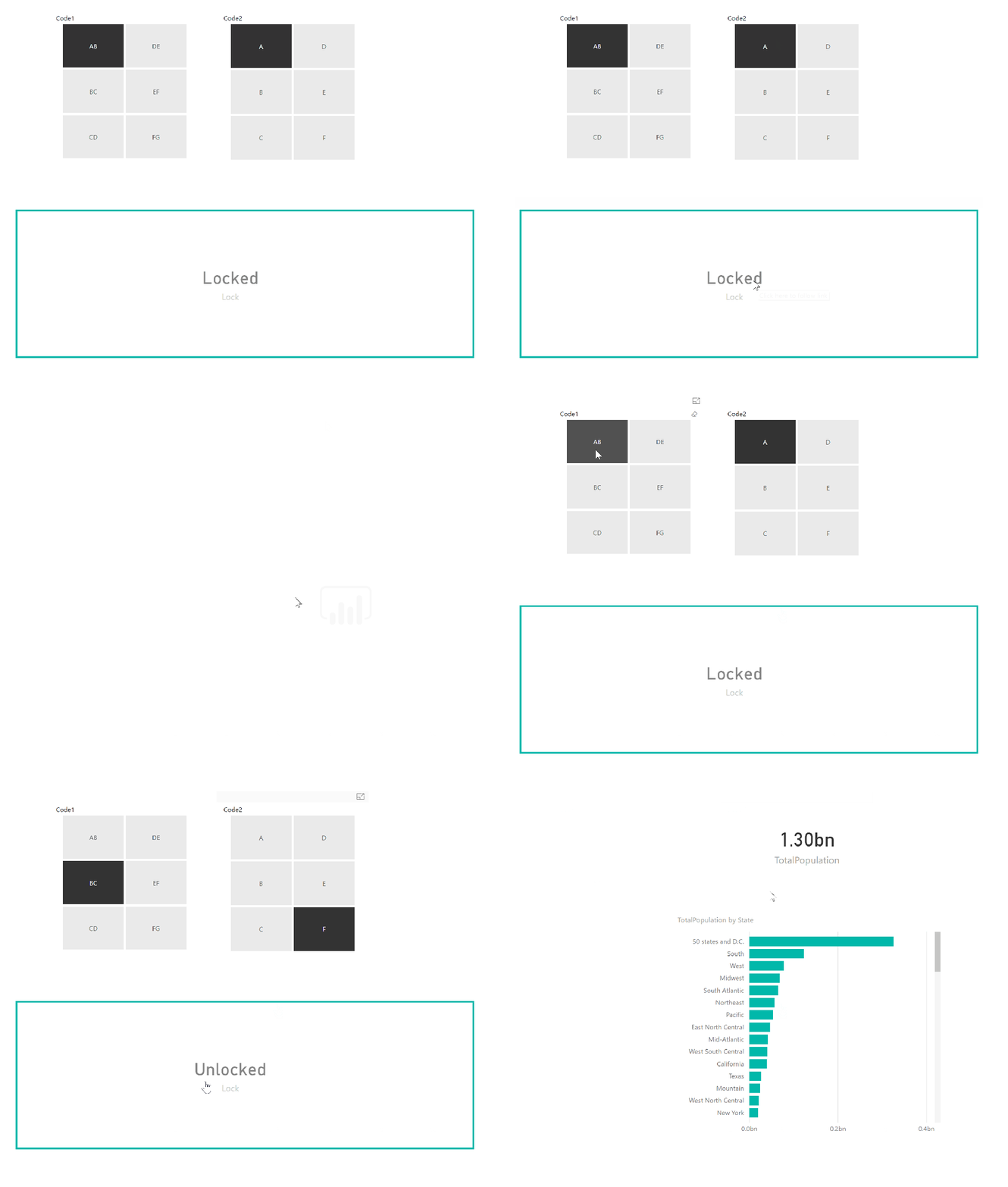
Now that everyone has read the warnings, let us get to the fun stuff. First, see how the codes were used in the puzzle to lock a hidden tab and how the hidden tab showed the right results when the correct code was selected.

Lock

To demonstrate this technique, I will create a simple report with only 2 codes, but you can easily expand this to multiple codes. Follow the steps below:-

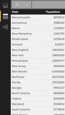
1) For the purpose of this demo, I just connected to Wikipedia and got the population by states.

image

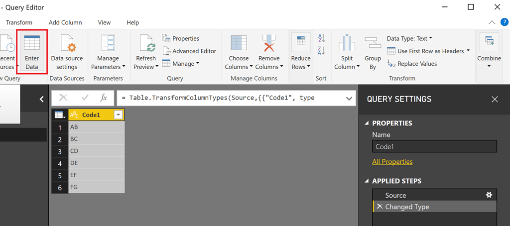
2) Along with that, I just entered data directly into the power bi file and created 2 code tables. The code tables will contain your codes and can be anything. To make it simple, I just made it as 2 letters as shown below.

image

The more entries you have and the more code tables you have, the larger your permutations and hence, the harder to crack your code.

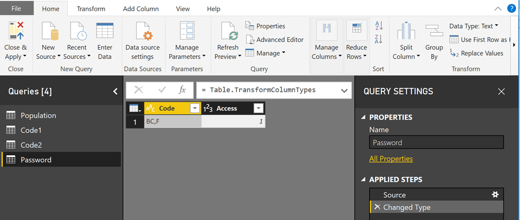
3) Create a password table with 2 columns – with one column as the correct code, and the other one as 1. This table will be used to check against the selected codes for a match with the help of a calculation.

image

4) Now that we have our code tables (Code1 and Code2), password table and the data table, let us proceed to the reporting canvas. Make a measure called Lock which will check if the selected values of Code1 and Code 2 match the password.

Lock =
VAR Code =
SELECTEDVALUE ( Code1[Code1] ) & “,”
& SELECTEDVALUE ( Code2[Code2] )
VAR Pswd =
CALCULATE ( FIRSTNONBLANK ( ‘Password'[Code], 1 ), ‘Password'[Access] = 1 )
RETURN
IF ( Code = Pswd, “Unlocked”, “Locked” )

5) Make another measure that will display the sum of the population only if the correct codes are entered.

TotalPopulation =
IF ( [Lock] = “Unlocked”, SUM ( ‘Population'[Population] ) )

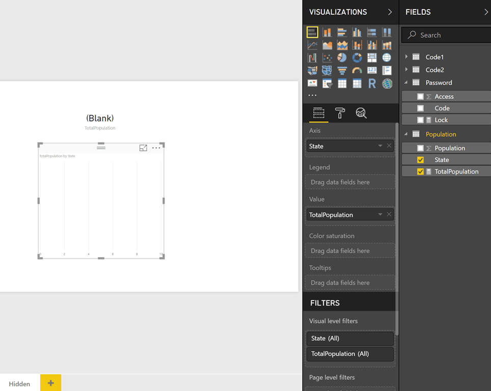
6) Now create a tab called Hidden. Use the new measure that we created in step 5 (Total Population) to create a bar chart by states and a card visual on the top. You will see that no data is displayed and that is because we haven’t selected any values for the Code tables (Code1 and Code2)

image

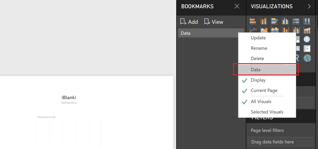
7) Create a bookmark with this view and rename it. Click on the three dots next to the bookmark, and makes sure that you uncheck the Data tab. This will ensure that the bookmark will respect any filters or slicers.

image

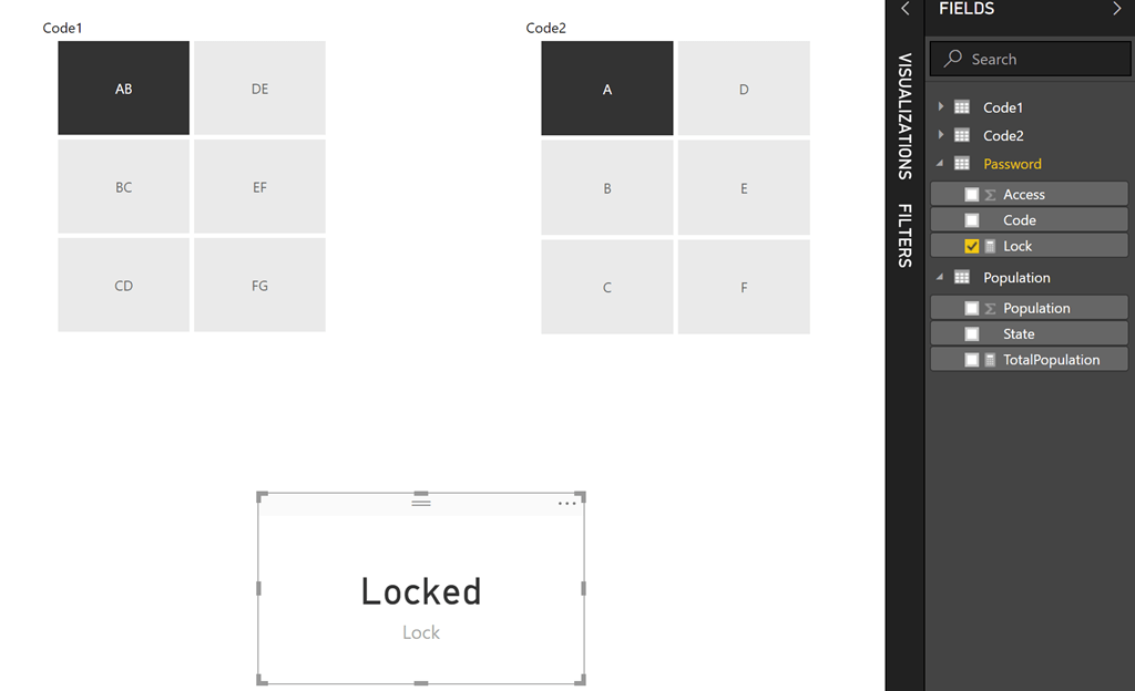
8) Now create a new page where you can display the Codes. Display Code1 and Code 2 as slicers. Also, display the Lock measure as a card visual.

image

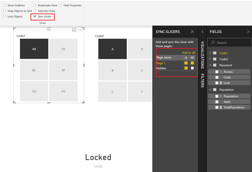
9) Sync both the slicers (Code1 and Code2) with the Hidden page. Make sure that the slicers are not visible in the Hidden page though. The selections are shown in the image below. By the end of this step, whatever codes you select in this page will also be passed to the Hidden page.

image

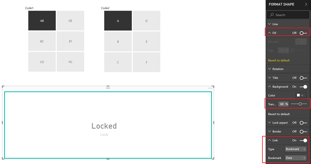
10) Now all that is left to do is to put a rectangular shape on top of the card visual (with some transparency), and add a link to the bookmark we created.

image

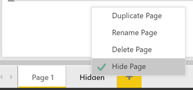
Also make sure to hide the Hidden tab.

image

11) Now we can publish this to Power BI, and then Publish to Web. See the end result in action below.

Solution

NOTE: For some reason, the initial password gets cached and exposed in the trace and this is another reason why you will not want to try this with your confidential data, and only use it for fun projects. That said, once I changed the password and republished it, the new password did not get exposed and it was still the old password that was getting exposed in the trace.

Posted by SQLJason in DAX, Power BI, 2 comments
Dynamic Grouping in Power BI using DAX

Dynamic Grouping in Power BI using DAX

It has been quite a while since I posted something and was already thinking of dusting up my tools. That was when I was going through the Power BI Community forums, and found an interesting question -

Requirement: The user wants a report with a column chart. The X axis will have Subcategory Name and the value will be the sum of Internet Sales. Along with this chart, the user will have a slicer where they can select the Subcategory Names. The column chart should “update” showing one column for each selected subcategory, and another column named “Others” with the summed amount of the rest of the unselected categories.

Basically, they wanted a dynamic group called “Others” and the members within this group should change based on what is selected on the slicer.

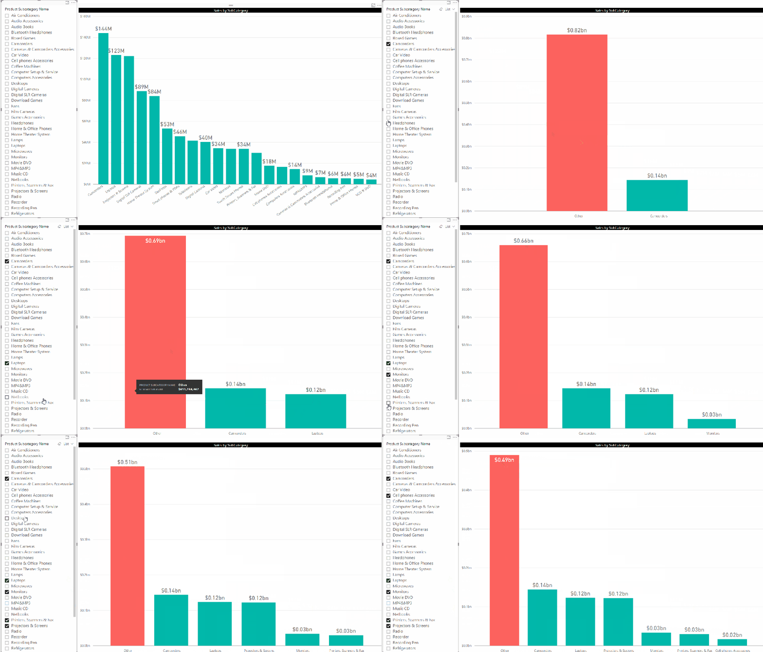
This would be a good time to show a visual representation of what the requirement means.

1 Requirements

You can see that there is one individual (green) column for every selected Subcategory and also one (orange/red) column called “Other” which has the summed up value for the rest of the unselected categories.

For solving this, follow the steps below:-

1) The “Other” member is not available in any existing column. So we will have to create a new table having a column for all the subcategories, as well as an additional member for Others. For this, I made a new calculated table in Power BI using the formula below

ProdSubCat_List =
UNION (
    — get the existing values of subcategory name   
    VALUES ( ProductSubcategory[Product Subcategory Name] ),
    — add the other member
    ROW ( “SubCategoryName”, “Other” )
)

The Subcategory column from this table has to be used in the charts, since this is the only column which has the “Other” member. At the same time, this table is a disconnected table (which means that there is no relationship between this table and the rest of the fact/dimension tables), so we will not get any proper values if we just use the Sales measure with this column in a column chart. For that, we will have to create a custom measure.

2) The next step is to make a measure which will display the values

NewSalesMeasure =
VAR SelectedSales =
    CALCULATE (
        [Sales Amount],
        INTERSECT (
            VALUES ( ProductSubcategory[Product Subcategory Name] ),
            VALUES ( ProdSubCat_List[Product Subcategory Name] )
        )
    )
VAR UnSelectedSales =
    CALCULATE (
        [Sales Amount],
        EXCEPT (
            ALL ( ProductSubcategory[Product Subcategory Name] ),
            VALUES ( ProductSubcategory[Product Subcategory Name] )
        )
    )
VAR AllSales =
    CALCULATE (
        [Sales Amount],
        ALL ( ‘ProductSubcategory'[Product Subcategory Name] )
    )
RETURN
    IF (
        HASONEVALUE ( ProdSubCat_List[Product Subcategory Name] ),
        SWITCH (
            VALUES ( ProdSubCat_List[Product Subcategory Name] ),
            “Other”, UnSelectedSales,
            SelectedSales
        ),
        AllSales
    )


Note that we are making use of 3 variables – SelectedSales, UnSelectedSales and AllSales to handle the 3 conditions that can arise.

SelectedSales will match the member values in the our calculated table (ProdSubCat_List) with the Subcategory names in the original Subcategory table and get their corresponding Sales Amount.

UnSelectedSales will get the Sales Amount for all the unselected Subcategory names, and we make use of the EXCEPT function for this.

AllSales is the total Sales Amount for all the Subcategories, and is used for showing the grand total.

3) Create a column chart with ProdSubCat_List[Product Subcategory Name] on axis and NewSalesMeasure on values. Put a slicer which has ProductSubcategory[Product Subcategory Name]. Now you can see the required end result.

Posted by SQLJason in DAX, Power BI, 18 comments

Performance Problems with IF statement execution in SSAS Tabular

Due to the high compression rates and stellar in-memory architecture of SSAS Tabular, most people with smaller models do not experience performance problems (in-spite of employing bad data modeling techniques and inefficient DAX measures). However, as the size of your models increase, you will start to see performance issues creep up, especially if you are not paying attention to data modeling and DAX measures. Last week, I gave a presentation at the PASS Summit 2015 on my experience of building a 150 GB Tabular model in SSAS 2012. During that, I shared my story on how some of the DAX measures with IF statements were causing performance issues and how to work-around that issue by rewriting your DAX measures. During that day, Microsoft also announced that they resolved this issue in SQL 2016, so I thought of demonstrating the issue, workaround and also the fix in SSAS 2016.

Issue in SSAS 2014 (& older versions)

For demonstrating the issue, I will be writing queries against the Adventure Works model in SSAS 2014 and using MDX Studio to show the server timings. Let me start with the below query

WITH MEASURE ‘Date'[test] = If ( 1 = 2, [Internet Total Sales], [Reseller Total Sales] )
SELECT NON EMPTY { [MEASURES].[Test] } ON COLUMNS,
NON EMPTY (
{ [Date].[Calendar Year].Children },
{ [Product].[Product ID].Children },
{ Geography.[Country Region Name].Children } ) ON ROWS
FROM [Model]

The above MDX query defines a DAX measure called Test, which depending on the condition displays either Internet Total Sales or the Reseller Total Sales (To make it simple, I just made a static condition 1=2 but that can be replaced by any dynamic condition also). The query results should display the Test measure for Year, Product ID and Country. Now, normally we would expect that the Test measure should only execute the true part of the IF statement. But let us execute this in MDX Studio and see what actually happens.

You can see that both the branches of the IF statement are being executed, even though we expect only the true part to be executed. For smaller models, it might not make a difference but for large models with expensive measures, this might cause severe performance issues.

Workaround in SSAS 2014 (& older versions)

The workaround for this issue is to rewrite your DAX such that we ensure that the measures get executed only if the condition is true.

WITH MEASURE ‘Date'[test] = CALCULATE([Internet Total Sales], FILTER(Currency, 1=2)) + CALCULATE( [Reseller Total Sales], FILTER(Currency, 1<>2))
SELECT NON EMPTY{[MEASURES].[Test]} ON COLUMNS,
NON EMPTY({[Date].[Calendar Year].children}, {[Product].[Product ID].children},{Geography.[Country Region Name].children}) ON ROWS
FROM [Model]

Note that the measure has been rewritten as the sum of two CALCULATE functions. The key is to use a table in the filter clause within the CALCULATE that satisfies the below conditions

  • Is related to the fact table of the measure
  • Is low in cardinality (you can also use a low cardinality column instead of a table)
  • Is not being used in the calculations for the measure/condition. If yes, do some extra testing to make sure the performance is not worse

The reasoning behind the table being connected to fact table is because the calculate() with the false condition has to evaluate to zero / BLANK so that the result of the Test measure would only be the one appropriate measure. If the table is not related, you will end up with the sum of both the measures. A low cardinality table or column is preferred because in this technique, you will see that there are 2 additional queries being sent to the storage engine, which evaluates the FILTER part for the two measures. If the tables have high cardinality, the time for the FILTER queries will take more time. The reason why I said that the table or column should not be used in the measure calculations or condition is because I have seen that in certain conditions, this could actually make the performance worse and still execute both the branches. So just make sure you do some extra testing.

That said, let us look at the scans for the above query. You can see that only the Reseller Sales measure is executed. Also, if you notice carefully, there are 2 extra scans which basically check the filter condition for Currency. In large models, these scans for low cardinality dimensions will be almost negligible and the time for these extra scans will be much lesser than the time taken to execute the other measure also. In this case, the Adventure Works model is just 18 MB, so you won’t see much of a difference.
New Optimization in SSAS 2016

SSAS 2016 CTP2.3 (and newer versions) has a new optimization for this issue – Strict evaluation of IF / SWITCH statements. A branch whose condition is false will no longer result in storage engine queries. Previously, branches were eagerly evaluated but results discarded later on. To prove this, let us execute the original query against SSAS 2016 and see the results.

Now we can see only the relevant measure is being executed. Also, it is faster compared to SSAS 2014 versions of both the original query as well as the workaround. I hope this article will help people who are not on SSAS 2016 to optimize IF statements, and also help understand what the new optimization in SSAS 2016 – Strict evaluation of IF / SWITCH statements actually means. There are also a bunch of new features and optimizations in SSAS 2016 and you should check them out!

Posted by SQLJason, 2 comments

My Thoughts on Calculated Tables in Power BI

Yesterday was a terrific day for all of Microsoft Power BI fans. Microsoft released updates for Power BI Service, Power BI Mobile and Power BI Desktop (with an unbelievable 44 new features) – which basically means no matter whether you are a developer, BI professional or an end user, all of you got something new to play with along with this release. The blogs give a lot of details on what those new features are, so I wouldn’t be going over them. But I wanted to take a moment to pen down a few moments on my thoughts on a new modeling feature within this release - Calculated Tables.

Chris Webb has already posted his thoughts on Calculated Tables in Power BI and I am pretty sure Marco Russo / Alberto Ferrari will post some on the same pretty soon (if not, this is an open request from my side for Marco & Alberto to post something on the topic, pretty please ) – [Update 9/28/2015 Read Transition Matrix using Calculated Tables]. As usual, a combination of posts from these folks are going to be the best resource for any topic in the Modeling side, and I learn most of my stuff from them. So you would be thinking – what exactly am I trying to achieve in this post? Well, I would like to add my 2 cents on the same and try to see if the community in general agrees with what I think and if not, to learn from the comments and the interaction this might generate.

I) How to build Calculated Tables in Power BI

Before I start on my thoughts on calculated tables, it might be a good idea to quickly see how we can create calculated tables.

1) First make sure that the version of Power BI is equal to or higher than 2.27.4163.351. (I am making a fair assumption that this feature will be enabled in all higher versions also released in the future). If not, download it from here

2) Now open any of your existing models in Power BI (or get some new data), and after that, click on the Data tab. You should be able to see the New Table icon in the Modeling tab on the top.

3) Click on the New Table icon, and then enter any DAX expression in the format that returns a table TableName = DAX Expression that returns a table Once you do that, then you should be able to see the resultant columns in the new table.

II) When is the data in a Calculated Table processed

The official blog says quite a few things on the same-

    • A Calculated Table is like a Calculated Column.
    • It is calculated from other tables and columns already in the model and takes up space in the model just like a calculated column.
    • Calculated Tables are re-calculated when the model is re-processed.

So based on this information, I am going to go a step further and assume that the data in a calculated table is processed during the ProcessRecalc phase of processing. Also, this means that every time any of the source tables changes (like a new calculated column or new data), the data in the calculated table will also change. To prove this, let us try a simple experiment-

1) Make a calculated table called Test which will be the same as the Date table (which currently has just the Year column).

Note that measures from the source table are not brought along to the calculated table, which is as expected.

2) Now go to the Date table (which is our source table in this case) and then add a new calculated column called TestColumn with 1 as the value.

Note that when we added a calculated column in the source table, the column was replicated in the calculated Table also with the same name. The only difference is that the source table shows an icon for calculated column. This shows that the ProcessRecalc that happens in the source table when a new calculated column is made, also recalculates the calculated table.

III) My thoughts on Calculated Tables

Based on my understanding so far, there are times when I think I should use calculated tables and times when I should not use calculated tables. So here it goes -

a) When NOT to use calculated tables

If you have a way of replicating the calculated table in some form of ETL or source query (even a SQL View), you should not use a Calculated table. Why? A couple of reasons

  • If done from ETL / source query, the engine will see the result as a regular table, which means parallel processing of the tables can be done (unlike now, where the ProcessData phase of the source tables have to finish first before the calculated tables can be processed). So calculated tables could lead to slower data processing time.
  • A ProcessRecalc happens every time you do a process full, and adding more calculated tables (as well as calculated columns) unnecessarily will increase the processing time. Also, during development of very large models, you might have to wait for a long time after each calculation is made for the data to appear, since all dependent tables will also have to be recalculated (unless you turn off the automatic calculation mode).
  • This one is more an assumption and further research will be needed to validate this, but I am putting it forward anyways. Just like a calculated column is not that optimized for data storage compared to a regular column, I suspect that a calculated table will also not be optimized for storage compared to a regular table. If this is true, this might affect query performance.

b) When to use calculated tables

There are a lot of scenarios where you would want to use calculated tables and I have listed a few of the scenarios below

  • During debugging complex DAX expressions, it might be easier for us to store the intermediate results in a calculated table and see whether the expressions ate behaving as expected.
  • In a lot of self-service BI scenarios or Prototype scenarios, it is more important to get the results out there faster and hence, it might be difficult or not worth the effort to fiddle with the source queries. Calculated tables can be a quick and easy method to get the desired table structures.
  • A kind of scenario that I see very often during prototyping / PoCs is when there are 2 facts in an excel file which are given for making reports. As seasoned users of Power Pivot / Power BI, we know that we will have to create a proper data model with the dimensions. Now, I might need to create a dimension which gets me the unique values from both the tables. For eg, in the below example, I need the Country dimension to get values from both the tables (USA, Canada, Mexico). It might be easier to write an expression for a calculated table like shown below
    Country = DISTINCT(UNION(DISTINCT(Table1[Country]), DISTINCT(Table2[Country])))

  • There are times (like in some role playing dimensions) where you will need to replicate the columns / calculated columns (or even delete) in another table also, even if the columns are built at a later phase in the project. Calculated tables are a perfect match for that, as you will only need to make the changes in one table, and the changes will flow down to the calculated table during ProcessRecalc phase (remember our previous example where we created a TestColumn in the Date table, and the change was reflected in our calculated table also).
  • Calculated tables can help in speeding up DAX expressions. This is very similar to the technique of using aggregate tables in SQL database to speed up the calculations in SQL.
  • Quick and easy way to create calendar tables (like Chris showed in his blog)

This is still a very early stage as far as Calculated tables are concerned, and I am pretty sure we are going to see some very innovative uses as well as benefits of calculated tables in the days to come. I might also learn that some of my assumptions are wrong, and if I do, I will come back and update this post to the best I can. Meanwhile, feel free to comment on your thoughts / concerns / feedback.

Update - 9/28/2015

Transition Matrix using Calculated Tables – Alberto Ferrari
Use Calculated Table to Figure Out Monthly Subscriber Churn – Jeffrey Wang

Posted by SQLJason, 0 comments

Using DAX to make your Power BI DataViz more meaningful

One of the best features I like about Power BI Desktop is that the data acquisition, data modeling and data visualization functionalities are all integrated in a user friendly way. I don’t have to leave the Power BI desktop to perform any of these common operations when I am playing with my data, unlike so many other tools. Why is this important? Because you tend to be more productive when you have everything you need in one place and also, you tend to be more creative when you have the power to model the data along with making your visualizations. DAX has some really powerful data modeling capabilities, and when you couple that with Power BI, you can start giving more meaning to your visualizations and get faster insights. I recently made a video on my company’s blog site on how to analyze Promotion Effectiveness and for the same, I was using a dashboard made in Power BI Desktop. I am just highlighting two examples of how I used DAX to make my visualizations better.

I) Make better Sparklines by Highlighting

In my Promotion Effectiveness Analytics demo, the sparklines highlight (instead of just filtering) the value for the months where the selected promotions ran. This gives us a better understanding of what is happening before, during and after the promotion. Now, this is not possible out of the box in Power BI, but with just a little bit of DAX magic, we can make this work.

1) First let us see how to build a simple sparkline in Power BI. For that, select the month & sales and make it as a line chart.

2) Next, let us remove all the format options so that it looks like a sparkline. Also feel free to resize it

3) Make a new bar chart for Sales by Promotions, so that we can use it to filter the sparkline.

You can see that the sparkline automatically gets cross-filtered to only the months where the promotion ran. This is great but what would add more value is if we could see the months highlighted instead of just filtered. That would let us know how the sales are before, during and after the promotions instead of just during the promotions.

4) Make a new measure by clicking on the dropdown next to the table, and then use the formula below

Sales Amount Total = CALCULATE([Sales Amount], ALL(Promotion))

Basically, we are making a measure which will show the Sales irrespective of whether the Promotions are filtered.

5) Now add the new measure to our sparkline (make sure to give it a lighter color like light grey for a better effect).

Now you can see that the the grey line shows the sales for all the promotions while the green line highlights just for the selected promotion. You can also use this technique in other creative ways, for e.g., to highlight the max and min points of a sparkline.

II) Waterfall charts for Measures

In my Promotion Effectiveness Analytics demo, I created a Waterfall chart to show the breakdown of Customer Visits. Basically,

Customer Visits (This Year) = Customer Visits (Last Year) – Lost Customers + New Customers

I have individual measures for each of those, and in this case, a waterfall chart would be a great way to show the breakdown. However, we can only put columns in the category axis for waterfall chart in Power BI. But with some data modeling, we can get this done.

1) Make a dummy dimension called Customer Retention with just one column and 3 values – Last Year, New and Lost. I just made the dummy table in a text file and imported it to Power BI.

Note that this is a disconnected table and will have no relations to any other table.

2) Create a new measure called Customer Visits as shown below

Customer Visits = IF(HASONEVALUE(‘Customer Retention'[Customer Retention]),
SWITCH(VALUES(‘Customer Retention'[Customer Retention]),
“New”, [New Customers],
“Lost”, [Lost Customers],
“Last Year”, [Visits (LY)]))

Basically you are assigning the appropriate measures for New, Lost and Last Year based on the values for the disconnected Customer Retention table.

3) Now just make a Waterfall chart with the Customer Retention column and Customer Visits measure to clearly see the breakdown.

Hope you got some ideas on what all we can do when we combine DAX with dataviz. Stay tuned for more as we expect to see Microsoft release more functionalities around the tool.

Note : Created using Power BI Desktop version listed below

Feel free to watch my video on analyzing promotion effectiveness by clicking on the image below

Posted by SQLJason, 8 comments

Ranking within Slicer Selection in Power Pivot

I know it’s been ages since I posted something, and I do have lots of lame excuses so maybe it deserves a post on it’s own. But for now, I want to jot down a workaround on how to rank a column based on the slicer selections for the same column.

The other day, I was working on an excel dashboard and I got a requirement to rank a field while the field values are there on the slicer. While I am used to getting requests on ranking a field based on a measure, this was the first time someone was asking me to rank a field based on a measure while the column was on the slicer. The user just wanted to rank within the selected values of the field in the slicer and not as a whole. To explain this, I just made a very simple example with the model given below

The FactLicense table contains data on new liquor licenses and I made a simple measure License Count to count the number of licenses. The FactLicense table is related to the Geo table through the Zip Code column. The requirements were that

  • the City field should be ranked by License Count
  • there should be a slicer displaying the values for City
  • the ranks should update based on the Slicer selections

Solution

1) To solve the first part of the requirement, I made a simple ranking measure by City as shown below.

LC Ranked by City:=RANKX(ALL(Geo[City]), [License Count])

You can see the results in the pivot table below.

2) For the second requirement, we can just add a slicer for the City field and then connect it to the Pivot Table.

3) Now the third requirement is the interesting one. When I try to filter by some cities, I get the result below.

You can see that the Ranks don’t get updated based on the slicer selections. The user wants the ranks to start from 1 but you can see that the ranks are still based on the entire city list and not just the selected city list. Now it is impossible (atleast as far as I know) to reset the ranking if the same field is on the rows as well as the slicer. The reason is that the Rank measure operates on ALL(Geo[City]) and hence removes any filter or selection that is already made. So what do we do?

4) A simple workaround is to make a calculated column (say City Slicer) and make the Slicer based on this new calculated column.

Make sure to remove the old slicer as well as connect this new slicer to the pivot table.

5) Now when we select the City in the slicer, you can see that the Ranks get reset.

You can further rename the Slicer such that it says only City and you can hide this calculated column so that it is not visible to the other users analyzing the model. This will help avoiding confusion among the end users (Eg – why do we have 2 city fields?) and at the same time, you can make your Excel dashboard with the fulfilled requirements.

Update

Within seconds of posting, Miguel Escobar (twitter) comes up with a much better way of doing this using the ALLSELECTED().

LC Ranked by City1:=RANKX(ALLSELECTED(Geo[City]), [License Count])

This would be the ideal way to do it as we don’t have to create a new calculated column and still achieve the same results. Thanks a lot for this Miguel!

Posted by SQLJason, 1 comment
Split a Delimited Row into Multiple Rows using DAX Queries

Split a Delimited Row into Multiple Rows using DAX Queries

Recently, I got a question from one of my readers on whether there is a way to split a single delimited row into multiple rows using DAX. I had kind of demonstrated the opposite to Group Multiple Rows to Single Delimited Row in PowerPivot here and this was another interesting challenge. Read on for the solution.

Split a Delimited Row into Multiple Rows using DAX Queries

Business Requirement

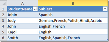
Suppose there is a table which has two columns – StudentName and Subject.

Source Table

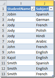
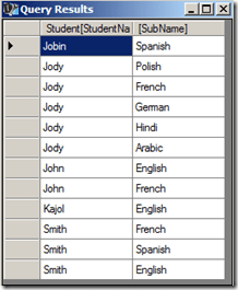
The end result should be

Required end result

Solution

We will be using DAX queries to generate a table that will have the desired output. For this demonstration, I will be creating a PowerPivot model and running DAX queries in DAX Studio on top of the Excel PowerPivot model.

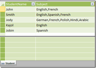
1) Create a linked table for the Student.

Student table

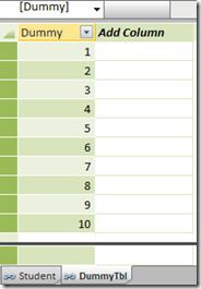
2) Create a table called DummyTbl which is just a list of running numbers from 1 till n. The value of n should be equal to the max number of subjects that a student can have. In this demo, I am assuming that a student can have a max of 10 subjects, so my Dummy table will consist of numbers 1 – 10.

Dummy table

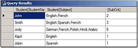
3) Now let us create the DAX queries in DAX Studio. First, we will create a computed column called SubCnt which will give the number of subjects for each row.

EVALUATE
SUMMARIZE (
Student,
[StudentName],
[Subject],
“SubCnt”,
1 + Len ( [Subject] ) - Len ( Substitute ( [Subject], “,”, “” ) )
)

find number of subjects

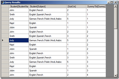
4) The only way we can increase the number of rows of a table is by using the function CrossJoin. So let us CrossJoin the Student table with the DummyTbl.

EVALUATE
Crossjoin (
SUMMARIZE (
Student,
[StudentName],
[Subject],
“SubCnt”,
1 + Len ( [Subject] ) - Len ( Substitute ( [Subject], “,”, “” ) )
),
DummyTbl
)

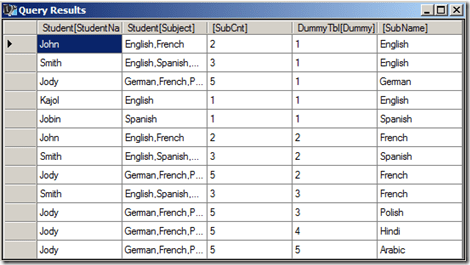
crossjoined tables

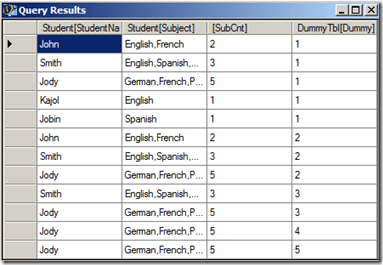
5) Now filter the resultant table where SubCnt is less than or equal to Dummy column. Now we have got the exact number of rows needed for the end result.

EVALUATE
Filter (
Crossjoin (
SUMMARIZE (
Student,
[StudentName],
[Subject],
“SubCnt”,
1 + Len ( [Subject] ) - Len ( Substitute ( [Subject], “,”, “” ) )
),
DummyTbl
),
DummyTbl[Dummy] <= [SubCnt]
)

filtered table

6) The only thing left is to split the delimited subjects to the single subject for each row. And the only way to split delimited values is to use the PATHITEM function. To use the PATHITEM function, we should substitute the commas (,) with the pipe (|) symbol.

EVALUATE
ADDCOLUMNS (
FILTER (
CROSSJOIN (
SUMMARIZE (
Student,
[StudentName],
[Subject],
“SubCnt”,
1 + Len ( [Subject] ) - Len ( Substitute ( [Subject], “,”, “” ) )
),
DummyTbl
),
DummyTbl[Dummy] <= [SubCnt]
),
“SubName”,
PATHITEM (
SUBSTITUTE ( Student[Subject], “,”, “|” ),
DummyTbl[Dummy]
)
)

splitting delimitted subjects to individual subjects

7) Now all we need to do is to select the two required columns.

EVALUATE
SUMMARIZE (
ADDCOLUMNS (
FILTER (
CROSSJOIN (
SUMMARIZE (
Student,
[StudentName],
[Subject],
“SubCnt”,
1 + Len ( [Subject] ) - Len ( Substitute ( [Subject], “,”, “” ) )
),
DummyTbl
),
DummyTbl[Dummy] <= [SubCnt]
),
“SubName”,
pathitem (
Substitute ( Student[Subject], “,”, “|” ),
DummyTbl[Dummy]
)
),
[StudentName],
[SubName]
)
ORDER BY [StudentName]

end result

Hopefully this post will help you when you encounter a similar situation!

Posted by SQLJason, 8 comments
UNION Operation in DAX Queries

UNION Operation in DAX Queries

In one of my previous posts - Row Selection Using Slicers in PowerPivot - Part 1, I had demonstrated the use of what Marco Russo defined as Reverse Linked Tables and Linkback tables. A particularly eye-catching thing in my post was the use of Microsoft Query instead of DAX Query to obtain the required reverse-linked table and one of the reasons I gave was that it was difficult to do an UNION operation using DAX queries (yes, you heard it right. I said difficult and not impossible). Well, since difficult is such a subjective word, I decided to jot down the technique, maybe it might seem easy for you guys!

Union operation with DAX queries / PowerPivot

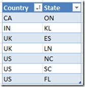
For the purpose of this demonstration, I am using two tables having identical structures. There are just two columns in the tables - country and state and we need to do an UNION operation on these two tables.

Source

The result should be 7 rows as shown below

Expected Result

Follow the steps below for the solution:-

1) Import the two tables to PowerPivot (you can also use this technique on a SSAS tabular model). I will be using DAX Studio for writing my queries and displaying the results (though you might as well as use this in SSMS or in the DMX query editor for SSRS depending on your purpose).

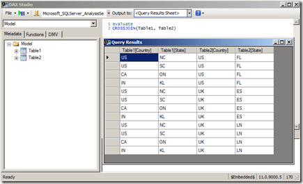
2) The first thing to understand here is that DAX, as a query language, can not add rows usually, and UNION requires that we get more rows (since it is the combined result of both the tables). However, there is an operator in DAX which generally generates more rows than its source tables – CROSSJOIN (except when any one of the participating tables has only one row). So let’s first crossjoin the two tables and see the results.

CrossJoin

Now you can see that we get 12 rows, however no single column gives the result that we need. Somehow, we need to get a logic to filter the 5 rows and also a logic to combine the right results in one calculated column.

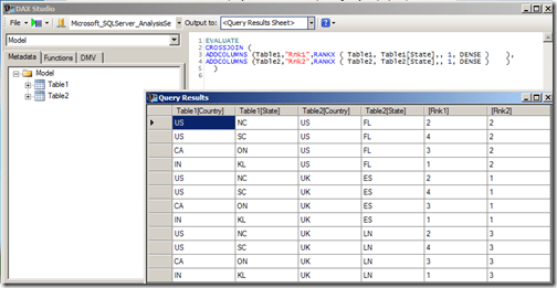
3) To identify the individual rows, let us add a rank column to each of the two tables and then crossjoin them.

EVALUATE
CROSSJOIN (
ADDCOLUMNS (Table1,”Rnk1″,RANKX ( Table1, Table1[State],, 1, DENSE ) ),
ADDCOLUMNS (Table2,”Rnk2″,RANKX ( Table2, Table2[State],, 1, DENSE ) )
)

Adding rank identifiers to the table rows

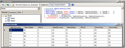
4) When I looked at this resultset initially, I felt that I could just filter all rows having Rank1 = 1 and Rank2 = 2 and then add a calculated column each for Country and State such that if Rank1 = 1, then the value comes from Table2 else it comes from Table1.

EVALUATE
ADDCOLUMNS (
FILTER (
CROSSJOIN (
ADDCOLUMNS (Table1,”Rnk1″,RANKX ( Table1, Table1[State],, 1, DENSE ) ),
ADDCOLUMNS (Table2,”Rnk2″,RANKX ( Table2, Table2[State],, 1, DENSE ) )
),
[Rnk1] = 1 || [Rnk2] = 2 ),
“UnionCntry”, IF ( [Rnk1] = 1, Table2[Country], Table1[Country] ),
“UnionState”, IF ( [Rnk1] = 1, Table2[State], Table1[State] )
)

Incorrect logic

Even though the UnionCntry and UnionState columns might appear right, they are not, as one row is missing (in this case, the row with IN country and KL state). This happens because there will always be one row which has Rnk1 = 1 and Rnk2 = 2, and hence there is an overlap. So we need to think of a different technique to filter the rows.

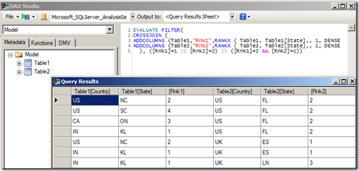
5) Since we are short of one row, we need to include one more extra row having the complementary values of ranks for the overlapping row (in this case, the row with Rnk1=2 and Rnk2=1). This can be done by using the query given below.

EVALUATE
FILTER(
CROSSJOIN (
ADDCOLUMNS (Table1,”Rnk1″,RANKX ( Table1, Table1[State],, 1, DENSE ) ),
ADDCOLUMNS (Table2,”Rnk2″,RANKX ( Table2, Table2[State],, 1, DENSE ) )
), ([Rnk1]=1 || [Rnk2]=2) || ([Rnk1]=2 && [Rnk2]=1))

Filtering the right number of rows

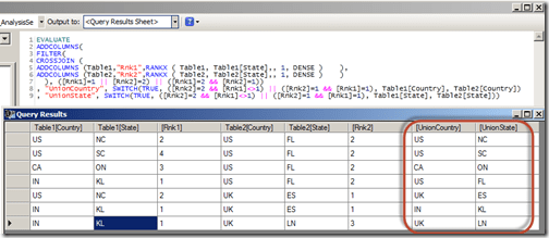
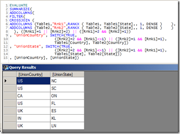
6) Now all we have to do is to get the logic for creating the calculated columns. We can do it with the help of a SWITCH statement by (a) assigning the extra row (Rnk1=2 and Rnk2=1) to Table1 and (b) making sure that the overlapping row (Rnk1=1 and Rnk2=2) is assigned to Table2. This can be done by the following query

EVALUATE
ADDCOLUMNS(
FILTER(
CROSSJOIN (
ADDCOLUMNS (Table1,”Rnk1″,RANKX ( Table1, Table1[State],, 1, DENSE ) ),
ADDCOLUMNS (Table2,”Rnk2″,RANKX ( Table2, Table2[State],, 1, DENSE ) )
), ([Rnk1]=1 || [Rnk2]=2) || ([Rnk1]=2 && [Rnk2]=1))
, “UnionCountry”, SWITCH(TRUE,
([Rnk2]=2 && [Rnk1]<>1) || ([Rnk2]=1 && [Rnk1]=1)
,Table1[Country], Table2[Country])
, “UnionState”, SWITCH(TRUE,
([Rnk2]=2 && [Rnk1]<>1) || ([Rnk2]=1 && [Rnk1]=1)
,Table1[State], Table2[State]))

Correct result of UNION ALL operation

Now you can see that the UnionCountry and UnionState column gives us the required results for a UNION ALL operation. This approach can be easily extended in case we have more than two tables to join. The only scenario where this approach will not work is when any of the participating tables has just one row (as the cross join will not give us more rows. Eg, cross-joining two tables with 3 and 1 rows will give only 3 rows whereas we need 4 rows for the UNION ALL). However, this can be resolved by adding a temporary table with two rows (so the cross join will be 3 * 1 * 2 = 6 rows) and then using this logic.

7) To do the UNION operation instead of UNION ALL, we should remove all duplicate rows. For that, we can use SUMMARIZE function.

EVALUATE
SUMMARIZE(
ADDCOLUMNS(
FILTER(
CROSSJOIN (
ADDCOLUMNS (Table1,”Rnk1″,RANKX ( Table1, Table1[State],, 1, DENSE ) ),
ADDCOLUMNS (Table2,”Rnk2″,RANKX ( Table2, Table2[State],, 1, DENSE ) )
), ([Rnk1]=1 || [Rnk2]=2) || ([Rnk1]=2 && [Rnk2]=1))
, “UnionCountry”, SWITCH(TRUE,
([Rnk2]=2 && [Rnk1]<>1) || ([Rnk2]=1 && [Rnk1]=1),
Table1[Country], Table2[Country])
, “UnionState”, SWITCH(TRUE,
([Rnk2]=2 && [Rnk1]<>1) || ([Rnk2]=1 && [Rnk1]=1),
Table1[State], Table2[State]))
, [UnionCountry], [UnionState])

Correct result of UNION operation

In this scenario, there is no difference in the result as there are no duplicate rows. Let me know what you think of this!

Update - 11/20/2015

I still see some hits on this page, so just wanted the readers to be aware that DAX now supports the UNION function (along with other set based function) out of the box

UNION Function DAX

Posted by SQLJason, 17 comments

Row Selection Using Slicers in PowerPivot - Part 2

This post is a continuation of the Row Selection Using Slicers in PowerPivot – Part 1 (so it might be a good idea to read that post before this). In our last post, we discussed the basic solution pattern for row selection using slicers in PowerPivot. In this post, we will discuss two other scenarios which are slightly more complex but still uses the same pattern. Scenario III - GroupNames in multiple dimensions
Our data model for this scenario will have a Product table, a Customer table and a Fact table which shows the sales by Product and Customer. The requirement is to select either Product or Customer in the slicer and display the appropriate rows in the pivot table. 1) As per the solution steps, we first have to create the Group table Note that we need two grain columns here, as the GroupNames belong to two dimensions – Product and Customer. The GroupName will be Customer and Product, and the GroupValues will be the actual product or customer values depending on the GroupName. As with the previous posts, I use MS Query to generate this table.  

SELECT Expr1000 AS GroupName, Customer1 AS GroupValue, ProductKey1 AS Product, Customer FROM
(
SELECT ‘Customer’ , C.Customer1, `Sheet1$`.ProductKey1, `Sheet1$`.Customer
FROM `Sheet1$` `Sheet1$`
INNER JOIN `Sheet1$` C
ON `Sheet1$`.Customer=C.CustomerKey
UNION ALL
SELECT ‘Product’, P.Product, `Sheet1$`.ProductKey1 , `Sheet1$`.Customer
FROM `Sheet1$` `Sheet1$`
INNER JOIN `Sheet1$` P
ON `Sheet1$`.ProductKey1=P.ProductKey
)

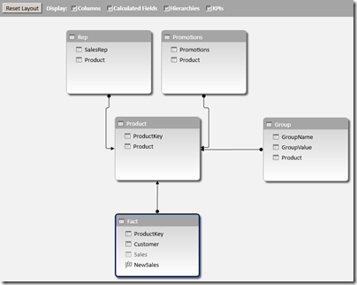
2) Add this new table (Group) to the data model and then relate the Product & Customer column in this table to the ProductKey column  in the Product table & CustomerKey column in the Customer table. 3) Hide the original measure Sales, and then create a new measure with the formula given below

NewSales:=CALCULATE(SUM(Fact[Sales]), ‘Group’)

4) Check out the results by creating a pivot table with GroupValue on the rows, NewSales on Values and GroupName in Slicers. Download the Excel 2013 file with the solution from here. Scenario IV – Hybrid Scenario 
In this scenario, we are going to combine all the different scenarios we discussed till now and see how to handle that. The data model for this scenario will contain a Fact table which shows sales by Product and Customer, a Product table with the Product and SubCategory information, a Customer table and a Promotions table which has a many to many relationship with Product. The requirement is to have SubCategory (Scanario I), Promotions (Scenario II) and Customer (Scenario III) on slicers. 1) As usual, the first step is to generate the Group table. Note that even though we have only 4 subcategories, we end up with 6 rows because we will have to ensure that the grain is at a Product and Customer level. Similarly, we end up with  9 rows for Promotions when we convert the granularity of the Promotions table from just Product to the Product and Customer level. Find below the MS Query way of generating this table

SELECT Expr1000 AS GroupName, SubCategory AS GroupValue, ProductKey1 AS Product, Customer FROM
(
SELECT ‘SubCategory’,S.SubCategory, `Sheet1$`.ProductKey1, `Sheet1$`.Customer
FROM `C:UsersJasonDesktopBlogRowSelectionScenario4_Hybrid.xlsx`.`Sheet1$` `Sheet1$`
INNER JOIN `C:UsersJasonDesktopBlogRowSelectionScenario4_Hybrid.xlsx`.`Sheet1$` `S`
ON `Sheet1$`.ProductKey1=S.ProductKey
UNION ALL
SELECT ‘Promotions’,P.Promotions, P.Product1, S.Customer
FROM `C:UsersJasonDesktopBlogRowSelectionScenario4_Hybrid.xlsx`.`Sheet1$` `P`
INNER JOIN `C:UsersJasonDesktopBlogRowSelectionScenario4_Hybrid.xlsx`.`Sheet1$` `S`
ON P.Product1=S.ProductKey1
UNION ALL
SELECT ‘Customer’, Customer, ProductKey1, Customer
FROM `C:UsersJasonDesktopBlogRowSelectionScenario4_Hybrid.xlsx`.`Sheet1$`
WHERE Customer IS NOT NULL
)

2) Add this new table (Group) to the data model and then relate the Product & Customer column in this table to the ProductKey column  in the Product table & CustomerKey column in the Customer table. 3) Hide the original measure Sales, and then create a new measure with the formula given below

NewSales:=CALCULATE(sum(Fact[Sales]), ‘Group’, Promotions)

Also note the use of the Promotions table (which is the many to many table) in the filter part of the calculate statement. 4) Check out the results by creating a pivot table with GroupValue on the rows, NewSales on Values and GroupName in Slicers. Download the Excel 2013 file with the solution from here. With that, we come to the end of this 2 part series on how to change the rows using slicers in PowerPivot. As you would have seen, the bulk of the work lies in generating the Group table and the rest is pretty simple. Hope these scenarios will help you in case you ever need to do the same.

Posted by SQLJason, 0 comments
Row Selection Using Slicers in PowerPivot – Part 1

Row Selection Using Slicers in PowerPivot - Part 1

A couple of months back, I had written a post on ‘Measure selection using Slicers in PowerPivot’ and this turned out to be one of my most popular ones in the PowerPivot / DAX category. It was just a matter of time before someone asked how to do the same with rows or dimension attributes using slicers in PowerPivot. And the case supporting it is also becoming strong with more and more dashboards being built in Power View and Excel. Well, as usual, this functionality is not available out of the box but you could simulate it with a little change to your data model. Read on for the solution. Row Selection using Slicers in PowerPivot Part 1

I will be first briefly explain the solution pattern and then apply it to a couple of scenarios.

Solution
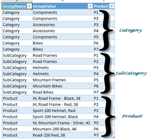
1) A new table should be built and added to the existing data model. The new table should have at least 3 columns
- GroupName : the text displayed in the slicers (for e.g., Product, Customer, etc.)
- GroupValue : the actual values that should be displayed in the rows on selecting the slicer values (for e.g., if Product is selected in the slicer for GroupName, then GroupValues will be the Product values)
- Grain of the Tables : If all the GroupNames displayed in the slicer belong to the same dimension (for eg, Product, Category and SubCategory in the Product dimension), then only one column is required which would be the grain of the dimension (to be precise, the column of the table linked to the facts which is usually the grain of the dimension). If multiple dimensions are involved in the GroupNames (for eg, Product and Customer), then the number of columns increases based on the grain of the participating dimensions.For each GroupName, all valid combinations of GroupValue and Grain columns should be generated.
2) The grain columns should then be related to the dimensions.
3) Create new calculated measures for each of the required measure by passing the new table in the filter part of a calculate statement and then use them in the pivot tables or charts.

Scenario I - GroupNames in one dimension and 1-to-Many Relationship
Our data model for this scenario will have a Product table and a Fact table which shows the sales by Product and Customer. The Product table has ProductKey, Product, SubCategory and Category columns. Our requirement is that we should be able to select Product, SubCategory or Category in the slicers and display the selected values on the row of the pivot table.

Source tables

1) As per the solution steps, we will have to create a new table as shown below

Group table for Scenario 1

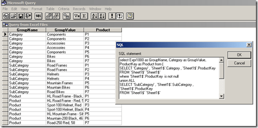
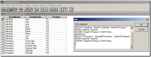
Since the slicers need to display the three levels, the GroupName values will be Category, SubCategory and Product. The granularity is at the Product level and hence that will be the third column. Note that for each value in GroupName, there should be a row mapping the GroupValue to the grain column (which is Product here). This sort of table is very easy to create if the source is a relational database. For this demo, I used linked tables and hence to automate the creation of this table, I had to use Microsoft Query as a datasource to pull data from the linked tables.

MS Query for Scenario 1

SELECT Expr1000 AS GroupName, Category AS GroupValue, ProductKey AS Product FROM (
SELECT ‘Category’ , ‘Sheet1$’.Category , ‘Sheet1$’.ProductKey
FROM ‘Sheet1$’ ‘Sheet1$’
WHERE ‘Sheet1$’.ProductKey IS NOT NULL
UNION ALL
SELECT ‘SubCategory’ , ‘Sheet1$’.SubCategory , ‘Sheet1$’.ProductKey
FROM ‘Sheet1$’ ‘Sheet1$’
WHERE ‘Sheet1$’.ProductKey IS NOT NULL
UNION ALL
SELECT ‘Product’ , ‘Sheet1$’.Product , ‘Sheet1$’.ProductKey
FROM ‘Sheet1$’ ‘Sheet1$’
WHERE ‘Sheet1$’.ProductKey IS NOT NULL
)

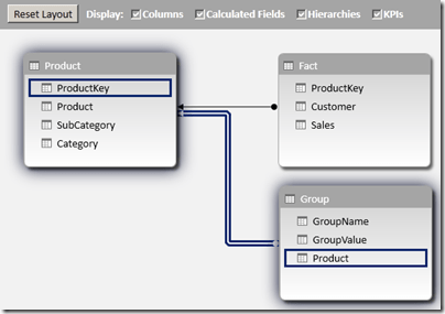
(Please note that I am not a MS query datasource expert and I had to workaround getting the column alias names by bringing the outermost select statement. This should have been a simple UNION ALL in SQL Server). If there is any data change in the linked tables, the Refresh button should be clicked twice in the Excel window (so that the Query can populate the changed data in the new table as well as refresh the PowerPivot model with the changed data). 2) Add this new table (Group) to the data model and then relate the Product column in this table to the ProductKey column in the Product table.

Data Model for Scenario 1

3) Hide the original measure Sales, and then create a new measure with the formula given below

NewSales:=CALCULATE(SUM(Fact[Sales]), ‘Group’)

4) Check out the results by creating a pivot table with GroupValue on the rows, NewSales on Values and GroupName in Slicers.

End result for Scenario 1

Download the Excel 2013 file with the solution from here.

Scenario II - GroupNames in one dimension and Many-to-Many Relationship
Our data model for this scenario will have a Product table, Fact table which shows the sales which shows the sales by Product and Customer, and two tables – Sales Rep and Promotions which will have a many to many relationship with Product.

Source tables for scenario 2

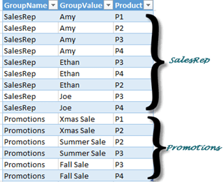
1) The Group table should have the below format

Group table for Scenario 2

To create the Group table, we again use Microsoft Query as a datasource to pull data from the linked tables.

MS Query for Scenario 2

SELECT Expr1000 AS GroupName, SalesRep AS GroupValue, Product1 AS Product FROM (
SELECT ‘SalesRep’, `Sheet1$`.SalesRep, `Sheet1$`.Product1
FROM `Sheet1$` `Sheet1$`
WHERE `Sheet1$`.Product1 IS NOT NULL
UNION ALL
SELECT ‘Promotions’ , `Sheet1$`.Promotions , `Sheet1$`.Product2
FROM `Sheet1$` `Sheet1$`
WHERE `Sheet1$`.Product2 IS NOT NULL
)

2) Add this new table (Group) to the data model and then relate the Product column in this table to the ProductKey column in the Product table.

Data model for Scenario 2

3) Hide the original measure Sales, and then create a new measure with the formula given below

NewSales:=CALCULATE(sum(Fact[Sales]), ‘Group’, ‘Promotions’, ‘Rep’)

4) Check out the results by creating a pivot table with GroupValue on the rows, NewSales on Values and GroupName in Slicers.

End result for Scenario 2

Download the Excel 2013 file with the solution from here.

I have got two more scenarios to show but guess that will have to wait till the second part of this series – Row Selection Using Slicers in PowerPivot – Part 2.

Note
There are some unique concepts here which might raise questions like
- why didn’t I use DAX queries to seed my Group table? Well, I couldn’t find a easy way to do union in DAX and that is the reason why I used MS query. It might not be the best way but it sure is an option.
- Is there any other way to avoid the double refresh of the file? I couldn’t find any other option to do so (actually, you will need to do that even if you are using DAX queries to seed the Group table). That is, if you are avoiding VBA. Javier Guillen has written a post on how to do it with a single refresh using VBA (check out the final part of his blog for the VBA code).

Posted by SQLJason, 1 comment