PowerPivot

Performance Problems with IF statement execution in SSAS Tabular

Due to the high compression rates and stellar in-memory architecture of SSAS Tabular, most people with smaller models do not experience performance problems (in-spite of employing bad data modeling techniques and inefficient DAX measures). However, as the size of your models increase, you will start to see performance issues creep up, especially if you are not paying attention to data modeling and DAX measures. Last week, I gave a presentation at the PASS Summit 2015 on my experience of building a 150 GB Tabular model in SSAS 2012. During that, I shared my story on how some of the DAX measures with IF statements were causing performance issues and how to work-around that issue by rewriting your DAX measures. During that day, Microsoft also announced that they resolved this issue in SQL 2016, so I thought of demonstrating the issue, workaround and also the fix in SSAS 2016.

Issue in SSAS 2014 (& older versions)

For demonstrating the issue, I will be writing queries against the Adventure Works model in SSAS 2014 and using MDX Studio to show the server timings. Let me start with the below query

WITH MEASURE ‘Date'[test] = If ( 1 = 2, [Internet Total Sales], [Reseller Total Sales] )
SELECT NON EMPTY { [MEASURES].[Test] } ON COLUMNS,
NON EMPTY (
{ [Date].[Calendar Year].Children },
{ [Product].[Product ID].Children },
{ Geography.[Country Region Name].Children } ) ON ROWS
FROM [Model]

The above MDX query defines a DAX measure called Test, which depending on the condition displays either Internet Total Sales or the Reseller Total Sales (To make it simple, I just made a static condition 1=2 but that can be replaced by any dynamic condition also). The query results should display the Test measure for Year, Product ID and Country. Now, normally we would expect that the Test measure should only execute the true part of the IF statement. But let us execute this in MDX Studio and see what actually happens.

You can see that both the branches of the IF statement are being executed, even though we expect only the true part to be executed. For smaller models, it might not make a difference but for large models with expensive measures, this might cause severe performance issues.

Workaround in SSAS 2014 (& older versions)

The workaround for this issue is to rewrite your DAX such that we ensure that the measures get executed only if the condition is true.

WITH MEASURE ‘Date'[test] = CALCULATE([Internet Total Sales], FILTER(Currency, 1=2)) + CALCULATE( [Reseller Total Sales], FILTER(Currency, 1<>2))
SELECT NON EMPTY{[MEASURES].[Test]} ON COLUMNS,
NON EMPTY({[Date].[Calendar Year].children}, {[Product].[Product ID].children},{Geography.[Country Region Name].children}) ON ROWS
FROM [Model]

Note that the measure has been rewritten as the sum of two CALCULATE functions. The key is to use a table in the filter clause within the CALCULATE that satisfies the below conditions

  • Is related to the fact table of the measure
  • Is low in cardinality (you can also use a low cardinality column instead of a table)
  • Is not being used in the calculations for the measure/condition. If yes, do some extra testing to make sure the performance is not worse

The reasoning behind the table being connected to fact table is because the calculate() with the false condition has to evaluate to zero / BLANK so that the result of the Test measure would only be the one appropriate measure. If the table is not related, you will end up with the sum of both the measures. A low cardinality table or column is preferred because in this technique, you will see that there are 2 additional queries being sent to the storage engine, which evaluates the FILTER part for the two measures. If the tables have high cardinality, the time for the FILTER queries will take more time. The reason why I said that the table or column should not be used in the measure calculations or condition is because I have seen that in certain conditions, this could actually make the performance worse and still execute both the branches. So just make sure you do some extra testing.

That said, let us look at the scans for the above query. You can see that only the Reseller Sales measure is executed. Also, if you notice carefully, there are 2 extra scans which basically check the filter condition for Currency. In large models, these scans for low cardinality dimensions will be almost negligible and the time for these extra scans will be much lesser than the time taken to execute the other measure also. In this case, the Adventure Works model is just 18 MB, so you won’t see much of a difference.

New Optimization in SSAS 2016

SSAS 2016 CTP2.3 (and newer versions) has a new optimization for this issue – Strict evaluation of IF / SWITCH statements. A branch whose condition is false will no longer result in storage engine queries. Previously, branches were eagerly evaluated but results discarded later on. To prove this, let us execute the original query against SSAS 2016 and see the results.

Now we can see only the relevant measure is being executed. Also, it is faster compared to SSAS 2014 versions of both the original query as well as the workaround. I hope this article will help people who are not on SSAS 2016 to optimize IF statements, and also help understand what the new optimization in SSAS 2016 – Strict evaluation of IF / SWITCH statements actually means. There are also a bunch of new features and optimizations in SSAS 2016 and you should check them out!

Posted by SQLJason, 2 comments

My Thoughts on Calculated Tables in Power BI

Yesterday was a terrific day for all of Microsoft Power BI fans. Microsoft released updates for Power BI Service, Power BI Mobile and Power BI Desktop (with an unbelievable 44 new features) – which basically means no matter whether you are a developer, BI professional or an end user, all of you got something new to play with along with this release. The blogs give a lot of details on what those new features are, so I wouldn’t be going over them. But I wanted to take a moment to pen down a few moments on my thoughts on a new modeling feature within this release - Calculated Tables.

Chris Webb has already posted his thoughts on Calculated Tables in Power BI and I am pretty sure Marco Russo / Alberto Ferrari will post some on the same pretty soon (if not, this is an open request from my side for Marco & Alberto to post something on the topic, pretty please ) – [Update 9/28/2015 Read Transition Matrix using Calculated Tables]. As usual, a combination of posts from these folks are going to be the best resource for any topic in the Modeling side, and I learn most of my stuff from them. So you would be thinking – what exactly am I trying to achieve in this post? Well, I would like to add my 2 cents on the same and try to see if the community in general agrees with what I think and if not, to learn from the comments and the interaction this might generate.

I) How to build Calculated Tables in Power BI

Before I start on my thoughts on calculated tables, it might be a good idea to quickly see how we can create calculated tables.

1) First make sure that the version of Power BI is equal to or higher than 2.27.4163.351. (I am making a fair assumption that this feature will be enabled in all higher versions also released in the future). If not, download it from here

2) Now open any of your existing models in Power BI (or get some new data), and after that, click on the Data tab. You should be able to see the New Table icon in the Modeling tab on the top.

3) Click on the New Table icon, and then enter any DAX expression in the format that returns a table TableName = DAX Expression that returns a table Once you do that, then you should be able to see the resultant columns in the new table.

II) When is the data in a Calculated Table processed

The official blog says quite a few things on the same-

    • A Calculated Table is like a Calculated Column.
    • It is calculated from other tables and columns already in the model and takes up space in the model just like a calculated column.
    • Calculated Tables are re-calculated when the model is re-processed.

So based on this information, I am going to go a step further and assume that the data in a calculated table is processed during the ProcessRecalc phase of processing. Also, this means that every time any of the source tables changes (like a new calculated column or new data), the data in the calculated table will also change. To prove this, let us try a simple experiment-

1) Make a calculated table called Test which will be the same as the Date table (which currently has just the Year column).

Note that measures from the source table are not brought along to the calculated table, which is as expected.

2) Now go to the Date table (which is our source table in this case) and then add a new calculated column called TestColumn with 1 as the value.

Note that when we added a calculated column in the source table, the column was replicated in the calculated Table also with the same name. The only difference is that the source table shows an icon for calculated column. This shows that the ProcessRecalc that happens in the source table when a new calculated column is made, also recalculates the calculated table.

III) My thoughts on Calculated Tables

Based on my understanding so far, there are times when I think I should use calculated tables and times when I should not use calculated tables. So here it goes -

a) When NOT to use calculated tables

If you have a way of replicating the calculated table in some form of ETL or source query (even a SQL View), you should not use a Calculated table. Why? A couple of reasons

  • If done from ETL / source query, the engine will see the result as a regular table, which means parallel processing of the tables can be done (unlike now, where the ProcessData phase of the source tables have to finish first before the calculated tables can be processed). So calculated tables could lead to slower data processing time.
  • A ProcessRecalc happens every time you do a process full, and adding more calculated tables (as well as calculated columns) unnecessarily will increase the processing time. Also, during development of very large models, you might have to wait for a long time after each calculation is made for the data to appear, since all dependent tables will also have to be recalculated (unless you turn off the automatic calculation mode).
  • This one is more an assumption and further research will be needed to validate this, but I am putting it forward anyways. Just like a calculated column is not that optimized for data storage compared to a regular column, I suspect that a calculated table will also not be optimized for storage compared to a regular table. If this is true, this might affect query performance.

b) When to use calculated tables

There are a lot of scenarios where you would want to use calculated tables and I have listed a few of the scenarios below

  • During debugging complex DAX expressions, it might be easier for us to store the intermediate results in a calculated table and see whether the expressions ate behaving as expected.
  • In a lot of self-service BI scenarios or Prototype scenarios, it is more important to get the results out there faster and hence, it might be difficult or not worth the effort to fiddle with the source queries. Calculated tables can be a quick and easy method to get the desired table structures.
  • A kind of scenario that I see very often during prototyping / PoCs is when there are 2 facts in an excel file which are given for making reports. As seasoned users of Power Pivot / Power BI, we know that we will have to create a proper data model with the dimensions. Now, I might need to create a dimension which gets me the unique values from both the tables. For eg, in the below example, I need the Country dimension to get values from both the tables (USA, Canada, Mexico). It might be easier to write an expression for a calculated table like shown below
    Country = DISTINCT(UNION(DISTINCT(Table1[Country]), DISTINCT(Table2[Country])))

  • There are times (like in some role playing dimensions) where you will need to replicate the columns / calculated columns (or even delete) in another table also, even if the columns are built at a later phase in the project. Calculated tables are a perfect match for that, as you will only need to make the changes in one table, and the changes will flow down to the calculated table during ProcessRecalc phase (remember our previous example where we created a TestColumn in the Date table, and the change was reflected in our calculated table also).
  • Calculated tables can help in speeding up DAX expressions. This is very similar to the technique of using aggregate tables in SQL database to speed up the calculations in SQL.
  • Quick and easy way to create calendar tables (like Chris showed in his blog)

This is still a very early stage as far as Calculated tables are concerned, and I am pretty sure we are going to see some very innovative uses as well as benefits of calculated tables in the days to come. I might also learn that some of my assumptions are wrong, and if I do, I will come back and update this post to the best I can. Meanwhile, feel free to comment on your thoughts / concerns / feedback.

Update - 9/28/2015

Transition Matrix using Calculated Tables – Alberto Ferrari
Use Calculated Table to Figure Out Monthly Subscriber Churn – Jeffrey Wang

Posted by SQLJason, 0 comments

Ranking within Slicer Selection in Power Pivot

I know it’s been ages since I posted something, and I do have lots of lame excuses so maybe it deserves a post on it’s own. But for now, I want to jot down a workaround on how to rank a column based on the slicer selections for the same column.

The other day, I was working on an excel dashboard and I got a requirement to rank a field while the field values are there on the slicer. While I am used to getting requests on ranking a field based on a measure, this was the first time someone was asking me to rank a field based on a measure while the column was on the slicer. The user just wanted to rank within the selected values of the field in the slicer and not as a whole. To explain this, I just made a very simple example with the model given below

The FactLicense table contains data on new liquor licenses and I made a simple measure License Count to count the number of licenses. The FactLicense table is related to the Geo table through the Zip Code column. The requirements were that

  • the City field should be ranked by License Count
  • there should be a slicer displaying the values for City
  • the ranks should update based on the Slicer selections

Solution

1) To solve the first part of the requirement, I made a simple ranking measure by City as shown below.

LC Ranked by City:=RANKX(ALL(Geo[City]), [License Count])

You can see the results in the pivot table below.

2) For the second requirement, we can just add a slicer for the City field and then connect it to the Pivot Table.

3) Now the third requirement is the interesting one. When I try to filter by some cities, I get the result below.

You can see that the Ranks don’t get updated based on the slicer selections. The user wants the ranks to start from 1 but you can see that the ranks are still based on the entire city list and not just the selected city list. Now it is impossible (atleast as far as I know) to reset the ranking if the same field is on the rows as well as the slicer. The reason is that the Rank measure operates on ALL(Geo[City]) and hence removes any filter or selection that is already made. So what do we do?

4) A simple workaround is to make a calculated column (say City Slicer) and make the Slicer based on this new calculated column.

Make sure to remove the old slicer as well as connect this new slicer to the pivot table.

5) Now when we select the City in the slicer, you can see that the Ranks get reset.

You can further rename the Slicer such that it says only City and you can hide this calculated column so that it is not visible to the other users analyzing the model. This will help avoiding confusion among the end users (Eg – why do we have 2 city fields?) and at the same time, you can make your Excel dashboard with the fulfilled requirements.

Update

Within seconds of posting, Miguel Escobar (twitter) comes up with a much better way of doing this using the ALLSELECTED().

LC Ranked by City1:=RANKX(ALLSELECTED(Geo[City]), [License Count])

This would be the ideal way to do it as we don’t have to create a new calculated column and still achieve the same results. Thanks a lot for this Miguel!
Posted by SQLJason, 1 comment
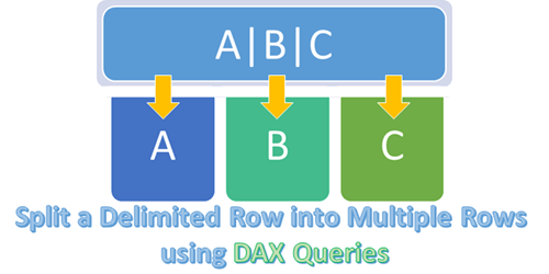
Split a Delimited Row into Multiple Rows using DAX Queries

Split a Delimited Row into Multiple Rows using DAX Queries

Recently, I got a question from one of my readers on whether there is a way to split a single delimited row into multiple rows using DAX. I had kind of demonstrated the opposite to Group Multiple Rows to Single Delimited Row in PowerPivot here and this was another interesting challenge. Read on for the solution.

Split a Delimited Row into Multiple Rows using DAX Queries

Business Requirement

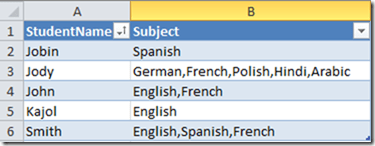
Suppose there is a table which has two columns – StudentName and Subject.

Source Table

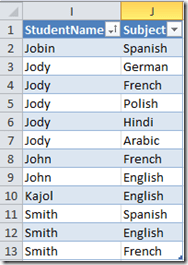
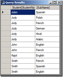
The end result should be

Required end result

Solution

We will be using DAX queries to generate a table that will have the desired output. For this demonstration, I will be creating a PowerPivot model and running DAX queries in DAX Studio on top of the Excel PowerPivot model.

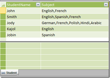
1) Create a linked table for the Student.

Student table

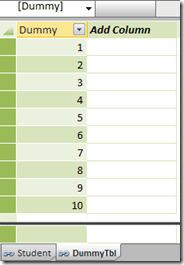
2) Create a table called DummyTbl which is just a list of running numbers from 1 till n. The value of n should be equal to the max number of subjects that a student can have. In this demo, I am assuming that a student can have a max of 10 subjects, so my Dummy table will consist of numbers 1 – 10.

Dummy table

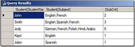
3) Now let us create the DAX queries in DAX Studio. First, we will create a computed column called SubCnt which will give the number of subjects for each row.

EVALUATE
SUMMARIZE (
Student,
[StudentName],
[Subject],
“SubCnt”,
1 + Len ( [Subject] ) - Len ( Substitute ( [Subject], “,”, “” ) )
)

find number of subjects

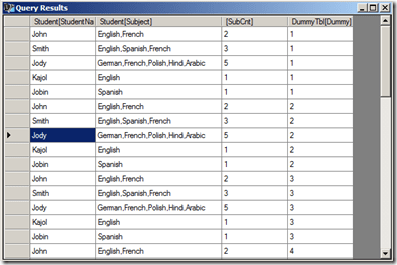
4) The only way we can increase the number of rows of a table is by using the function CrossJoin. So let us CrossJoin the Student table with the DummyTbl.

EVALUATE
Crossjoin (
SUMMARIZE (
Student,
[StudentName],
[Subject],
“SubCnt”,
1 + Len ( [Subject] ) - Len ( Substitute ( [Subject], “,”, “” ) )
),
DummyTbl
)

crossjoined tables

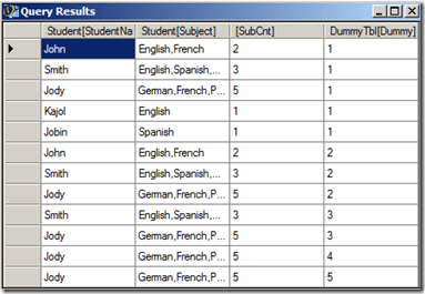
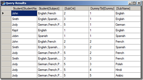
5) Now filter the resultant table where SubCnt is less than or equal to Dummy column. Now we have got the exact number of rows needed for the end result.

EVALUATE
Filter (
Crossjoin (
SUMMARIZE (
Student,
[StudentName],
[Subject],
“SubCnt”,
1 + Len ( [Subject] ) - Len ( Substitute ( [Subject], “,”, “” ) )
),
DummyTbl
),
DummyTbl[Dummy] <= [SubCnt]
)

filtered table

6) The only thing left is to split the delimited subjects to the single subject for each row. And the only way to split delimited values is to use the PATHITEM function. To use the PATHITEM function, we should substitute the commas (,) with the pipe (|) symbol.

EVALUATE
ADDCOLUMNS (
FILTER (
CROSSJOIN (
SUMMARIZE (
Student,
[StudentName],
[Subject],
“SubCnt”,
1 + Len ( [Subject] ) - Len ( Substitute ( [Subject], “,”, “” ) )
),
DummyTbl
),
DummyTbl[Dummy] <= [SubCnt]
),
“SubName”,
PATHITEM (
SUBSTITUTE ( Student[Subject], “,”, “|” ),
DummyTbl[Dummy]
)
)

splitting delimitted subjects to individual subjects

7) Now all we need to do is to select the two required columns.

EVALUATE
SUMMARIZE (
ADDCOLUMNS (
FILTER (
CROSSJOIN (
SUMMARIZE (
Student,
[StudentName],
[Subject],
“SubCnt”,
1 + Len ( [Subject] ) - Len ( Substitute ( [Subject], “,”, “” ) )
),
DummyTbl
),
DummyTbl[Dummy] <= [SubCnt]
),
“SubName”,
pathitem (
Substitute ( Student[Subject], “,”, “|” ),
DummyTbl[Dummy]
)
),
[StudentName],
[SubName]
)
ORDER BY [StudentName]

end result

Hopefully this post will help you when you encounter a similar situation!

Posted by SQLJason, 8 comments
UNION Operation in DAX Queries

UNION Operation in DAX Queries

In one of my previous posts - Row Selection Using Slicers in PowerPivot - Part 1, I had demonstrated the use of what Marco Russo defined as Reverse Linked Tables and Linkback tables. A particularly eye-catching thing in my post was the use of Microsoft Query instead of DAX Query to obtain the required reverse-linked table and one of the reasons I gave was that it was difficult to do an UNION operation using DAX queries (yes, you heard it right. I said difficult and not impossible). Well, since difficult is such a subjective word, I decided to jot down the technique, maybe it might seem easy for you guys!

Union operation with DAX queries / PowerPivot

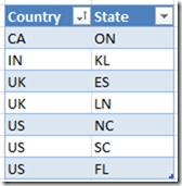
For the purpose of this demonstration, I am using two tables having identical structures. There are just two columns in the tables - country and state and we need to do an UNION operation on these two tables.

Source

The result should be 7 rows as shown below

Expected Result

Follow the steps below for the solution:-

1) Import the two tables to PowerPivot (you can also use this technique on a SSAS tabular model). I will be using DAX Studio for writing my queries and displaying the results (though you might as well as use this in SSMS or in the DMX query editor for SSRS depending on your purpose).

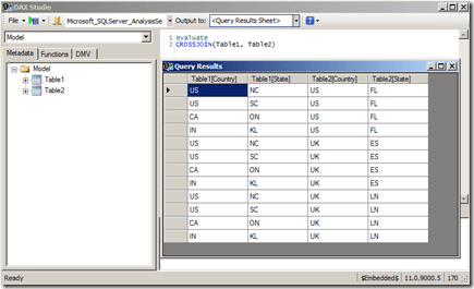
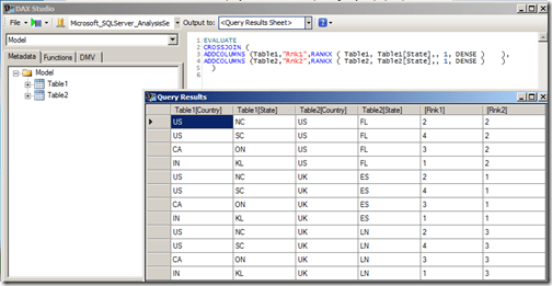
2) The first thing to understand here is that DAX, as a query language, can not add rows usually, and UNION requires that we get more rows (since it is the combined result of both the tables). However, there is an operator in DAX which generally generates more rows than its source tables – CROSSJOIN (except when any one of the participating tables has only one row). So let’s first crossjoin the two tables and see the results.

CrossJoin

Now you can see that we get 12 rows, however no single column gives the result that we need. Somehow, we need to get a logic to filter the 5 rows and also a logic to combine the right results in one calculated column.

3) To identify the individual rows, let us add a rank column to each of the two tables and then crossjoin them.

EVALUATE
CROSSJOIN (
ADDCOLUMNS (Table1,”Rnk1″,RANKX ( Table1, Table1[State],, 1, DENSE ) ),
ADDCOLUMNS (Table2,”Rnk2″,RANKX ( Table2, Table2[State],, 1, DENSE ) )
)

Adding rank identifiers to the table rows

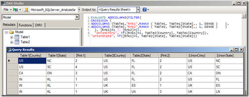
4) When I looked at this resultset initially, I felt that I could just filter all rows having Rank1 = 1 and Rank2 = 2 and then add a calculated column each for Country and State such that if Rank1 = 1, then the value comes from Table2 else it comes from Table1.

EVALUATE
ADDCOLUMNS (
FILTER (
CROSSJOIN (
ADDCOLUMNS (Table1,”Rnk1″,RANKX ( Table1, Table1[State],, 1, DENSE ) ),
ADDCOLUMNS (Table2,”Rnk2″,RANKX ( Table2, Table2[State],, 1, DENSE ) )
),
[Rnk1] = 1 || [Rnk2] = 2 ),
“UnionCntry”, IF ( [Rnk1] = 1, Table2[Country], Table1[Country] ),
“UnionState”, IF ( [Rnk1] = 1, Table2[State], Table1[State] )
)

Incorrect logic

Even though the UnionCntry and UnionState columns might appear right, they are not, as one row is missing (in this case, the row with IN country and KL state). This happens because there will always be one row which has Rnk1 = 1 and Rnk2 = 2, and hence there is an overlap. So we need to think of a different technique to filter the rows.

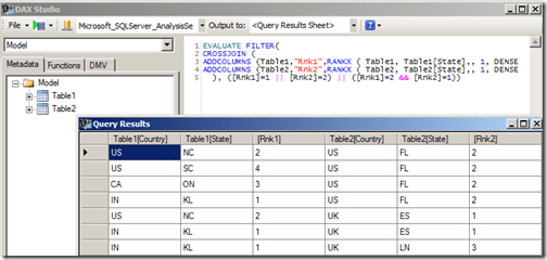
5) Since we are short of one row, we need to include one more extra row having the complementary values of ranks for the overlapping row (in this case, the row with Rnk1=2 and Rnk2=1). This can be done by using the query given below.

EVALUATE
FILTER(
CROSSJOIN (
ADDCOLUMNS (Table1,”Rnk1″,RANKX ( Table1, Table1[State],, 1, DENSE ) ),
ADDCOLUMNS (Table2,”Rnk2″,RANKX ( Table2, Table2[State],, 1, DENSE ) )
), ([Rnk1]=1 || [Rnk2]=2) || ([Rnk1]=2 && [Rnk2]=1))

Filtering the right number of rows

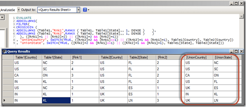
6) Now all we have to do is to get the logic for creating the calculated columns. We can do it with the help of a SWITCH statement by (a) assigning the extra row (Rnk1=2 and Rnk2=1) to Table1 and (b) making sure that the overlapping row (Rnk1=1 and Rnk2=2) is assigned to Table2. This can be done by the following query

EVALUATE
ADDCOLUMNS(
FILTER(
CROSSJOIN (
ADDCOLUMNS (Table1,”Rnk1″,RANKX ( Table1, Table1[State],, 1, DENSE ) ),
ADDCOLUMNS (Table2,”Rnk2″,RANKX ( Table2, Table2[State],, 1, DENSE ) )
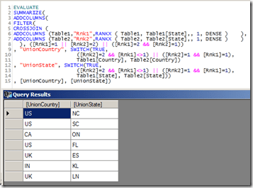
), ([Rnk1]=1 || [Rnk2]=2) || ([Rnk1]=2 && [Rnk2]=1))
, “UnionCountry”, SWITCH(TRUE,
([Rnk2]=2 && [Rnk1]<>1) || ([Rnk2]=1 && [Rnk1]=1)
,Table1[Country], Table2[Country])
, “UnionState”, SWITCH(TRUE,
([Rnk2]=2 && [Rnk1]<>1) || ([Rnk2]=1 && [Rnk1]=1)
,Table1[State], Table2[State]))

Correct result of UNION ALL operation

Now you can see that the UnionCountry and UnionState column gives us the required results for a UNION ALL operation. This approach can be easily extended in case we have more than two tables to join. The only scenario where this approach will not work is when any of the participating tables has just one row (as the cross join will not give us more rows. Eg, cross-joining two tables with 3 and 1 rows will give only 3 rows whereas we need 4 rows for the UNION ALL). However, this can be resolved by adding a temporary table with two rows (so the cross join will be 3 * 1 * 2 = 6 rows) and then using this logic.

7) To do the UNION operation instead of UNION ALL, we should remove all duplicate rows. For that, we can use SUMMARIZE function.

EVALUATE
SUMMARIZE(
ADDCOLUMNS(
FILTER(
CROSSJOIN (
ADDCOLUMNS (Table1,”Rnk1″,RANKX ( Table1, Table1[State],, 1, DENSE ) ),
ADDCOLUMNS (Table2,”Rnk2″,RANKX ( Table2, Table2[State],, 1, DENSE ) )
), ([Rnk1]=1 || [Rnk2]=2) || ([Rnk1]=2 && [Rnk2]=1))
, “UnionCountry”, SWITCH(TRUE,
([Rnk2]=2 && [Rnk1]<>1) || ([Rnk2]=1 && [Rnk1]=1),
Table1[Country], Table2[Country])
, “UnionState”, SWITCH(TRUE,
([Rnk2]=2 && [Rnk1]<>1) || ([Rnk2]=1 && [Rnk1]=1),
Table1[State], Table2[State]))
, [UnionCountry], [UnionState])

Correct result of UNION operation

In this scenario, there is no difference in the result as there are no duplicate rows. Let me know what you think of this!

Update - 11/20/2015

I still see some hits on this page, so just wanted the readers to be aware that DAX now supports the UNION function (along with other set based function) out of the box

UNION Function DAX

Posted by SQLJason, 17 comments

Row Selection Using Slicers in PowerPivot - Part 2

This post is a continuation of the Row Selection Using Slicers in PowerPivot – Part 1 (so it might be a good idea to read that post before this). In our last post, we discussed the basic solution pattern for row selection using slicers in PowerPivot. In this post, we will discuss two other scenarios which are slightly more complex but still uses the same pattern. Scenario III - GroupNames in multiple dimensions
Our data model for this scenario will have a Product table, a Customer table and a Fact table which shows the sales by Product and Customer. The requirement is to select either Product or Customer in the slicer and display the appropriate rows in the pivot table. 1) As per the solution steps, we first have to create the Group table Note that we need two grain columns here, as the GroupNames belong to two dimensions – Product and Customer. The GroupName will be Customer and Product, and the GroupValues will be the actual product or customer values depending on the GroupName. As with the previous posts, I use MS Query to generate this table.  

SELECT Expr1000 AS GroupName, Customer1 AS GroupValue, ProductKey1 AS Product, Customer FROM
(
SELECT ‘Customer’ , C.Customer1, `Sheet1$`.ProductKey1, `Sheet1$`.Customer
FROM `Sheet1$` `Sheet1$`
INNER JOIN `Sheet1$` C
ON `Sheet1$`.Customer=C.CustomerKey
UNION ALL
SELECT ‘Product’, P.Product, `Sheet1$`.ProductKey1 , `Sheet1$`.Customer
FROM `Sheet1$` `Sheet1$`
INNER JOIN `Sheet1$` P
ON `Sheet1$`.ProductKey1=P.ProductKey
)

2) Add this new table (Group) to the data model and then relate the Product & Customer column in this table to the ProductKey column  in the Product table & CustomerKey column in the Customer table. 3) Hide the original measure Sales, and then create a new measure with the formula given below

NewSales:=CALCULATE(SUM(Fact[Sales]), ‘Group’)

4) Check out the results by creating a pivot table with GroupValue on the rows, NewSales on Values and GroupName in Slicers. Download the Excel 2013 file with the solution from here. Scenario IV – Hybrid Scenario 
In this scenario, we are going to combine all the different scenarios we discussed till now and see how to handle that. The data model for this scenario will contain a Fact table which shows sales by Product and Customer, a Product table with the Product and SubCategory information, a Customer table and a Promotions table which has a many to many relationship with Product. The requirement is to have SubCategory (Scanario I), Promotions (Scenario II) and Customer (Scenario III) on slicers. 1) As usual, the first step is to generate the Group table. Note that even though we have only 4 subcategories, we end up with 6 rows because we will have to ensure that the grain is at a Product and Customer level. Similarly, we end up with  9 rows for Promotions when we convert the granularity of the Promotions table from just Product to the Product and Customer level. Find below the MS Query way of generating this table

SELECT Expr1000 AS GroupName, SubCategory AS GroupValue, ProductKey1 AS Product, Customer FROM
(
SELECT ‘SubCategory’,S.SubCategory, `Sheet1$`.ProductKey1, `Sheet1$`.Customer
FROM `C:UsersJasonDesktopBlogRowSelectionScenario4_Hybrid.xlsx`.`Sheet1$` `Sheet1$`
INNER JOIN `C:UsersJasonDesktopBlogRowSelectionScenario4_Hybrid.xlsx`.`Sheet1$` `S`
ON `Sheet1$`.ProductKey1=S.ProductKey
UNION ALL
SELECT ‘Promotions’,P.Promotions, P.Product1, S.Customer
FROM `C:UsersJasonDesktopBlogRowSelectionScenario4_Hybrid.xlsx`.`Sheet1$` `P`
INNER JOIN `C:UsersJasonDesktopBlogRowSelectionScenario4_Hybrid.xlsx`.`Sheet1$` `S`
ON P.Product1=S.ProductKey1
UNION ALL
SELECT ‘Customer’, Customer, ProductKey1, Customer
FROM `C:UsersJasonDesktopBlogRowSelectionScenario4_Hybrid.xlsx`.`Sheet1$`
WHERE Customer IS NOT NULL
)

2) Add this new table (Group) to the data model and then relate the Product & Customer column in this table to the ProductKey column  in the Product table & CustomerKey column in the Customer table. 3) Hide the original measure Sales, and then create a new measure with the formula given below

NewSales:=CALCULATE(sum(Fact[Sales]), ‘Group’, Promotions)

Also note the use of the Promotions table (which is the many to many table) in the filter part of the calculate statement. 4) Check out the results by creating a pivot table with GroupValue on the rows, NewSales on Values and GroupName in Slicers. Download the Excel 2013 file with the solution from here. With that, we come to the end of this 2 part series on how to change the rows using slicers in PowerPivot. As you would have seen, the bulk of the work lies in generating the Group table and the rest is pretty simple. Hope these scenarios will help you in case you ever need to do the same.

Posted by SQLJason, 0 comments
Row Selection Using Slicers in PowerPivot – Part 1

Row Selection Using Slicers in PowerPivot - Part 1

A couple of months back, I had written a post on ‘Measure selection using Slicers in PowerPivot’ and this turned out to be one of my most popular ones in the PowerPivot / DAX category. It was just a matter of time before someone asked how to do the same with rows or dimension attributes using slicers in PowerPivot. And the case supporting it is also becoming strong with more and more dashboards being built in Power View and Excel. Well, as usual, this functionality is not available out of the box but you could simulate it with a little change to your data model. Read on for the solution. Row Selection using Slicers in PowerPivot Part 1

I will be first briefly explain the solution pattern and then apply it to a couple of scenarios.

Solution
1) A new table should be built and added to the existing data model. The new table should have at least 3 columns
- GroupName : the text displayed in the slicers (for e.g., Product, Customer, etc.)
- GroupValue : the actual values that should be displayed in the rows on selecting the slicer values (for e.g., if Product is selected in the slicer for GroupName, then GroupValues will be the Product values)
- Grain of the Tables : If all the GroupNames displayed in the slicer belong to the same dimension (for eg, Product, Category and SubCategory in the Product dimension), then only one column is required which would be the grain of the dimension (to be precise, the column of the table linked to the facts which is usually the grain of the dimension). If multiple dimensions are involved in the GroupNames (for eg, Product and Customer), then the number of columns increases based on the grain of the participating dimensions.For each GroupName, all valid combinations of GroupValue and Grain columns should be generated.
2) The grain columns should then be related to the dimensions.
3) Create new calculated measures for each of the required measure by passing the new table in the filter part of a calculate statement and then use them in the pivot tables or charts.

Scenario I - GroupNames in one dimension and 1-to-Many Relationship
Our data model for this scenario will have a Product table and a Fact table which shows the sales by Product and Customer. The Product table has ProductKey, Product, SubCategory and Category columns. Our requirement is that we should be able to select Product, SubCategory or Category in the slicers and display the selected values on the row of the pivot table.

Source tables

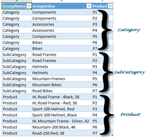
1) As per the solution steps, we will have to create a new table as shown below

Group table for Scenario 1

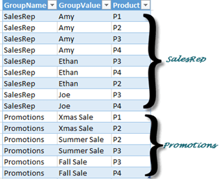
Since the slicers need to display the three levels, the GroupName values will be Category, SubCategory and Product. The granularity is at the Product level and hence that will be the third column. Note that for each value in GroupName, there should be a row mapping the GroupValue to the grain column (which is Product here). This sort of table is very easy to create if the source is a relational database. For this demo, I used linked tables and hence to automate the creation of this table, I had to use Microsoft Query as a datasource to pull data from the linked tables.

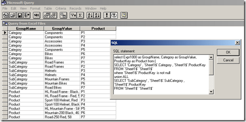
MS Query for Scenario 1

SELECT Expr1000 AS GroupName, Category AS GroupValue, ProductKey AS Product FROM (
SELECT ‘Category’ , ‘Sheet1$’.Category , ‘Sheet1$’.ProductKey
FROM ‘Sheet1$’ ‘Sheet1$’
WHERE ‘Sheet1$’.ProductKey IS NOT NULL
UNION ALL
SELECT ‘SubCategory’ , ‘Sheet1$’.SubCategory , ‘Sheet1$’.ProductKey
FROM ‘Sheet1$’ ‘Sheet1$’
WHERE ‘Sheet1$’.ProductKey IS NOT NULL
UNION ALL
SELECT ‘Product’ , ‘Sheet1$’.Product , ‘Sheet1$’.ProductKey
FROM ‘Sheet1$’ ‘Sheet1$’
WHERE ‘Sheet1$’.ProductKey IS NOT NULL
)

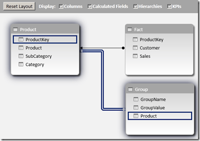
(Please note that I am not a MS query datasource expert and I had to workaround getting the column alias names by bringing the outermost select statement. This should have been a simple UNION ALL in SQL Server). If there is any data change in the linked tables, the Refresh button should be clicked twice in the Excel window (so that the Query can populate the changed data in the new table as well as refresh the PowerPivot model with the changed data). 2) Add this new table (Group) to the data model and then relate the Product column in this table to the ProductKey column in the Product table.

Data Model for Scenario 1

3) Hide the original measure Sales, and then create a new measure with the formula given below

NewSales:=CALCULATE(SUM(Fact[Sales]), ‘Group’)

4) Check out the results by creating a pivot table with GroupValue on the rows, NewSales on Values and GroupName in Slicers.

End result for Scenario 1

Download the Excel 2013 file with the solution from here.

Scenario II - GroupNames in one dimension and Many-to-Many Relationship
Our data model for this scenario will have a Product table, Fact table which shows the sales which shows the sales by Product and Customer, and two tables – Sales Rep and Promotions which will have a many to many relationship with Product.

Source tables for scenario 2

1) The Group table should have the below format

Group table for Scenario 2

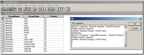
To create the Group table, we again use Microsoft Query as a datasource to pull data from the linked tables.

MS Query for Scenario 2

SELECT Expr1000 AS GroupName, SalesRep AS GroupValue, Product1 AS Product FROM (
SELECT ‘SalesRep’, `Sheet1$`.SalesRep, `Sheet1$`.Product1
FROM `Sheet1$` `Sheet1$`
WHERE `Sheet1$`.Product1 IS NOT NULL
UNION ALL
SELECT ‘Promotions’ , `Sheet1$`.Promotions , `Sheet1$`.Product2
FROM `Sheet1$` `Sheet1$`
WHERE `Sheet1$`.Product2 IS NOT NULL
)

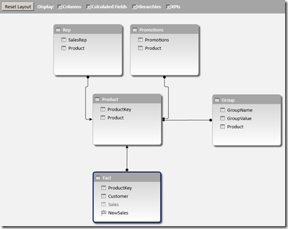
2) Add this new table (Group) to the data model and then relate the Product column in this table to the ProductKey column in the Product table.

Data model for Scenario 2

3) Hide the original measure Sales, and then create a new measure with the formula given below

NewSales:=CALCULATE(sum(Fact[Sales]), ‘Group’, ‘Promotions’, ‘Rep’)

4) Check out the results by creating a pivot table with GroupValue on the rows, NewSales on Values and GroupName in Slicers.

End result for Scenario 2

Download the Excel 2013 file with the solution from here.

I have got two more scenarios to show but guess that will have to wait till the second part of this series – Row Selection Using Slicers in PowerPivot – Part 2.

Note
There are some unique concepts here which might raise questions like
- why didn’t I use DAX queries to seed my Group table? Well, I couldn’t find a easy way to do union in DAX and that is the reason why I used MS query. It might not be the best way but it sure is an option.
- Is there any other way to avoid the double refresh of the file? I couldn’t find any other option to do so (actually, you will need to do that even if you are using DAX queries to seed the Group table). That is, if you are avoiding VBA. Javier Guillen has written a post on how to do it with a single refresh using VBA (check out the final part of his blog for the VBA code).

Posted by SQLJason, 1 comment
Group Multiple Rows to Single Delimited Row in PowerPivot

Group Multiple Rows to Single Delimited Row in PowerPivot

When PowerPivot was announced a couple of years back, I was one among the many who started feeling insecure on having to learn a new trade. I could have sat there and kept on cribbing, or picked myself up and started my baby steps towards the new technology. As Hillary Clinton said, the challenges of change are always hard. It is important that we begin to unpack those challenges and realize that we each have a role that requires us to change and become more responsible for shaping our own future. I am glad that I gave PowerPivot a chance and kept on learning (it sure helps sitting next to a passionate PowerPivot supporter like Javier Guillen!), else I wouldn’t have realized how much useful it is to me. Agreed that it has it’s fair sets of limitations, but as the community grows and the technology matures, we will see that many of it gets resolved or have workarounds. For eg, if you had asked me before on whether there was any way in PowerPivot to group all the row values into a single delimited row, I would have said no. But seeing this question in the PowerPivot forum, I decided to spend a little more time in the weekend and found a workaround, which I am sharing through this post.

Group Multiple Rows to Single Delimited Row in PowerPivot

Scenario
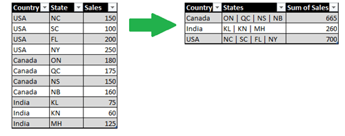
Let us say that we have a table which shows the sales by Country and State. The result should be a table which shows the sum of sales by country along with a delimited row of states as shown below

Scenario

Solution
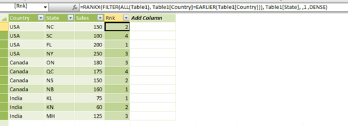
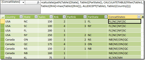
There is only one function (atleast as far as I know) in PowerPivot that returns a delimited list from multiple rows – PATH(). But the issue is that PATH() works only with a parent child hierarchy. So the trick for getting this piece done would be to build an artificial parent child hierarchy. Follow the steps below to get the solution:- 1) Make a calculated column called Rnk which will generate a running number of the states within a country.

=RANKX (
FILTER ( All ( Table1 ), Table1[Country] = EARLIER ( Table1[Country] ) ),
Table1[State], , 1, DENSE
)

This will allow us to uniquely identify each state value within a country.

Rank States within country using RANKX

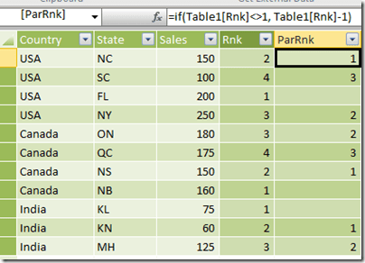
2) Make a calculated column called ParRnk with the formula below

=IF (
Table1[Rnk] <> 1,
Table1[Rnk] - 1
)

This will allow us to get the parent node id of the parent child hierarchy.

Parent Rank

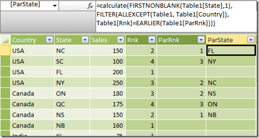
3) Now, make a calculated column called ParState which will get the Parent State for the current row (based on the ParRnk column).

=CALCULATE (
FIRSTNONBLANK ( Table1[State], 1 ),
FILTER (
ALLEXCEPT ( Table1, Table1[Country] ),
Table1[Rnk] = EARLIER ( Table1[ParRnk] )
)
)

Get value of State for the parent

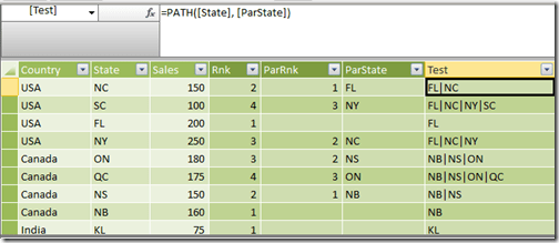
4) The final part of the solution is to make the delimited list column by using the path function where State is the child node and ParState is the parent node. But if we directly apply the PATH function in each row, we will not get the intended results as you can see in the image below.

PATH() without passing the relevant context

What we need is the delimited list value for the row with the maximum rank in each country applied across all other rows in that country. For that, make a calculated column called ConcatStates with the formula below

=CALCULATE (
PATH ( Table1[State], Table1[ParState] ),
CALCULATETABLE (
FILTER ( Table1, Table1[Rnk] = Max ( Table1[Rnk] ) ),
ALLEXCEPT ( Table1, Table1[Country] )
)
)

Now the results should look like below

PATH() with the correct table context

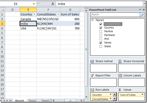
Now make a new pivot table and drag and drop the Country, ConcatStates and Sales fields to see the intended results

solution

Wasn’t that a fascinating workaround? If you want to play around, you can download the excel file from here.

Posted by SQLJason, 33 comments
Classifying and Solving the Events in Progress Problem in PowerPivot

Classifying and Solving the Events in Progress Problem in PowerPivot

Last week, I was going through the PowerPivot forums as usual and was answering a question on How to handle count of data with “valid to/from” dates in DAX. This was a classic case of the “Events in Progress” or finding the number of active events between a start date and an end date (In case you haven’t read, Chris Webb (blog | twitter) has got some great posts on the Events in Progress solutions using both DAX and MDX). I replied back with a possible solution and soon, Marco Russo (blog | twitter) came up with a much more elegant solution. But more than the solution, what caught my eye was that our results were not matching and after a few email exchanges with Marco (and a big thanks to Marco for taking time off to answer my questions), we came up to the conclusion that it was because of the difference in our interpretations of the Event in Progress. That is when I thought of classifying the different interpretations of the “Events in Progress” as well as extending Marco’s solution for the same.

image

In a typical Events in Progress problem, there are fact rows with a start and end date and each row denotes an event. The requirement would be to find the number of events that were in progress on any given date. At a date level, there is no ambiguity as the number of events in progress for a particular day, say D would be the number of those events whose start date is less than or equal to D and the end date is greater than or equal to D (Actually, you can further sub-categorize this into whether the start dates and end dates are inclusive or exclusive i.e. whether the start date is less than or less than or equal to D and whether end date is greater than or greater than or equal to D. For the sake of simplicity, we are assuming that both start and end dates are inclusive). However, the moment you start analysing on a level above the dates, say a month or a year, the question arises on which date of the month to use for comparing the start and end date. Should we be using the first date of the month? Or the last date of the month? Or should we be using a combination of both? There is no wrong answer here and the right definition completely depends on the business requirement. So let us look at the four possible combinations that are possible:-

image

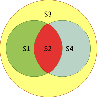
To give an example, say we are analysing the events in progress for January 2012. For Scenario S2, this would mean the number of events which have a From Date (or start date) less than or equal to January 1 2012 (which is the minimum date for January 2012) and To Date (or end date) greater than or equal to 31 January 2012 (which is the maximum date for the January 2012). Here also, we can further sub-categorize whether the start and end dates are inclusive or exclusive but this is not done for the sake of simplicity and also because our solution can easily be modified by removing the equal to symbol. It might be easier to understand the relationship between the four scenarios with the help of a Venn Diagram.

image

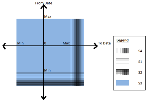
As you can see, Scenario S3 is the superset and includes any event that was active on any date in the selected time period. Scenario S1 requires that the event started before the time period but can end during any day on or after the time period. Conversely, scenario S4 requires that the event started on or before the time period and ends on any day after the time period. Scenario S2 is the intersection of the scenarios S1 and S4 and requires that the event starts before the time period and ends after the time period. This means that those events starting or ending in the selected time period will not be counted. Let’s have a look at the four scenarios from a different visualization perspective.

image

Now that you have got a good idea of the different scenarios, let us look at some sample data that we can use for testing the solution. Given below is a simple fact table which contains Order Numbers with a From Date and To Date and also the Order quantity.

image

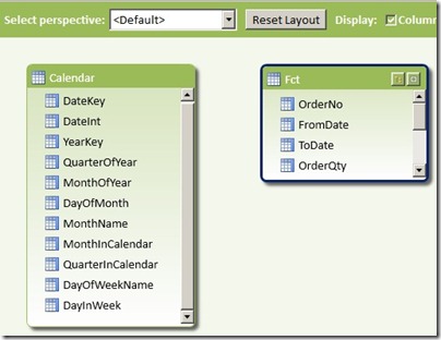
The PowerPivot data model that we are going to use is given below

1 PowerPivot model

I just have a simple calendar table (where I have just populated days from 2011 to 2013, again for simplicity) and the above Orders fact table. It is interesting to note that we will not be creating any relationships between the two tables as our solution does not require them. Now follow the steps below to get the solution for the four scenarios:-

1) Before we start, it might be a good exercise to review the original formula that I wrote and why we are moving to a different solution. The original formula I wrote was

OldMsr:=Calculate (
CountRows ( Fct ),
Filter (
Fct,
CountRows (
Filter (
Values ( Calendar[DateKey] ),
( Calendar[DateKey] >= VALUE ( Fct[FromDate] ) ) && ( Calendar[DateKey] <= VALUE ( Fct[ToDate] ) )
)
) > 0
)
)

To explain this formula, I am dividing it into 3 parts. The red highlighted area gives us the count of the fact rows which is the count of events in progress, provided the correct set of rows in the Fact table is passed as a table filter. Now to pass the correct table filter, we need to filter the fact table which is the part highlighted in orange and the condition to filter it is highlighted in yellow. Since we don’t have any relations between the tables, what I am doing is to filter all the fact rows which has at least one row where there is a date greater than the From Date but less than the To Date. When we are analysing by month, what this will mean is that even if there is a single day in that month which satisfies the condition, include that fact row. This is exactly similar to our scenario S3. Now some of the problems associated with this:-

- Formula is difficult to understand and write
- Formula can’t be easily changed to that of other scenarios
- Formula doesn’t perform well

2) Now let us look at the formula which was given by Marco in the forums

S3:= Calculate (
CountRows ( Fct ),
Filter (Values ( Fct[FromDate] ), Fct[FromDate] <= Max ( Calendar[DateKey] ) ),
Filter (Values ( Fct[ToDate] ), Fct[ToDate] >= Min ( Calendar[DateKey] ) )
)

You can already see how simple it is to understand. We are just passing the From dates which are less than the max of the time period and those To Dates which are greater than min of the time period as a table filter to the calculate statement and there is no need to filter the fact table explicitly. Not only that, it performs much better as it doesn’t have to parse through the entire fact table and just has to parse through two tables having the distinct values of From Date and To Date respectively (Always remember, it is faster to parse through two smaller tables than one big table). Now the best part is that this can be easily extended to the other scenarios as shown below

S1:= Calculate (
CountRows ( Fct ),
Filter (Values ( Fct[FromDate] ), Fct[FromDate] <= Min ( Calendar[DateKey] ) ),
Filter (Values ( Fct[ToDate] ), Fct[ToDate] >= Min ( Calendar[DateKey] ) )
)

S2:= Calculate (
CountRows ( Fct ),
Filter (Values ( Fct[FromDate] ), Fct[FromDate] <= Min ( Calendar[DateKey] ) ),
Filter (Values ( Fct[ToDate] ), Fct[ToDate] >= Max ( Calendar[DateKey] ) )
)

S4:= Calculate (
CountRows ( Fct ),
Filter (Values ( Fct[FromDate] ), Fct[FromDate] <= Max ( Calendar[DateKey] ) ),
Filter (Values ( Fct[ToDate] ), Fct[ToDate] >= Max ( Calendar[DateKey] ) )
)

Wasn’t that simple?

3) Now let us have a look at the results to make sure everything is coming correctly.

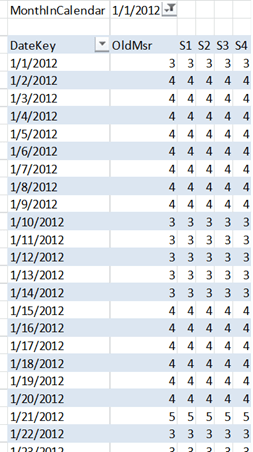
image

I have filtered for January 2012 and you can see that the dates in that table are showing the same values for all the five measures. Let us pick 10 January 2012 as an example. Only 11001, 11003 and 11004 suffice the conditions and hence the measures are all 3. The results come up correctly even if we look at a month or year level.

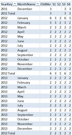
image

Let us take January 2012 as an example, so the max will be 31 Jan 2012 and minimum will be 1 Jan 2012. The order numbers which match the given conditions are given below and matches with the measure counts

S1 = 11001, 11002, 11003
S2 = 11001, 11003
S3 = 11001, 11002, 11003, 11004, 11005, 11006
S4 = 11001, 11003. 11006

4) Another benefit of this pattern is that it can easily be applied to other problems where you might need to find the sum or distinct count or any other aggregations between a from date and to date. Let us say, if I want to find the sum of Order Quantity between the from date and to date according to scenario S1, all I need to do is as follows

S1Sum:= Calculate (
Sum ( Fct[OrderQty] ),
Filter (Values ( Fct[FromDate] ), Fct[FromDate] <= Min ( Calendar[DateKey] ) ),
Filter (Values ( Fct[ToDate] ), Fct[ToDate] >= Min ( Calendar[DateKey] ) )
)

If you want to try this on your own, feel free to download the completed excel file from here.

Posted by SQLJason, 2 comments

PivotTable

How to Go About Choosing a Luxury Watch?

We all are highly receptive to the word luxury- luxury cars, luxury house, luxury vacations. All of these come attached to visions of instant status recognition and high-end quality. Included in these sought after luxury world is the luxury watch- the best style accessories. The inception of the wristwatch owners has found impressive ways to showcase its beauty. Some of them are adorned with gems, some encased in diamond while others are wrapped in gold and silver variety. As these luxury watches are held in high esteem, its purchases are considered as an investment. This is the best replica rolex.

Luxury watch is simply about style. They are classic accessory that goes with everything and anything. Moreover, these unique timepieces act as an heirloom that can be handed down from generation to generation. In such cases, the watch is esteemed for emotional bonding and also for monetary value. Consequently, buying a luxury watch is more about commitment from the manufacturers to uphold their standards by maintaining the high quality operation of their watches. So when you wish to add a luxurious timepiece to your collection you may have some questions in your mind. And yes, those questions are definitely answered by the information provided in the wristwatch buying guide.

Have you decided on your budget?

Watches are often compared to other luxurious items because of the mechanics and technology used. But the comparison could also just as well apply to your spend. As an exclusive watch can be quite expensive, so it is better to start your search based on how much you wish to invest and then stick to it.

Are the investments protected?

There are no hidden extras beyond what you see. However, do not forget that buying a luxury watch specifically a mechanical one will need as much attention as a car require. The brands also recommend you to get your new watch serviced every three to five years. Over a period of time, the lubricants vitiate and need replacing before all the moving parts of the chronograph start to wear out. This is worth remembering before you buy a watch to protect your investment for a prolong period of time.

Does the size matters?

Yes it does. They are available in all manner of case size. Luxury watches for ladies-particularly the cocktail pieces-can be as small as 20mm in diameter while some men watches can be as big as 50mm mark. With the passage of time, case sizes have changed. People want variation. Some say, a classic Patek Philippe with 39mm is the ultimate size while others prefer 42mm Audemars Piguet Royal Oak Offshore. Well, the thickness cannot be avoided. Anything deeper than 10mm can start to play havoc with a cuff. That’s one of the reason why until recently ultra-thins have grabbed the attention of its fans.

Do you take a look under the dial?

In the broadest category, there are two types of watch those powered by mechanical movement and those by a battery-powered quartz movement. Mechanical movements are more expensive as they are assembled by hand and each movements comprises of hundreds of parts. Watch lovers admire the mechanical movement which are either automatic or manually wound as they feel this particular characteristics make the timepieces more romantic and have longer value which is why the top brands still manufacture them even though the technology is years old.

Is it complicated?

Mechanical watches get really interesting once you start adding in complications. In layman’s term almost every luxury timepieces comes with complicated functions. Among these, what you might call convenient complications are second times zones, annual calendars that show the day, date and month of the year and chronograph. Some of the most illustrious horological complications are intensive more on rejoicing the art and craft of the great mechanical watchmakers.

Have you taken the plunge?

The water-resistance quality is often misunderstood-the case back and the numbers on the dial should not be taken literally. To make it more precise, watch with 30 meters water-resistance will deter rain but should not be submerged in water. Similarly a watch with 50 meter water-resistance is ideal for swimming and 100 meters for snorkeling and 200 meters for other extreme water sports. However, watches for diving should have a 500 meters water-resistance capacity. To your surprise, there are specially designed professional watches for Scuba diving with 1000 meters or more on the dial. But water-resistance is not permanent. If you use them regularly under water you will need to get it reproofed every couple of years.

Rolex, Tag Heuer, Omega, Jaeger-LeCoultre, Vacheron Constantin, Panerai Luminor and the list is endless. If your passion gets really serious you can turn your attention to horological wonder of these endless lists as you now know your checklist.

Posted by SQLJason, 2 comments