Spatial / Map Reports

Hex Tile Grid Maps for Power BI

Hex Tile Grid Maps for Power BI

I have always been fascinated by maps as a child, and could spend endless hours looking at the globe my parents got me as a present for my 5th birthday. I was so hooked on to it that my parents even considered removing it from my room fearing that it could hamper my social development (and this was in spite of my  parents being extremely proud that I could tell most of the countries and their capitals around that time!). Even though maps don’t intrigue me to that level anymore, I still follow them as part of my job and have written quite a number of blogs on getting spatial information in the Microsoft stack, starting from SSRS 2008 R2. So it was kind of natural that when I saw a couple of hex grid maps floating around my twitter feed a couple of months ago, I thought of reproducing it in Power BI as I knew it could be done.

Hex tile grid maps for Power BI

First of all, let us start with an introduction of hex maps and why they could be useful. Regular choropleth map is a tried and tested visualization for area maps but it carries the risk of under-representing some areas. For e.g., in a regular choropleth map of the US, DC is hardly visible along with some other North-Eastern states. A hex tile map solves this issue by giving each state equal weight. However, it comes with it’s own set of problems like balancing between depicting unique geographical features (like Texas and Florida being the southern most part of the country) versus depicting bordering states accurately. Because of this reason, you will find more than one version of hex grid maps and it is perfectly ok to choose the one that suits your need more appropriately. Now you can follow the steps below to reproduce a hex tile grid map in Power BI (and don’t forget to check out the Power BI report that I made with this technique at the bottom of my post):-

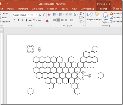
1) Choose a version of the hex tile grid map that you like from the internet. Or you can even make one easily in PowerPoint or any other image processing software (as it is just a collection of hexagons) based on the image that you get from the internet and save it as an image.

Making hexagons in powerpoint

2) Go to http://synoptic.design/ and upload the image to the synoptic designer by dragging and dropping the image to the designer.

Uploading to Synoptic designer

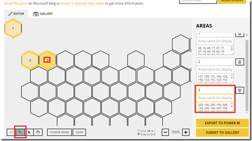
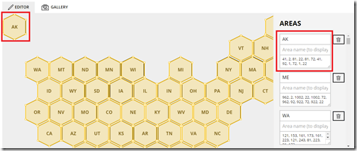
3) Ensure that the second icon on the bottom left is enabled (which helps us to automatically discover new areas). Now you can just click on the hexagons and the synoptic designer automatically discovers the areas for you, which is super cool.

Using the automatic discovery of areas icon in Synoptic designer

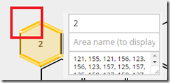
Now, for most people, this should be more than enough and the results come out really good. In my case, I decided to take a step further as I was planning to share the file for the community. If you notice carefully, you can see that more than 6 vertices are being plotted by the designer automatically (check out the multiple vertices in the section I highlighted).

Multiple vertices being recorded

To avoid this, I just wrote a bunch of formulas which would calculate the vertices in plain old excel and then just copied the 6 pairs for each of the 51 states manually.

Replacing it with just 6 vertices

Make sure that you map the areas to the appropriate state name / code also.

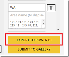
4) After this, your map is ready and you can just export it to Power BI, which would save the map data as a SVG file in your computer.

Export as SVG file for Power BI use

I would also request that if you make some interesting maps / shapes, please consider submitting it to the gallery so that other community members can also reuse it. I have submitted my map to the gallery and hopefully it will be approved by the SQLBI team (who created and still supports this wonderful tool).

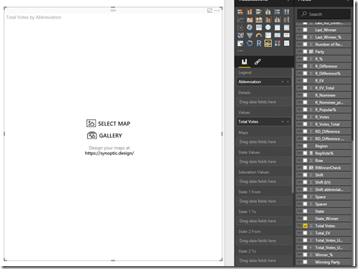
5) Now open Power BI, and download the Synoptic Panel from here (if you don’t already have it) and import to Power BI. Once you have done that, click on the Synoptic Panel to add it to Power BI, and add the state code (which is the filed we are going to bind our dataset with the map) and a measure (like Total Votes) to it. Then click on the “Select Map” icon.

Synoptic Panel in Power BI

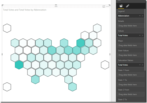
Then browse to the SVG file we just downloaded from Synoptic Designer and you should have your basic version of the hex tile map ready. Feel free to experiment by adding measure values to the Saturation or State values.

Basic hex tile grid map in Power BI

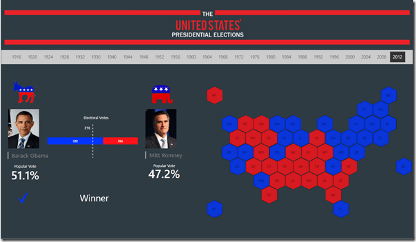
Now as a reward for making it till here, I thought of letting you play with this simple report that I created using this hex map. In this report, you can select any year from 1916 and see the winning party of each states (I only included the data for Republican and Democratic parties), as well as the nominees of the election. You can also see the number of electoral votes they won along with the popular vote %, which gives some pretty insights. For e.g., it is interesting to see that George W Bush won the election even though he got fewer popular votes than Al Gore in 2000. Click on the Expand icon to see the report in full screen.

Posted by SQLJason in Power BI, Spatial / Map Reports, 8 comments

Category Shading for Regions in Power Map

It’s been a really busy month for me professionally (with the PASS Summit 2013, SQL Saturday Charlotte BI Edition, etc) as well as personally (with a steady stream of family flying in to visit the new born baby as well as looking after a new born baby – how I miss my 8 hrs. of sleep!). I remember people saying to me that things are going to change drastically once you have a baby. Well, what can I say other than it’s 100% true . Understandably, I don’t get the same amount of time to spend on blogging and with all the stuff that has been happening behind the scenes, I decided to procrastinate till everything gets a little bit more calmer. That is when I was reading through an article and fell upon this gem of a line from Zip Zaglar - “If you wait until all the lights are “green” before you leave home, you’ll never get started on your trip to the top”. So I decided to shake off my laziness and get started on blogging about a cool feature in Power Map that has not been explored or blogged much – Category Shading for Regions.

The objective of this post is to explore the category shading feature in Power Map as well as try to see what kind of questions can be answered (after all, a feature that just adds flashiness and no business value is not desirable). For this post, I will be using the stats for my blog for visitors from the USA by browsers.

With this data, I created a simple Power Map visualization which shows the number of visitors by state. (Check out this link if you are new to Power Map or need more info on how to create this visualization).

With the above visualization, I can answer questions like – Which state in the US has the most number of readers? I can easily see that California and Texas are where I have got the most number of readers. Now that I have a general understanding of the visitors, I am going to ask a few more specific questions based on the browsers that they are using:-

I) What is the dominant browser for my readers in each of the states?

To answer this question, bring the Browser field to the category and now you should notice an icon which appears on the top-right of the category textbox (denoted by 2 in the image below). Click on the icon and select the No shading option as shown below.

Now, I can see the results for myself. Interestingly, the dominant browser in almost all the states is Internet Explorer. There are a couple of states (6 to be precise) where Chrome is the dominant browser. This brings me to my next question.

II) How dominant are the leading browsers within each state with respect to their competing browsers in that state?

Click on the category shading icon and select the “Shade based on category value within location” option. Now you should see the below visualization.

From this, you can easily see the leading browsers based on the color as well as the shading shows the share for the leading browser. The darker the shade for the color, the more dominant the browser is within the region. For eg, you can see that Internet Explorer is pretty dominant in Alaska as well as North Dakota, while Chrome is pretty dominant in Wyoming. In California, you can see that IE is leading but not by much.

However, when I saw the actual numbers in the tooltip, I found it to be really less. This brought me to my third question.

III) Which states have more visitors and what is the dominant browser there?

Click on the category shading icon and select the “Shade based on category value compared to all other values” option. Now you should see the below visualization

You can see that it is a refined version of the map which was obtained initially by not putting the category field. The darker the color, the more number of visitors I have. So from the above image, we can easily see that the top 4 states by readership counts are California (Internet Explorer), Texas (Internet Explorer), Washington (Internet Explorer) and North Carolina (Chrome). And now looking at the previous image (for Question II) in combination with this image, we can see that the difference is not much and that the competition between the browsers are pretty tight across the states. Also, for the three states where the difference is really big (Alaska, North Dakota and Wyoming), we can see that the counts are pretty small and hence not that significant.

IV) How do the states within the same dominant browser measure up against each other?

For this, click on the category shading icon and select the “Shade based on category value compared to other values in the category” option. Now you should see the below visualization.

From this image, I can see that for Internet Explorer, the top 3 states are California, Texas and Washington & for Chrome, the top 3 states are North Carolina, Iowa and Utah. It is important to understand that there might be other states which has more value for that browser. For eg, California might have more readers using Chrome than North Carolina, but it is not taken into account since Chrome is not the dominant browser there. Time to finish this lengthy post and this will be all from me today. But before I sign off, I wanted to let you know that you can animate this kind of visualization across time by dragging the date field to the time-play axis. This can answer the same 4 questions we asked above across time, which is pretty powerful. Also, we can look at the existing set of data with Power View and answer more interesting questions – a sneak peek of a simple dashboard is given below. Have fun with Power BI till we speak again!

Posted by SQLJason, 3 comments

How to make Map Reports in SSRS

I was going through some of my old documents and found this article on map reports which I had written for a SSRS book (which didn’t go through because of some time related issues). I thought it might be useful to those who are looking to explore map reports in SSRS. So here it goes:- Map reports have been a part of SQL Server Reporting Services from SSRS 2008 R2. However, they are usually a grey box for developers and hence, not been used to their full potential in most of the organizations. This chapter will introduce you to the basic concepts involved in map reports and then take you through some of the common scenarios involved while building map reports.

Basic Concepts

1) Geometry and Geography: These are the two spatial data types that are available in SQL Server 2008 and above. Geometry imagines that the world is a flat rectangle while Geography takes the curvature of the spherical earth into account. Depending on your application, you can choose between the two data types for your spatial purposes. Geography data types would be more precise over long distances as the earth is actually spherical, but it would require more overhead in setting up the spatial data as additional parameters have to be provided to account for the roundness of the earth. Geometry on the other hand is easier to setup but might not give you the precision over long distances.

2) Source for Map Reports: SSRS 2008 R2 and above allows two main map sources – ESRI Shapefiles and SQL spatial. Shapefiles are a popular geospatial vector data format which can be used in a lot of geographic information softwares. A shapefile will consist of at least 3 mandatory files (of extension .shp, .shx and .dbf) to store core data and might have some other files for improving performance. Apart from shapefiles, the spatial data can be stored in SQL Server database using the data types geography or geometry and used as a source for SSRS map reports. SSRS also has a predefined set of maps in the Map Gallery, which is essentially spatial data embedded in reports and this can also be used as a source for your map reports.

3) Layer Types in Map Reports: There can be 4 types of layers in SSRS Map reports namely Polygon, Line, Point and Bing Map. Polygon layers are used for displaying outlines of areas like administrative boundaries for countries, states, etc. Line layers are used for displaying the lines for routes, roads, paths, etc. Point layers are usually used for displaying the markers for point locations. The Bing Map layer adds a background of Bing Map tiles that correspond to the spatial data available in the map viewport.

Prerequisites To recreate the scenarios explained in this chapter, you would require the following:-

1. SQL Server 2012. You can download an evaluation copy from http://tinyurl.com/SQL2012Eval

2. AdventureWorksDW2012 Database. You can download it from http://tinyurl.com/Adw2012SqlDB

3. AdventureWorks Multidimensional Models for SQL Server 2012. You can download it from http://tinyurl.com/Adw2012CubeDB

4. Some sample shapefiles for the United Kingdom, which can be downloaded from http://tinyurl.com/ShapefileUK

Initial Setup

1. Start by creating a new report project using SQL Server Data Tools (SSDT).

2. Design a new shared data source based on the Microsoft SQL Server provider that connects to the sample AdventureWorksDW2012 database and name it DS_SQL.

3. Design a new shared data source based on the Microsoft SQL Server Analysis Services provider that connects to the sample AdventureWorks Multidimensional database and name it DS_SSAS.

I) Creating Map Reports from Shapefiles

This section will demonstrate how to create a map report from a shapefile and visualize it with the measures present in your relational or multidimensional database.

1. Add a new report to the project and name it ‘1 Report from Shapefiles

2. Create a new data source which points to the shared data source, DS_SQL

3. Design a dataset called DST_Analytical_UK_C and populate it with the SQL query below

SELECT ‘England’ AS Country, 500 AS Sales

UNION ALL

SELECT ‘N Ireland’ AS Country, 300 AS Sales

UNION ALL

SELECT ‘Scotland’ AS Country, 350 AS Sales

UNION ALL

SELECT ‘Wales’ AS Country, 200 AS Sales

4. Drag and drop a map report item from the toolbox to open the Map Wizard. In the first screen, select ESRI Shapefile as the source of spatial data. Browse to the folder which has the saved maps for the sample UK shapefiles and select GBR_adm1.shp. Click on Next.

5. You should be able to view the map and change its resolution or crop it in this screen. You can also add a Bing Maps layer in this screen if needed. Click on Next.

6. Choose the Map Visualization in this screen. Since we have chosen a polygon shapefile, we get the options for Basic Map (which just displays the map), Color Analytical Map (which visualizes the data by varying color) and Bubble Map (which visualizes the data by bubbles of varying sizes). The last two options would require a dataset for getting the measure information to visualize data. Choose the Color Analytical option for now and click on Next.

7. In the next screen, select the analytical dataset DST_Analytical_UK_C that we had created in Step 3.

8. In this screen, we will have to specify the match fields in the spatial and analytical data. Select the checkbox for NAME_1 in the spatial dataset field and select Country in the dropdown for analytical dataset field. You can see the selected fields getting highlighted in the window panes below. Click on Next.

9. Choose an appropriate theme and select [sum(sales)] from the dropdown list of the Field to visualize option. Choose the Color Rule as Red-Yellow-Green. You can choose to display the labels also if you want. Click on Finish. 10. Now you can preview the report and see your first map report.

FAQs regarding Map Reports from Shapefiles

1) Why is that some of my map regions are not getting visualized and are being displayed in white color?

This is a clear indicator that the names in the match fields for the spatial and analytical data are not the same. An example is present in our current example where DST_Analytical_UK_C has a field value of ‘N Ireland’ while the shapefile has a field value of ‘Northern Ireland’. You can change the value to Northern Ireland in the analytical query but this might not be a valid scenario in most of the cases where the data comes from the Data Warehouse and we would not want to tamper with the Data Warehouse. In such cases, we can change the field value of the shapefile by going to the design mode for the report, right clicking on the polygon region (in this example, Northern Ireland) in the map report item and selecting Embedded Polygon Properties. Now the NAME_1 field can be changed from ‘Northern Ireland’ to ‘N Ireland’ in the popup window and all the regions should be visualized now.

2) Why is it that I am getting a system exception when I try to deploy some of my map reports?

This happens normally when you are working with shapefiles in excess of 4MB. By default, the maximum size of a rdl report which can be deployed is 4MB. This can be easily changed by replacing <httpRuntime executionTimeout = “9000” /> with <httpRuntime executionTimeout = “9000” maxRequestLength=”1000000″ /> in the Web.config file which by default is found in C:Program FilesMicrosoft SQL ServerMSRS11.SQL2012Reporting ServicesReportServer. The reporting services might need to be restarted for the change to be reflected.

3) OK, I have succeeded in deploying my report to the ReportServer. However the report takes a long time to render. Why is that?

This should come as no wonder if you are working with large shapefiles. Most of the shapefiles that are available online exceed 8MBs and it would be prudent to trim them down the size by changing the resolution in the map wizard. For example, I was able to trim down the size for the current report using this method from 8.5MB to less than a MB without much difference to the map outlines. Another alternative would be to upload the Shapefiles to the ReportServer and then use them as the source for your map reports as is shown in this link http://tinyurl.com/Jason-UploadSHP. This could help in decreasing the rendering time as well as making the shapefiles available for other reports.

4) Why is it that I see only the maps for USA in the Map Gallery? How can I add my own maps there?

Currently, only the maps for USA are there in the Map Gallery. However, you can add your own maps by following the instructions in this link http://tinyurl.com/Jason-AddMapToGallery

5) Where do I find some sample shapefiles to start exploring map reports? There are plenty of sites which offer free shapefiles for at least the country level administrative boundaries. One of them is http://diva-gis.org. For more detailed level shapefiles (like zip codes for Netherlands), you might need to buy it from some vendors or make your own shapefile using tools like ArcGIS.

II) Creating Map Reports from SQL Spatial Data

This section will demonstrate how to create a map report from spatial data stored in SQL Server and visualize it with the measures present in your database.

1. Create a new table called dbo.GBR_adm2 in the database which corresponds to the shapefile GBR_adm2 in the sample. (Read the FAQs below on how to import spatial data to the database).

2. Add a new report to the project and name it ‘2 Report from SQL Spatial

3. Create a new data source which points to the shared data source, DS_SQL

4. Design a dataset called DST_Spatial_UK_D and populate it with the SQL query below

SELECT NAME_1, NAME_2, geom

FROM dbo.GBR_adm2

Note that the table dbo.GBR_adm2 contains the equivalent spatial data of the GBR_adm2 shapefile in our samples.

5. Design a dataset called DST_Analytical_UK_D and populate it with the SQL query below

SELECT NAME_1, NAME_2, LEN(NAME_2) AS Sales

FROM dbo.GBR_adm2

6. Drag and drop a map report item from the toolbox to open the Map Wizard. In the first screen, select SQL Server Spatial Query as the source of spatial data. Click on Next.

7. Choose DST_Spatial_UK_D as the spatial dataset in the screen and click on Next.

8. You should be able to view the map and change its resolution or crop it in this screen. You can also add a Bing Maps layer in this screen if needed. Click on Next.

9. For the purpose of exploring a new map visualization, select Bubble Map and click on Next.

10. Choose DST_Analytical_UK_D as the analytical dataset and click on Next.

11. Select NAME_2 as the matching field for both spatial and analytical datasets and click on Next.

12. Select the checkbox for Use bubble sizes to visualize data and choose the Data Field as [Sum(Sales)]. Click on Finish.

13. Now you can preview the report and see the result.

III) Parameterizing Map Reports

Most of the times, it is necessary to add report parameters to filter out the data so that we can focus better on a particular region. This section will provide a walkthrough on how to add parameters to a map report

1. Open the 2 Report from SQL Spatial report and add a new dataset, DST_RP_Country with the query given below.

SELECT DISTINCT NAME_1

FROM GBR_adm2

2. Add a new report parameter, RP_Country with available values from the DST_RP_Country dataset.

3. Modify the query of the DST_Spatial_UK_D dataset as shown below

SELECT NAME_1, NAME_2, geom

FROM GBR_adm2

WHERE (NAME_1 = @RP_Country)

4. Modify the query of the DST_Analytical_UK_D dataset as shown below

SELECT NAME_1, NAME_2, LEN(NAME_2) AS Sales

FROM dbo.GBR_adm2

WHERE (NAME_1 = @RP_Country)

5. It would be good idea to add a Bing Map layer to the background so that we can understand the location better. For this, click on the polygon layer to display the Map Layers panel on the right hand side. Then click on the Add Layer icon and select the Tile Layer option from it.

6. Click on Preview and you can see that the map changes with the selected parameter value.

IV) Implementing Drill Down in Map Reports

This section will provide details on how you can implement the drill down feature in map reports. For the same, we will be making use of the two reports that we have already created – 1 Report from Shapefiles as the parent report and 2 Report from SQL Spatial as the child report.

1. Open the report – 1 Report from Shapefiles in design mode and click on map report item to bring the Map Layers panel on the right hand side.

2. Right click on the polygon layer and select the Polygon Properties.

3. Select the Action tab on the property popup window, and select the Go to Report radio button.

4. Specify the 2 Report from SQL Spatial report as the child report and map the RP_Country parameter with the Country field as shown in the image below. Then click on OK.

5. Once this is done, you can preview the report and see that the second report gets displayed with the appropriate filtered data on clicking a particular country in the first report.

V) Aggregating Spatial Data in Map Reports

Just like we aggregate our normal relational data, there might be scenarios where we would like to aggregate spatial data and display it in a report. An example would be to aggregate custom sales regions of an organization at a country level. This example would take you through such a similar implementation.

1. Create a new table dbo.GBR_adm1 with spatial data which corresponds to the shapefile GBR_adm1 in the samples.

2. Add a new column called Sales_Region to the table dbo.GBR_adm1 and give a value of North to Scotland and Ireland, and South to England and Wales.

3. Create a new report 3 Aggregate Spatial Data and add a dataset called DST_Spatial_AggUK with the query below

SELECT SalesRegion, geography::UnionAggregate(geom) AS geom

FROM GBR_adm1

GROUP BY SalesRegion

Note that geography::UnionAggregate and geometry::UnionAggregate are two new spatial functions introduced in SQL Server 2012 to aggregate geography and geometry data respectively.

4. Now make a Basic Map report with the above dataset and you can see the result below when you preview the report

The same effect can also be done by aggregating the spatial data in the reports instead of in the query.

1. Create a dataset called DST_Spatial_UK with the query below

SELECT SalesRegion, geom

FROM GBR_adm1

2. Create a Basic Map report with this dataset as the source.

3. Click on the map viewport to bring the Map Layers panel on the right. Click on the polygon layer, and then press F4 to bring the property panel.

4. Modify the VectorData property as =Union(Fields!geom.Value)

5. Click on the Group property and add the SalesRegion field as shown in the image below. Click on OK.

6. Preview the report now and you should see the map of UK aggregated by SalesRegion as in the example above.

FAQs regarding Map Reports from SQL Spatial Data

1) All of my map reports are visualized in a single color even when I have not chosen the Basic Map option. Why is that?

SSRS has some color distribution options which govern the way colors are visualized in your map reports. By default, it is kept to Optimal option which create ranges that automatically adjust distribution to create balanced sub ranges. You might want to change it to EqualInterval option (which creates ranges that divide the data into equal range intervals), EqualDistribution option (which creates ranges that divide that data so that each range has an equal number of items) or Custom option (where you can specify your own number of ranges to control the distribution of values). This can be done by right clicking on the map layer and selecting Layer Color Rule option.

2) How do I import my shapefiles to SQL Server?

Currently, SQL Server does not have a built-in option to import shapefile data to SQL Server. One of the most popular ways to import shapefile data to SQL Server is by using the free tool Shape2SQL. This has a single screen, easy to use GUI and can be downloaded from http://tinyurl.com/Shape2Sql.

There are a few bugs with this tool and from my personal experience, in case you are not able to see the imported table in the database, it might be worthwhile to create the table structure beforehand and then run the software again

3) How do I add my own custom locations as a point layer in map reports?

There are many sites like http://tinyurl.com/FindLatnLong which will return the latitude and longitude if you enter your address. This can be converted to spatial data using the function STPointFromText(). An example is shown below

1. Create a sample table

CREATE TABLE [dbo].[MyHangouts](

[ID] [int] IDENTITY(1,1) NOT NULL,

[Location] [varchar](255) NULL,

[Latitude] [float] NULL,

[Longitude] [float] NULL,

[PostCode] [varchar](20) NULL,

[GeoL] [geography] NULL

) ON [PRIMARY]

2. Insert some data with the latitude and longitude

INSERT INTO [dbo].[MyHangouts] ( [Location], [PostCode], [Latitude], [Longitude] )

VALUES (‘Home’,’NC 28210′,35.1537875,-80.8502022),

(‘Office’,’NC 28211′,35.1493742,-80.8272008),

(‘PetSmart’,’NC 28217′,35.1385661,-80.8764557),

(‘The EpiCentre’,’NC 28202-2538′,35.225324,-80.842187),

(‘Library’,’NC 28211′,35.1513557,-80.8225257)

3. Update the spatial data column using the STPointFromText function

UPDATE [MyHangouts]

SET [GeoL] = geography::STPointFromText(‘POINT(‘ + CAST([Longitude] AS VARCHAR(20)) + ‘ ‘ + CAST([Latitude] AS VARCHAR(20)) + ‘)’, 4326)

geography::STPointFromText(‘POINT(‘ + CAST([Longitude] AS VARCHAR(20)) + ‘ ‘ + CAST([Latitude] AS VARCHAR(20)) + ‘)’, 4326)

4) Can I create my own custom shapes in the map reports?

Yes, you can create your own custom shapes in the map reports as long as you are able to provide the location points for it. You can use online image mapping tools like http://tinyurl.com/ImageToMaps to get the point locations and then use the STPolyFromText() to convert it into spatial data. For eg, I have used a spatial query to get the result below

The query is available in http://tinyurl.com/SpatialLogo if you want to have a further look. Conclusion SSRS spatial features take up the charting possibilities to a whole new level. In addition to the normal geo-spatial reporting capabilities, we can also use the spatial features to basically create any shape or chart that we require and visualize it with data. All we need are the locations of the shape as well as a little bit of creativity.

Posted by SQLJason, 9 comments

Power Map Preview - Exploring the NEW features!

Woot! Microsoft just announced the pre-release availability of the refreshed builds for Power Map with some really cool new features and boy, I must say that I am PUMPED! For folks that know me, I have been doing quite a number of presentations on Power Map (and geospatial analytics in general) and there were a couple of features that I really really wished for in Power Map. Well, looks like the Power Map team heard my requests and I feel this release is a big step forward.

First of all, here are some useful links (including the download link for the refreshed bits):-

  • Power BI Forum: Post and answer questions for the product team and community
  • Power BI Product Page on Office.com: Download requirements, directs to Web Download page below
  • Power Map Download Page: Download the bits on Microsoft Download Center

Now let’s see some of the new features that has come up since my last post on Power Map.

I) Recognizing geographic data and Plotting them on launching Power Map On launching Power Map, the columns with geographic data are automatically recognized and plotted. For example, I had some data of the population of North Carolina by zip code as shown below

Now when I launched Power Map, this is what I saw

The best part is that the geographic columns seemed to be recognized correctly even if the they are named something other than City / State / Zip Code, etc. For eg, I renamed the City to CVDS and still was able to see it correctly mapped to City.

And anyways, you still have the option to change it from the drop down. All in all, great feature and saves me a couple of unnecessary clicks.

II) Support for Flat Map

I know, I know, all of you would be thinking – what’s so special about this? After all, what made Power Map unique was that it had the ability to do 3-D geospatial analysis. Well, that is pretty cool but there are certain times when only a flat map would do. For eg, when you are looking at a worldwide data like population by countries, you want to see both sides of the globe. Earlier in Power Map, it used to look like shown below:-

We could see only one half of the globe and had to rotate to see the other half. Now we have this icon to convert the 3D map to a flat map (and back to 3D if required!)

This is REALLY cool!

III) Support for Regions Visualization (Chloropeth Mapping)

Now this is the most awesome enhancement according to me – support for chloropeth mapping or shading a geographical area (and I had actually requested as a Connect suggestion during the beta release of GeoFlow). Let me show you how the visualization looks for the population data for North Carolina

Best part is that it is damn right simple – just change the visualization from Column to Region (and yes, that also means that we have a fourth visualization type now – apart from Column, Bubble and HeatMap)

The Region visualization is only present at a Country / Region, State / Province, County or Zip / Postal Code level (which means City is not available) and is available across all countries (not just the USA). If you try to use a geographical level which is not one of the above, you will receive the following error and the chart type will be changed to Column.

I LOVE this feature and more than that, adore the way how simple it is for users to geocode at that level (no need to bring in complex shapefiles to geocode county/zip code level data like in SSRS!). I can already see a lot of use for it.

IV) Change Color for Data Series

Now this is another simple but very useful new feature – the ability to change colors for data series. You can see this new option in the Layer options.

You can also see that the display options of the Themes button has changed and now the colors also show up.

V) Exporting Tours as Videos

A question that consistently makes the rounds when I present on Power Map is – “How do I “unlock” the tours from the Excel workbook? Is it possible to share it through any other medium?” Well, the answer has been No until now. The current build allows you to export your tours as a video and now this can be shared across all your channels. For creating videos, there is a new Create Video button on the ribbon and then you can select the video quality also.

To demonstrate the feature, I have exported a tour from one of my recent presentations. This tour is around 5 mins long and investigates the myth – Are Refugees flooding Industrialized countries? It took quite some time for me to export the tour as a video even in the 360p mode, but that is understandable I guess.

Power Map Tour exported as a video

Conclusion

Overall, I feel this is a build with some really awesome features. Apart from the new features I described, there are also some UI changes but these changes are simple enough to understand, so I am not going over them. There are still some really basic functionalities that are desired like filtering your data and drilling down on the geographic levels (and I found out at least one bug which I will be filing on Connect soon), but we should not forget that this is not the final version. So I am happy and I would encourage everyone to try out the new build.

Posted by SQLJason, 11 comments

Pie Charts on SSRS Map Reports

Ok, I think I am getting a few puzzled looks now. All of you must be wondering why I am talking about pie charts (isn’t pie chart the untouchable outcast in the family of visualization techniques?). Also, you must be thinking that there is no possible way you can make pie charts in SSRS map reports (unless I am referring to Power View instead of SSRS). Well, to answer your questions, I am not recommending pie charts but ever since Power View gave the feature for displaying pie charts in map reports (read section III in Creating Maps in Excel 2013 using Power View), a lot of people have been asking whether it is possible to replicate the same in SSRS. You do have the ability to display bubble charts in SSRS map reports but there is no default way of achieving pie charts in SSRS map reports. That is when yours truly decided to take a shot at it and came up with this workaround (oh yes, you heard it right – there is a workaround!)

To demonstrate this workaround, I am using the data from 2000 US Presidential Election (which I got using the online search feature in Data Explorer). Follow the steps below:-

1) Create a new report and then create a datasource pointing to your SQL database. After that, create a new dataset query like shown below

SELECT State, Gore, Bush, Others, TotalVotes FROM EData

EData is the table which contains the election data that I pulled up before. This table contains the State name, the percentage of votes for Gore, percentage of votes for Bush, percentage of vote for all Others and finally the total number of votes.

2) The key to getting the pie charts on the SSRS map reports is to make use of the Pie Charts feature in Google chart. You can get an image of a pie chart as long as you pass in the required parameters in an url format. The basic syntax of the url we are going to use is

http:chart.googleapis.com/chart
?chs=300×225 — size of the image
&cht=p — type of chart, in this case, pie chart
&chd=t:20,30,50 — Data to be used in pie chart
&chco=FF0000|00FF00|0000FF — color to be used in pie chart

To get a pie chart for each row / state, we need to construct the url for each row in the table. This can be done by the following query

SELECT State,
Gore,
Bush,
Others,
TotalVotes,
‘http://chart.googleapis.com/chart?chs=300×300&cht=p&chd=t:’ + CAST (Gore AS VARCHAR (20)) + ‘,’ + CAST (Bush AS VARCHAR (20)) + ‘,’ + CAST (Others AS VARCHAR (20)) + ‘&chco=06A2CB|DD1E2F|EBB035’ AS MarkerUrl
FROM EData

3) Create a map report of US State from the map gallery and then choose the map visualization as Color Analytical Map. Choose the analytical dataset as Edata and then map the statename in the spatial dataset with the state field in the analytical dataset.

Click on Next and then finish to create a basic map report.

4) Even though it is not part of this requirement, I decided to color the states as blue or red based on whether Gore or Bush had got more votes respectively. For this, right click on the Polygon in Map Layers and then click on Polygon Color Rule.

Write a simple expression to display blue or red based on who’s got more votes like shown below.

Now your map report should look like this when previewed

5) Right click on the Polygon layer and then enable the Show Center Points option.

6) Now select the Center Point Marker Rule.

Now choose the Marker Type as Image, image source as External and the image as the Marker Url field as shown below.

7) Also, we need to change the size of the pie chart based on Total votes field. For this, change the Center Point Size Rule.

Change the size rule option as shown below.

Now we should get the basic version of the end result as shown below.

8) After deleting the legends as well as modifying the colors so that my eyes don’t get blinded, this is what I came up with.

So aren’t you amazed at the flexibility SSRS gives you? As usual, comment and let me know what your thoughts are on this technique. Meanwhile, feel free to download the completed SSRS 2012 report that I made from here.

Posted by SQLJason, 9 comments

GeoSpatial Analytics, Microsoft BI & John Snow’s Cholera Map

Throughout my childhood, I have always been fascinated by the idea of maps. It could be attributed to the number of pirate and treasure hunter stories that I used to voraciously devour. My dreams were filled with the protagonists in those books and their endless struggles to decipher the coded information in the maps. What used to strike me was that the location of the treasure was always present in the maps but still countless men were misled by them. Most of the times, it took the right person or the right context to get to the bottom of the map. As I grew older, my association with pirate / treasure hunter stories decreased (apart from watching the occasional Pirates of the Caribbean releases) but my bond with maps just went on getting stronger. Though my friends might joke that the reason for this is because I am so spatially disoriented (I still use a navigation system to travel from my home to the office which is just a mile away for fear of getting lost), the real rationale is because I see a lot of value in geospatial analytics as a BI consultant. In today’s world, when more and more product companies are bringing forth tools to easily analyse location based data, the excuses for not trying to analyse and explore geographic patterns in your business data are running dry. The Microsoft BI platform has a very able set of tools for geospatial analysis which includes SQL Server Reporting Services, Power View and Geo Flow (this is without including some of the map apps that are present in Office 2013) and helps me a lot in evangelizing geospatial analytics amongst my clients. While I was reading the news, I came to know that the last week was the 200th birth anniversary of one of the pioneers of geospatial analysis as well as the father of modern epidemiology – John Snow. I decided to pay my homage to him by following his adventure and reproducing his famous 1854 Broad Street Cholera Outbreak map using Microsoft BI.

Before we start, it might be interesting to set the context to the 19th century London. London was evolving into a big city with a large influx of people, but without the modern day facilities and sanitary services. Houses used to have cesspools below their basements and human as well as animal wastes were accumulated there. Initially, people seemed to forget about the cesspools below and somehow thought that the wastes would get disposed magically, till the cesspools started overrunning. That is when the London government decided to dispose the waste into River Thames (which was also the source for water supply). You can imagine London at that time – stinking with all the human and animal wastes and it was no wonder that diseases were rampant at that time. The reason for the diseases were all attributed to the pollution and foul air emanating from those wastes. John Snow was a big sceptic of this theory though he had no evidence to prove otherwise. That is around when there was a major outbreak of Cholera in the Soho district of London and he decided to investigate it further. I am not 100% sure of how he actually did his investigation, but I am pretty sure that he must have at least gone through some variations (if not exact) of the four main sections in any treasure-hunting plot :-

1) Collecting the Data (or acquiring the Map!)
The first section of most treasure hunter stories weave through the part where the protagonist goes through shady alleys and dilapidated shops to find the treasure map from some ancient hawker. Likewise, John Snow might have gone through the disease laden streets to pick up the statistics on the cholera deaths and their locations. Luckily for me, I just had to search the internet and got the data (thanks to Robin Wilson). You can download a copy of the data from here. I did some simple changes to the source data to extract the longitude and the latitude columns from the geometry column as shown below (pro tip: use the Flash Fill feature of Excel 2013).

2) Exploring the data patterns (or deciphering the Map!)
The plot continues where the protagonist tries to make sense out of the map. Treasure maps are never straightforward and he takes a lot of time to see whether there are any hidden clues or markers in the map. Similarly, John Snow must have spent a lot of time studying the statistics as well as exploring the data visually for geographic patterns. I decided to visualize the data using Power View initially to check for any patterns.

Just as the protagonist tries different approaches, I decided to also use GeoFlow to visualize the same data.

The heatmap visualization in GeoFlow indicated something that Power View didn’t show that explicitly - unusually large number of deaths around the red area.

3) Investigating the Outliers / Patterns (or Validating the potential Treasure locations)
This is one of the most crucial part of the story, where the protagonist tries to cross check and re-validate the patterns or code that he has found within the map. This is what is going to distinguish him from the countless men that have lost their lives in search of the treasure. He makes sure that the clues that he has got from the map is not a red-herring. This is what John Snow did too, as is his evident from his writings – “On proceeding to the spot, I found that nearly all the deaths had taken place within a short distance of the [Broad Street] pump. There were only ten deaths in houses situated decidedly nearer to another street-pump. In five of these cases the families of the deceased persons informed me that they always sent to the pump in Broad Street, as they preferred the water to that of the pumps which were nearer. In three other cases, the deceased were children who went to school near the pump in Broad Street… With regard to the deaths occurring in the locality belonging to the pump, there were 61 instances in which I was informed that the deceased persons used to drink the pump water from Broad Street, either constantly or occasionally…”. As for all of us, we already know the cause and hence all I had to do currently was to display the pumps also as another layer in GeoFlow and to see the correlation of deaths and proximity of pump.

Isn’t it amazing to see how accurately GeoFlow has plotted the problem causing Broad Street pump right in the area of the maximum deaths!

4) Visualizing and Sharing the Results (or finding the Treasure!)
This is the final part of the story where the protagonist undertakes the arduous journey to find (and hopefully claims) the treasure. The journey is not easy and there are every chance that he might be misled like the countless many before him. Similarly, in geospatial analysis, it is very easy to get carried away and share wrong results.

However, John Snow’s map (shown below) was very instrumental in convincing the London authorities to shut down the problem causing Broad Street Pump and history says that this helped in containing the outbreak.

If done correctly, geospatial analysis is extremely powerful and with technologies like Power View and GeoFlow, this can be done pretty easily and quickly. If you are interested in geospatial analysis or Business Analytics in general, it’s still not late to register for the PASS BA Conference happening on Apr 10-12, 2013. And if you do register, don’t forget to attend my session on GeoSpatial Analytics using Microsoft BI.

You can download the completed Excel 2013 file with the Power View and GeoFlow visualizations from here.

Posted by SQLJason, 9 comments
Introduction to Excel GeoFlow (Beta 1)

Introduction to Excel GeoFlow (Beta 1)

I have been playing around for a couple of weeks with the beta release of Excel GeoFlow and I have got very mixed feelings about the product. No, I am not trying to be the Grinch in this Christmas season and I must say that I sure do like the direction in which Microsoft and this product is going – just that it is not even half as ready as I would have expected (but to be fair to them, it is just the beta 1 release). That said, there are a couple of features that I am really excited about and I thought of jotting down a quick introduction to GeoFlow for those who are interested.

1) How to get the beta release of GeoFlow
If you would like to try GeoFlow, send a mail to [email protected] and wait for the team to respond. You must have Excel 2013 for GeoFlow to work.

2) Current Limitations
- Related tables are not supported in this release.All the data should be in one table.
- Backend data changes are not reflected in the visualization in this release and this will mean deleting and recreating the visualizations.
- No Undo/Redo is supported in this release.
- No way to slice and dice data within the visualization
- No drill down functionalities from a higher level (say, states) to a lower level (say, counties) which is there in tools like Power View.

3) Create a basic GeoFlow report
GeoFlow requires your data to have some geographical fields in it. It can be in a variety of formats including latitude and longitude, street address, city, zipcode, state, country, etc. Be aware that you will need internet connection for the geocoding to take place. For the purpose of this demo, I have got the population and personal income data by year of all the counties in the United States. Follow the steps below to create a basic GeoFlow report:-

a) After installing GeoFlow, you should now be able to see the 3D Map button in the Insert tab. Click on any of the cell within the data table and then select the 3D Map button within the Insert tab. Click on the Explore in 3D option as shown in the image below.

b) Choose the geographical field based on which you need the map. In my case, it is the StateName field. Click on Map It button to proceed.

c) Click on the Population field to see the states visualized by this measure.

By default, you have got the Column chart visualization (which can be clustered or stacked if a category is present). This can be changed to a bubble map or a heat map visualization also.

4) Navigating the 3D Map
Navigating the 3D map can be tricky so it is useful to know all the navigation features. To use a mouse to navigate in the GeoFlow 3D environment, do any of the following:
· Double click rapidly on any portion in the globe to zoom closer to it.
· Use the scroll wheel on your mouse to zoom in and zoom out.
· Click and drag the globe in any direction to pan without changing the pitch.
· Hold the Alt key, and then click and drag to change the pitch.
· If you lose your point of focus, zoom all the way out with the scroll wheel to reset the globe and view. To use the Keyboard to navigate in the GeoFlow 3-D environment, do any of the following:
· Tap the arrow keys up, down, left and right to pan and spin the globe.
· Hold the Alt key and then tap the left and right arrow keys to orbit the current target, or the up and down arrow keys to increase and decrease the camera pitch.
· Tap the plus (+) and minus (-) keys to zoom in and out.

5) Interesting Features
There are quite some interesting features in GeoFlow and these are some of the main ones in my opinion:-

a) Handles multiple geographical levels:- We can add multiple geographical levels to GeoFlow. To add the counties (AreaName field) to our basic report, click on the Edit button in the Layer Manager as shown below.

Then select the AreaName field and map it to the County in Geography section. Then click on Map It button.

Now you should see the map visualized by counties. It might take some time for all the data to be processed on the map and it depends on the number of rows that you have. When the processing is done, you should see the message as Finished in the green bar below the map.

You can easily toggle back to the states by selecting the StateName radio button in the Map by section. However, as I mentioned before, drill downs are not possible (as far as I know in this release). Vote to up this request in Connect by clicking here.

b) Visualizing Data over time:- We can visualize the data over time if we have a date or time field. In my dataset, I have the year but this is not enough as GeoFlow requires a date or time field. So I had to make a new filed called DateYr which converts the year to a date field by adding 1/1/ before every year. Vote here to up this request to have the time play axis use any level of the time dimension. Now in GeoFlow, drag and drop the DateYr field to the Time section. Now you will get an additional section for time settings which has values like Time Accumulation, Instant and Persist the last.

You can also see the time play axis on the bottom. Click on play and you can see the data changing over time. c) Adding Annotations and Textboxes:- This is definitely one of my favourite features. We can now add an annotation to a particular data-point by right clicking on it and then selecting the Add annotation option.

Similarly, you can add a textbox also. The only difference between them is that an annotation is bound to a data point while the textbox is more like a sticky note on the screen. The textbox stays at the same position even when the map is panned or zoomed. d) Find a Location:- The find a location feature is pretty handy in case you have a lot of data points and want to directly zoom to a particular location.

e) Creating and Saving Tours:- I have obviously saved the most exciting feature for the last. Now you can create tours by clicking on the New Tour button and then including the scenes in the tour by selecting the Capture Scene button.

Scenes will transition automatically and effects are automatically applied. A scene is auto-saved when you capture a new scene. If you want to change a scene, for example if you want the scene to show a different angle or a different time subset, select the scene, make the changes and then click on Save Scene, Once you have created a tour, you can play it by selecting the Play Tour button. I have posted a video of a sample tour that I created.

Excel GeoFlow

After creating a tour in GeoFlow, the tour is automatically saved back to your workbook. You can create multiple tours by clicking on New Tour. Saving your Excel workbook will save each of the GeoFlow tours you created with the worksheet it was created from. Now you will be able to see a new option to Manage Tours also.

To summarize, there are some exciting features but clearly, a lot of work needs to be done before it can be used by data professionals for analysis. With this, we come to the end of today’s post. Wishing all of you a very Merry Christmas from my side and be good!

Posted by SQLJason, 14 comments

Creating Maps in Excel 2013 using Power View

There has been a lot of buzz in the BI community since yesterday, and the reason is none other than the public preview of Office 2013 (Excel 2013 in particular). There’s been a lot of articles written on the new features available and the integration of PowerPivot and Power View has really got everyone talking about. In case you still haven’t looked at the new features, here is the link for it. Meanwhile I can’t wait to blog about the spatial capabilities available in Power View, so I am directly jumping to the topic.

Power View in Excel 2013 has the ability to create maps from your data and uses Bing maps for the same. Unlike the maps in SSRS, here you do have the ability to zoom and pan as needed. Also, Bing maps automatically detects the location and hence you don’t need to provide a shapefile or even the latitude/longitude information. In this blog, I will take you through the steps to create a map report in Power View.

I) Creating a basic map report

1) Open up a new workbook Excel 2013 and then enter the following data in the cells

Country City Sales
USA Charlotte, North Carolina 100
USA Madison, Wisconsin 50
USA Jacksonville, Florida 140
USA Rochester, New York 40
USA Philadelphia, Pennsylvania 120

2) Select the entire data, go to the Insert tab and click on Power View icon.

You should get a loading screen while it takes a couple of seconds to open Power View

3) Now click on the Country field, and then you should be able to see the Map icon appear on the menu above. Click on the Map icon as shown in the image below

You should get a warning to enable content as the data needs to be sent to Bing to get geocoded. Click on enable content to proceed. Note that you would need an internet connection for implementing this.

4) Now you can pretty much rearrange your fields by dragging them into the areas below. I have dragged Sales into the Size, City into Locations as well as Color. So I get a map report below which shows the cities as bubbles with corresponding colors and size as the amount of sales.

5) You can also play around with other properties like Title, Legend, Data Labels and Map Background. They are present when you click on the Layout tab.

It is interesting to note that the data used for creating the Power View report gets imported into PowerPivot by default. This is because Power View can only communicate through DAX currently, and hence needs a tabular model behind it. The PowerPivot model can be viewed by clicking on the PowerPivot tab and then selecting the manage tab.

Since there is no way to add additional data into this model without deleting and recreating the table, it would be a good practice to create the PowerPivot model first from linked tables, and then using the PowerPivot fields to create the Power View report. This way, we will be able to keep on adding data as long as there is a link between the table and PowerPivot. I will be showing you how to do this in the next part.

II) Creating a drill down in map report

1) Select the same set of data in excel, go to the PowerPivot tab and select the Add to Data Model icon as shown below.

Note that you can still create Power View reports directly, but we will be using this technique for the reasons mentioned above earlier. 2) Select the home tab, then click on Pivot table option and select Power View to create Power View report.

PivotTable-->Power View

It is recommended to set the reporting properties of the Country and City field, so that Power View can recognize them as geographical entities, as shown in the image below.

3) Now you should be able to see Power View (in case you don’t, you can click on a blank cell, go to the Insert tab and click on Power View icon). Notice that the Country and City fields have a map icon

4) Now click on the Country field, and then you should be able to see the Map icon appear on the menu above. Click on the Map and then drag both the country and city fields within locations. You can also put the Sales measure in the Size area. Now you should have a map report which drills down from the Country level to the city.

If you double click on the blue dot in the center (which is USA), you will get the drill down report by cities. Notice that the title has automatically changed from Sales by Country to Sales by City. You can also click on the up arrow (highlighted in the image below) to return to the parent report.

You can also create hierarchies in your PowerPivot model, and that can be directly added dragged and dropped to the Locations area. This will ensure that you don’t have to drag and drop each field individually and the drill down would be present across the entire hierarchy. You can also see the benefit of adding the linked table to the PowerPivot model instead of using a range. Now if I have to add data, I can just go to the excel sheet and append the rows that I want as shown below

Now, all I need to do is to go to my Power View sheet and refresh the report. You can see that the new data is already included in the report

III) Creating Pie charts in map report

1) Use the previous report, and then add the city to the Color area. Now you can see that there is a pie chart by cities at a country level.

2) You can hover the mouse on the pie charts, and the pie chart will expand and show the tooltips as shown below

You can also use the horizontal / vertical multiples location areas to split it by the selected field as shown below

Similarly, you can use the Tile By option also (however, this feature is not available if you use the multiples option) Another best practice is to concatenate your city names with state/country info also (as I have done in all the examples) as there might be duplicate city names and doing this will help Bing in geocoding it better. You can also do this operation as a calculated column in PowerPivot, if you don’t want the city names to be displayed with their country/region info appended.

IV) Creating a map report with latitude and longitude

1) Let’s say we already have fields in the database with longitude and latitude, and we want to use them instead of Bing geocoding for us. For the purpose of this demo, let’s use the data below and paste them into excel

Country City latitude longitude
Australia Melbourne, Australia -37.8136 144.9631
Australia Sydney, Australia -33.8737 151.2069
Australia Brisbane, Australia -27.4709 153.0235
Australia Perth, Australia -31.9529 115.8573
Australia Adelaide, Australia -34.9287 138.5999

I used the site http://www.findlatitudeandlongitude.com/batch-geocode/ to get the latitude and longitude of the address. 2) Now select the data and use that to insert a Power View report. Click on the City field and then select the Map option. Now the latitude and longitude would be mapped to the corresponding columns if the names are the same (else you can always drag and drop them) and your map report would be ready.

Hopefully this post has given you a good start to start playing with your own map reports in Power View. There are again a lot of best practices embedded within the post and sorry for not doing a great job of consolidating them, but I am hoping that this will serve as an incentive for you to read this long post completely. And well, if you have not yet downloaded the office preview, do it now from this link.

Posted by SQLJason, 22 comments

Going beyond Geospatial Analysis with SSRS Map Reports

When I came to the US six months ago, I had set myself a goal of doing more presentations than I did last year in the UK (which was two – one at the London BI User group and another at SQLBits 9). Well, I am glad to say that I achieved this goal within the last two months where I was able to present at four SQL Saturdays (#118, #130, #129 & #121), one code camp (Carolina Code Camp) and at my local UG in Charlotte. I have already got two other SQL Saturdays confirmed – #122 (Louisville, KY) on July 21 and #158 (New York City) on August 4 (so if you are around, please don’t forget to come over and say a hi). One of my favorite topics to present is on Map Reports in SSRS, and a statement that I just can’t stress enough is that the map reports feature can be used much beyond geospatial analysis. You don’t necessarily have to restrict yourself with geographical boundaries, and this post will give an example on the same. (By the way, if you are reading this post before June 26 and are interested in learning more about map reports, you might want to attend my online session – ‘Fast Track to Spatial Reporting using SSRS 2012’ through PASS BI Virtual Chapter) The inspiration for this post is a demo from the Tableau product gallery where tooth decay is being visualized using images for the tooth, and I thought of replicating the same with SSRS. Follow the steps below to make a simple report:- 1) Get an image for the tooth set and then by using an online image mapping site like Image-Maps, you can trace the coordinates. Once you get the coordinates, you can convert it into polygons using the SQL function - geometry::STPolyFromText. You can download the SQL query for the tooth set that I created from the image below There are many other ways in which you can obtain the same results, though I usually use Image-Maps because it is free. 2) Create a table called dbo.Teeth and store the results of the above query into this table. 3) Create a table called dbo.[Teeth Data] and store the results of the csv sheet below into this table. 4) Now that you have both the spatial data as well as the analytical data, create a new report and make 2 datasets – DST_Spatial for the spatial dataset (which will have the columns from table dbo.Teeth) and DST_Analytical for the analytical dataset (which will have the columns from the table dbo.[Teeth Data]) 5) Drag and drop the map report item from the toolbox. From the wizard, select the SQL Server spatial query as the data source and choose DST_Spatial as the Spatial dataset. Select Color Analytical map as the map visualization and choose DST_Analytical as the analytical dataset. The match fields should be Name and Tooth as shown below:- 6) Select Decay_Scale measure as the field to visualize and click on finish. Now we should be able to see the map report item in design mode. 7) Click on preview and you should be able to see the result. Here, I have just made a very simple report and this can be extended with all the common SSRS features like drill-down, report parameters, color formatting, tooltips, labels, etc. Compare this sort of a spatial report against a tabular report. Here, a dentist might be able to make more sense of the effect in tooth decay on neighboring teeth and hence can be very useful. Hopefully, this short post will make you think of the map report item in a new light now.

Posted by SQLJason, 6 comments

Finding Nearest Stores using SSRS Map Reports

April is turning out to be a busy month for me. Apart from taking the beta SQL Server 2012 certification exams and some reviews, I am also speaking at the Charlotte SSUG and at SQL Saturday #118 (Madison) and #130 (Jacksonville). I have also submitted at a couple of other SQL Saturdays, so if you do see me speaking at a SQL Saturday close to you, don’t forget to give a shout! As my topic for the first two sessions are on Spatial Reporting in SSRS, I was preparing for it and that is when I thought of posting one of my demos as a blog. This post will teach you how to implement a report to find the nearest stores using the spatial features in SQL Server and SSRS. As some of you might know, I am living in Charlotte and Harris Teeter is one of the grocery stores that I frequent. For this demo, I would be finding some of the nearest Harris Teeter stores from a list of my hangouts. Follow the instructions below to replicate it:- 1) Create the table structure for storing the locations of Harris Teeter. CREATE TABLE [dbo].[Harris Teeter](
    [ID] [int] IDENTITY(1,1) NOT NULL,
    [Location] [varchar](255) NULL,
    [Latitude] [float] NULL,
    [Longitude] [float] NULL,
    [PostCode] [varchar](20) NULL,
    [GeoL] [geography] NULL
) ON [PRIMARY] Also, create the table structure for storing a list of the hangouts. CREATE TABLE [dbo].[MyHangouts](
    [ID] [int] IDENTITY(1,1) NOT NULL,
    [Location] [varchar](255) NULL,
    [Latitude] [float] NULL,
    [Longitude] [float] NULL,
    [PostCode] [varchar](20) NULL,
    [GeoL] [geography] NULL
) ON [PRIMARY] 2) Load some sample data for Harris Teeter stores in Charlotte. INSERT INTO [dbo].[Harris Teeter] ( [Location], [PostCode], [Latitude], [Longitude] )
VALUES (‘Quail Corners - 204′,’NC 28210-5803’,35.116603,-80.858247),
(‘Old Towne Mall - 294′,’NC 28226-7159’,35.117117,-80.824515),
(‘Morrocroft Village - 160′,’NC 28211-3570’ ,35.152698,-80.825796),
(‘Park Selwyn Terrace - 35’, ‘NC 28209’,35.1616695,-80.8492303),
(‘Colony Place - 4′,’NC 28226’,35.106549,-80.806327),
(‘Park Road - 218′,’NC 28209-2229’,35.1767066,-80.8510191),
(‘Cotswold Mall - 208′,’NC 28211-2802’,35.177524,-80.801119),
(‘Arboretum - 30′,’NC 28226’,35.096321,-80.78463),
(‘Myers Park - 12′,’NC 28207’,35.1901493,-80.8231644),
(‘Kenilworth Commons - 61′,’NC 28203’,35.2026843,-80.8455712),
(‘Ballantyne Commons - 11′,’NC 28277’,35.05313,-80.848995),
(‘Stonecrest Shopping Center - 66′,’NC 28277’,35.059911,-80.816675),
(‘Providence Commons - 45′,’NC 28277’,35.066452,-80.7717459),
(‘Sardis Crossing - 171′,’NC 28270’,35.138476,-80.740138),
(‘Central Avenue Location - 201′,’NC 28205-5108’,35.219757,-80.809982),
(‘The Shops at Blakeney - 27′,’NC 28277’,35.036336,-80.806711),
(‘Uptown Charlotte - 205′,’NC 28202-1603’,35.2330664,-80.846148),
(‘Rea Village Shopping Center - 40′,’NC 28277’,35.052441,-80.770867),
(‘The Shoppes at Ardrey Kell - 317′,’NC 28277’,35.02431,-80.847881),
(‘Plantation Market - 147′,’NC 28105-6725’,35.082745,-80.732972),
(‘Steele Croft - 88′,’NC 28278’,35.103305,-80.990847),
(‘Matthews Township - 157′,’NC 28105’,35.125179,-80.710001),
(‘Mintworth Commons - 174′,’NC 28227’,35.172913,-80.709081),
(‘Weddington Corners Shopping Center - 343′,’NC 28104’,35.023379,-80.760665) For getting the data, I used the Harris Teeter website to get the address of the stores in Charlotte and then used this site to geocode the address to latitude and longitude. Using the same method, I also populated the MyHangouts table with the data below INSERT INTO [dbo].[MyHangouts] ( [Location], [PostCode], [Latitude], [Longitude] )
VALUES (‘Home’,’NC 28210′,35.1537875,-80.8502022),
(‘Office’,’NC 28211′,35.1493742,-80.8272008),
(‘PetSmart’,’NC 28217′,35.1385661,-80.8764557),
(‘The EpiCentre’,’NC 28202-2538′,35.225324,-80.842187),
(‘Library’,’NC 28211′,35.1513557,-80.8225257) 3) Once that is done, we will have to convert the Latitude and Longitude to spatial data of type geography. Execute the code below for the same:- UPDATE [Harris Teeter]
SET [GeoL] = geography::STPointFromText(‘POINT(‘ + CAST([Longitude] AS VARCHAR(20)) + ‘ ‘ + CAST([Latitude] AS VARCHAR(20)) + ‘)’, 4326) UPDATE [MyHangouts]
SET [GeoL] = geography::STPointFromText(‘POINT(‘ + CAST([Longitude] AS VARCHAR(20)) + ‘ ‘ + CAST([Latitude] AS VARCHAR(20)) + ‘)’, 4326) 4) Create a new report and a datasource pointing to the database where the tables are stored. Create a dataset query named DST_Hangouts for selecting the data from the [MyHangouts] table. 5) Create a new report parameter which will source data from DST_Hangouts. The value will be the spatial field - GeoL while the label will be the Location. 6) Create another report parameter – RP_Cnt which will be of integer data type. This will be used for specifying the number of closest stores you want to see. 7) Make another dataset query – DST_HT which will filter the list of hangouts based on the parameter selected. This dataset query will be used in the map to show the selected hangout. 8) Now, make the pivotal dataset query of this post – DST_TopHT which will be used in the map to calculate the closest stores from the selected hangout SELECT        TOP (@RP_Cnt) Location, GeoL.STDistance(@RP_MyLoc) AS distance, GeoL, Latitude, Longitude
FROM            [Harris Teeter]
ORDER BY distance 9) Optionally, we can also include a spatial query – DST_Circle which will draw a circle of 1 km diameter around the selected hangout so that we get an idea of the scale. SELECT        ID, Location, Latitude, Longitude, PostCode, GeoL.STBuffer(1000) AS GeoLocation
FROM            MyHangouts AS H I have filtered this dataset by the selected hangout in the Filters tab of the daataset properties. 10) Now drag and drop a map from the toolbox and then add two point layers based on the datasets - DST_Top HT and DST_HT. Also add a Bing maps layer and a polygon layer for the dataset DST_Circle. You can see that I have used the marker type as PushPin for the DST_HT point layer and circles for the DST_TopHT point layer to differentiate both of them. It would be good to add a table also which will show the top stores and the distance. 11) Now preview the report and you should be able to see the top N stores nearest to your selected hangout. You can change the selections or the top count value and see that your report changes accordingly. You will also notice that the Bing Maps layer is data aware and centres / zooms dynamically based on the data. You can do much more like visualizing the colour of your points based on the distance or any other measure in your warehouse, which will be helpful in making a decision. For eg, there might be a store which is not the closest but is running a sale as shown in the image below. I have visualized the colors of the stores based on the distance, and in addition to that, stores running a sale are shown with a thick black border. So from this, I can see that the nearest store is at Morrocroft Village, but if I drive an extra 2 miles, I can shop at the Park Selwyn Terrace where I can save some money potentially. The choice of colors or the visualization in itself might not be appropriate, but hopefully this helps to explain the available features. As this turned out to be a pretty long post, I haven’t included all the steps as I normally do. If you do feel lost, feel free to mail me and I can send a copy of the report rdl to you. Time to give my aching fingers some rest now

Posted by SQLJason, 1 comment