Office 365

Visio Custom Visual (Preview) for Power BI – Quick Look

Visio Custom Visual (Preview) for Power BI – Quick Look

A week back, I was at the Data Insights Summit, where I got to hear in person many exciting updates for Power BI. One of the updates was the release of a preview version of a new custom visual – Visio for Power BI. At that time itself, I registered myself to try out the new custom visual but it took almost another week for the team to send me the download files for the Visio custom visual (pretty sure they were flooded with preview requests from excited users like me). That said, I have been trying out the visual for the last 2 days and decided to write down a quick review of the preview version.

How to get the Visio Custom Visual for Power BI

You can request the private preview for the Power VI Visio custom visual by clicking on this link - aka.ms/visio-new and filling in the form.

How to use the Custom Visual in Power BI

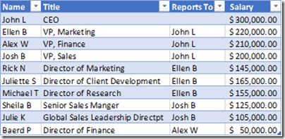
1) For the purpose of this report, I created a simple excel file (OrgData.xlsx) containing Name, Title, Reports To and Salary.

sample data

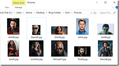
I also added some pictures of the employees in a folder.

employee headshots for org chart

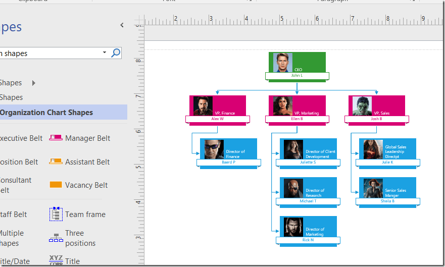
2) I imported this data into Visio to create a Org Chart (follow the steps from this link).

Org chart in Visio

3) Save the Visio diagram to One Drive for Business or SharePoint Online where your team also has access.

saved visio file in One Drive for Business

Click on the Visio diagram and then copy the link into a text file for future use.

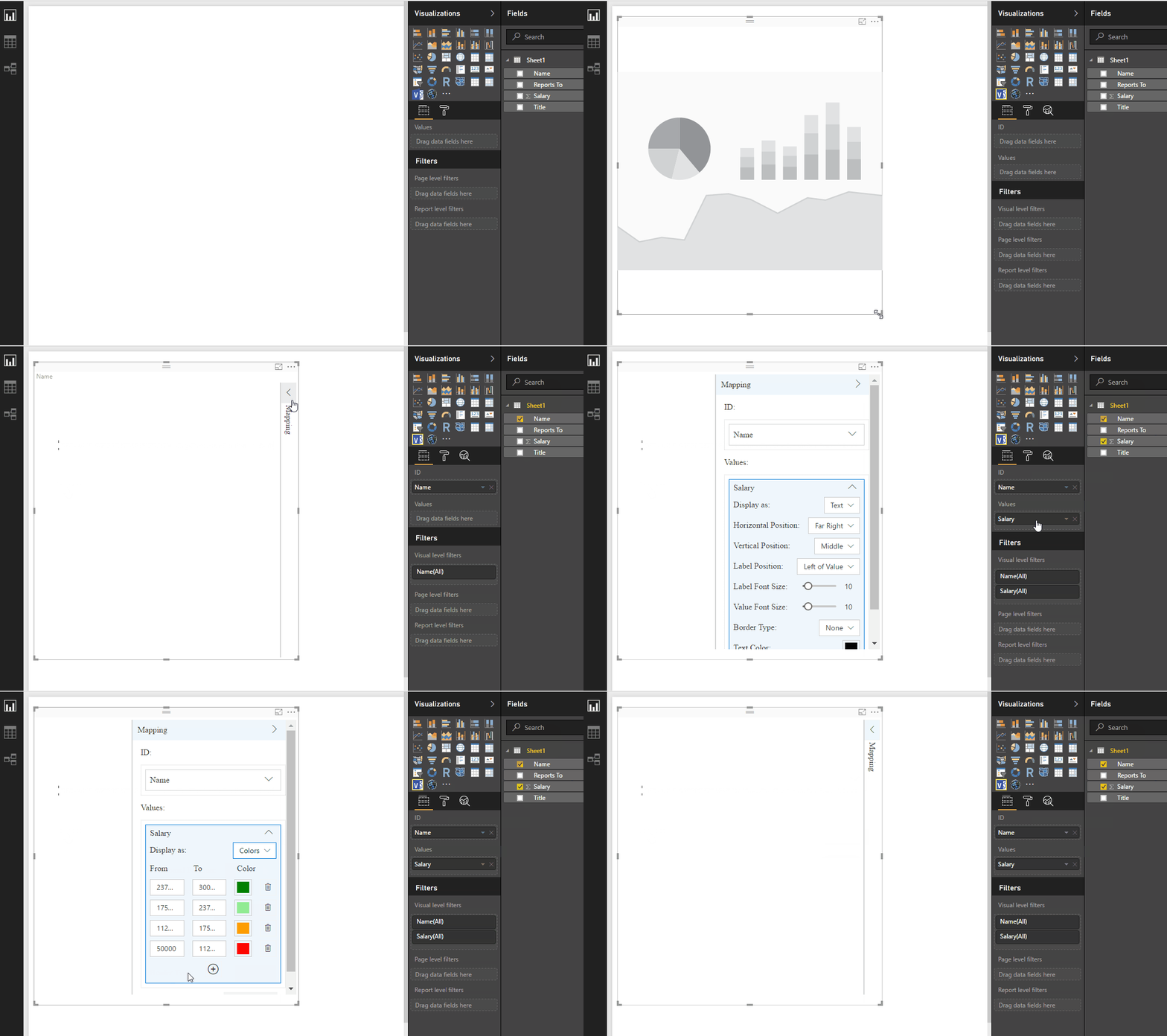
4) Now open Power BI desktop and import the Excel file with the org data. After that, import the Visio custom visual and select it on the reporting canvas. Add Name to the ID field, and then you should see a dialog box to input the Visio diagram’s URL that we copied in the previous step. Click on connect after that, and also add the Salary in the Values field, so that we can see the Org Chart display the colors. Check out the gif below for more details.

Visio Custom visual in Power BI

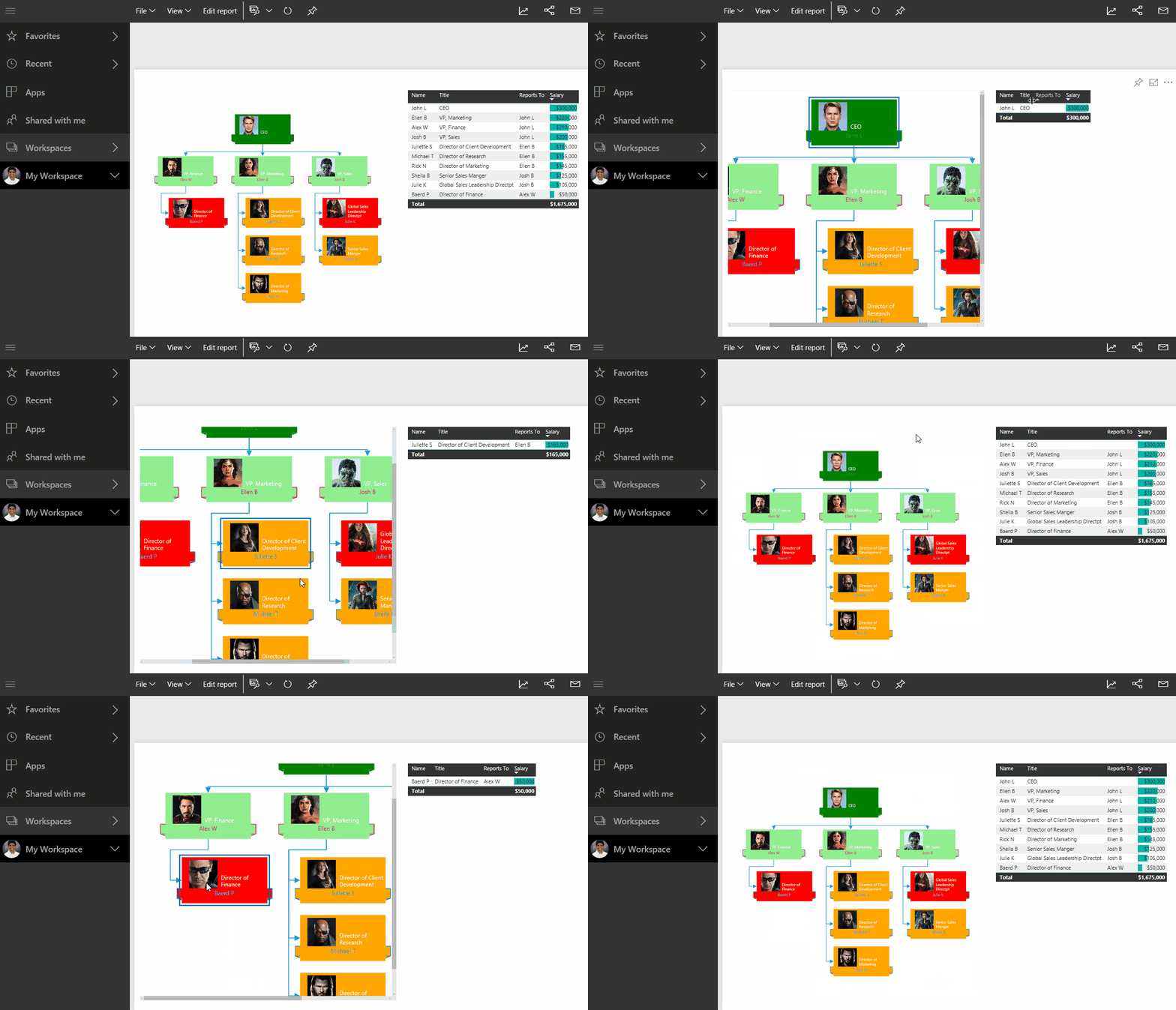
5) Notice that the visio diagram is not coming up in Power BI Desktop. This is a limitation of the current preview version, and the diagram will only be visible when you view it in Power BI Web. Add a simple table with Name and Salary next to the Visio custom visual and then publish the report. Now you should see the Visio diagram in the report.

Visio custom visual in Power BI Web

Note that you can click on the org chart and see the table getting filtered for the selection. However, it is not possible to make multiple selections using CTRL+Click in the Visio diagram, as we can do in the other native charts.

My Thoughts – The Good & The Bad

1) This visual provides a great way to make some cool visuals easily. Apart from the Org charts, I also experimented with Flow charts, network diagrams, floor plans and it was great to see how easy it was to make those charts in Visio and integrate them within Power BI.

2) This is more of a Visio feedback rather than for the Visio custom visual for Power BI. You can use Visio to make some charts that are not available natively in Power BI like Org Charts, Flow charts, etc. from Excel data (or other sources) automatically. So if something changes, it is easy to create a new one by importing the data again and then saving it in the same location in One Drive for Business / SharePoint Online. The Power BI report seems to pick up the latest version of the Visio diagram every time the browser is refreshed (even though the official documentation says that you might need to re-insert the custom visual sometimes).

However, it would have been better if the shapes were automatically added or deleted in Visio based on changes in data, rather than manually adding them or recreating them. Even though this feature is not present in most charts, I did notice that there are some like the “Cross Functional Flowchart using Data Visualizer” in Visio where the shapes get added/deleted by just clicking the Refresh button in Visio.

3) I am pretty sure this is just a limitation of the Preview version – the visual gets displayed only on Power BI Web version and not in the desktop.

4) Currently, it looks like you can’t do multiple select (using CTRL+Click) on the shapes with the Visio custom visual. It would have been nice if we could do that just like we do in all the other native visuals in Power BI.

5) The usefulness of this visual can be greatly enhanced if there was a way to automate the refresh of Visio diagrams based on the change of data, saving the changed Visio diagram to One Drive for Business/SharePoint Online and then seeing the latest version without any issues in Power BI. I am still investigating if there is a way for it.

Apart from what I have mentioned, the official documentation also mentions the following things about the Preview

1. Visio custom visual needs to access the Visio diagram so in cases where Power BI user’s sign-in information can’t be accessed via Single Sign-on, the user might be presented with a sign in prompt and they need to sign-in to authenticate themselves.

2. If clicking on sign in button doesn’t do anything then it could be due to a known IE/Edge browser behavior when Power BI and SharePoint are in different security zones, please add both the Power BI domain and the SharePoint domain to the same security zone and try again.

3. Data graphics applied to Visio diagram from Visio client are removed.

4. In case your diagram has complex styles, themes, fill patterns etc., you might notice some visual differences between the Visio diagram in the Visio client and the diagram rendered in the Visio custom visual.

5. Large diagrams with shape count over 2000 are not supported.

6. In case you need to add new shapes that map to your Power BI Data, or remove shapes that have been previously mapped please verify the report. In case you observe any issues, you might need to re-insert the Visio custom visual and map the shapes again.

It is pretty exciting to see all these features in the Preview version of this custom visual, and I can’t wait to see what else is going to be available once this is no longer in Preview. Also, the general trend of trying to integrate different products like Visio and Power Apps into Power BI is extremely heartening.

Posted by SQLJason in Office 365, Power BI, 4 comments

Category Shading for Regions in Power Map

It’s been a really busy month for me professionally (with the PASS Summit 2013, SQL Saturday Charlotte BI Edition, etc) as well as personally (with a steady stream of family flying in to visit the new born baby as well as looking after a new born baby – how I miss my 8 hrs. of sleep!). I remember people saying to me that things are going to change drastically once you have a baby. Well, what can I say other than it’s 100% true . Understandably, I don’t get the same amount of time to spend on blogging and with all the stuff that has been happening behind the scenes, I decided to procrastinate till everything gets a little bit more calmer. That is when I was reading through an article and fell upon this gem of a line from Zip Zaglar - “If you wait until all the lights are “green” before you leave home, you’ll never get started on your trip to the top”. So I decided to shake off my laziness and get started on blogging about a cool feature in Power Map that has not been explored or blogged much – Category Shading for Regions.

The objective of this post is to explore the category shading feature in Power Map as well as try to see what kind of questions can be answered (after all, a feature that just adds flashiness and no business value is not desirable). For this post, I will be using the stats for my blog for visitors from the USA by browsers.

With this data, I created a simple Power Map visualization which shows the number of visitors by state. (Check out this link if you are new to Power Map or need more info on how to create this visualization).

With the above visualization, I can answer questions like – Which state in the US has the most number of readers? I can easily see that California and Texas are where I have got the most number of readers. Now that I have a general understanding of the visitors, I am going to ask a few more specific questions based on the browsers that they are using:-

I) What is the dominant browser for my readers in each of the states?

To answer this question, bring the Browser field to the category and now you should notice an icon which appears on the top-right of the category textbox (denoted by 2 in the image below). Click on the icon and select the No shading option as shown below.

Now, I can see the results for myself. Interestingly, the dominant browser in almost all the states is Internet Explorer. There are a couple of states (6 to be precise) where Chrome is the dominant browser. This brings me to my next question.

II) How dominant are the leading browsers within each state with respect to their competing browsers in that state?

Click on the category shading icon and select the “Shade based on category value within location” option. Now you should see the below visualization.

From this, you can easily see the leading browsers based on the color as well as the shading shows the share for the leading browser. The darker the shade for the color, the more dominant the browser is within the region. For eg, you can see that Internet Explorer is pretty dominant in Alaska as well as North Dakota, while Chrome is pretty dominant in Wyoming. In California, you can see that IE is leading but not by much.

However, when I saw the actual numbers in the tooltip, I found it to be really less. This brought me to my third question.

III) Which states have more visitors and what is the dominant browser there?

Click on the category shading icon and select the “Shade based on category value compared to all other values” option. Now you should see the below visualization

You can see that it is a refined version of the map which was obtained initially by not putting the category field. The darker the color, the more number of visitors I have. So from the above image, we can easily see that the top 4 states by readership counts are California (Internet Explorer), Texas (Internet Explorer), Washington (Internet Explorer) and North Carolina (Chrome). And now looking at the previous image (for Question II) in combination with this image, we can see that the difference is not much and that the competition between the browsers are pretty tight across the states. Also, for the three states where the difference is really big (Alaska, North Dakota and Wyoming), we can see that the counts are pretty small and hence not that significant.

IV) How do the states within the same dominant browser measure up against each other?

For this, click on the category shading icon and select the “Shade based on category value compared to other values in the category” option. Now you should see the below visualization.

From this image, I can see that for Internet Explorer, the top 3 states are California, Texas and Washington & for Chrome, the top 3 states are North Carolina, Iowa and Utah. It is important to understand that there might be other states which has more value for that browser. For eg, California might have more readers using Chrome than North Carolina, but it is not taken into account since Chrome is not the dominant browser there. Time to finish this lengthy post and this will be all from me today. But before I sign off, I wanted to let you know that you can animate this kind of visualization across time by dragging the date field to the time-play axis. This can answer the same 4 questions we asked above across time, which is pretty powerful. Also, we can look at the existing set of data with Power View and answer more interesting questions – a sneak peek of a simple dashboard is given below. Have fun with Power BI till we speak again!

Posted by SQLJason, 3 comments

Power Map Preview - Exploring the NEW features!

Woot! Microsoft just announced the pre-release availability of the refreshed builds for Power Map with some really cool new features and boy, I must say that I am PUMPED! For folks that know me, I have been doing quite a number of presentations on Power Map (and geospatial analytics in general) and there were a couple of features that I really really wished for in Power Map. Well, looks like the Power Map team heard my requests and I feel this release is a big step forward.

First of all, here are some useful links (including the download link for the refreshed bits):-

  • Power BI Forum: Post and answer questions for the product team and community
  • Power BI Product Page on Office.com: Download requirements, directs to Web Download page below
  • Power Map Download Page: Download the bits on Microsoft Download Center

Now let’s see some of the new features that has come up since my last post on Power Map.

I) Recognizing geographic data and Plotting them on launching Power Map On launching Power Map, the columns with geographic data are automatically recognized and plotted. For example, I had some data of the population of North Carolina by zip code as shown below

Now when I launched Power Map, this is what I saw

The best part is that the geographic columns seemed to be recognized correctly even if the they are named something other than City / State / Zip Code, etc. For eg, I renamed the City to CVDS and still was able to see it correctly mapped to City.

And anyways, you still have the option to change it from the drop down. All in all, great feature and saves me a couple of unnecessary clicks.

II) Support for Flat Map

I know, I know, all of you would be thinking – what’s so special about this? After all, what made Power Map unique was that it had the ability to do 3-D geospatial analysis. Well, that is pretty cool but there are certain times when only a flat map would do. For eg, when you are looking at a worldwide data like population by countries, you want to see both sides of the globe. Earlier in Power Map, it used to look like shown below:-

We could see only one half of the globe and had to rotate to see the other half. Now we have this icon to convert the 3D map to a flat map (and back to 3D if required!)

This is REALLY cool!

III) Support for Regions Visualization (Chloropeth Mapping)

Now this is the most awesome enhancement according to me – support for chloropeth mapping or shading a geographical area (and I had actually requested as a Connect suggestion during the beta release of GeoFlow). Let me show you how the visualization looks for the population data for North Carolina

Best part is that it is damn right simple – just change the visualization from Column to Region (and yes, that also means that we have a fourth visualization type now – apart from Column, Bubble and HeatMap)

The Region visualization is only present at a Country / Region, State / Province, County or Zip / Postal Code level (which means City is not available) and is available across all countries (not just the USA). If you try to use a geographical level which is not one of the above, you will receive the following error and the chart type will be changed to Column.

I LOVE this feature and more than that, adore the way how simple it is for users to geocode at that level (no need to bring in complex shapefiles to geocode county/zip code level data like in SSRS!). I can already see a lot of use for it.

IV) Change Color for Data Series

Now this is another simple but very useful new feature – the ability to change colors for data series. You can see this new option in the Layer options.

You can also see that the display options of the Themes button has changed and now the colors also show up.

V) Exporting Tours as Videos

A question that consistently makes the rounds when I present on Power Map is – “How do I “unlock” the tours from the Excel workbook? Is it possible to share it through any other medium?” Well, the answer has been No until now. The current build allows you to export your tours as a video and now this can be shared across all your channels. For creating videos, there is a new Create Video button on the ribbon and then you can select the video quality also.

To demonstrate the feature, I have exported a tour from one of my recent presentations. This tour is around 5 mins long and investigates the myth – Are Refugees flooding Industrialized countries? It took quite some time for me to export the tour as a video even in the 360p mode, but that is understandable I guess.

Power Map Tour exported as a video

Conclusion

Overall, I feel this is a build with some really awesome features. Apart from the new features I described, there are also some UI changes but these changes are simple enough to understand, so I am not going over them. There are still some really basic functionalities that are desired like filtering your data and drilling down on the geographic levels (and I found out at least one bug which I will be filing on Connect soon), but we should not forget that this is not the final version. So I am happy and I would encourage everyone to try out the new build.

Posted by SQLJason, 11 comments

Power BI for Office 365

Great news!!! Today, at the Worldwide Partner Conference, Microsoft announced a new offering – Power BI for Office 365. Quoted from Microsoft – “Power BI for Office 365 is a cloud-based business intelligence (BI) solution that enables our customers to easily gain insights from their data, working within Excel to analyze and visualize the data in a self-service way. It works with Office 365 to help customers share insights, find answers and stay connected to their data from their favorite mobile devices.” For those of you who have the time, I would recommend going through the links that I have collected below. And for those who don’t have the time, let me do a very quick summary:- 1) Discover, analyze, and visualize with Power BI for Office 365, which includes Power Query (formerly known as Data Explorer), Power Map (formerly known as GeoFlow), Power Pivot (formerly known as PowerPivot - notice the space between the words) and Power View (for a change, I like that the names are standardized with a space after Power). 2) Create Power BI Sites to share live interactive reports. Power BI Sites are dedicated collaborative BI workspaces in Office 365 for sharing data and insights with colleagues. 3) Ask questions and get back instant answers with the new Q&A feature that uses natural language query technology to provide you with immediate answers in the form of interactive charts and graphs based on the questions you type into the speech bubble. 4) Browse Excel and Power View reports with HTML 5. Stay connected with the touch-optimized Power BI mobile app. BI users can access and receive live updates on their reports through their browser with HTML5 or through a mobile application designed for their tablet or touch-enabled device, either Microsoft Power BI for Windows or Microsoft Power BI for iPad. 5) Refresh your data on demand or define a schedule. The Data Management Gateway allows your IT department to enable data refresh from Office 365 to your favourite on-premises data sources. 6) No announcement on pricing or preview date (except for “later this summer”). The natural language feature looks pretty impressing even though I doubt whether the experience is going to be as seamless as shown in the demo. Also, the bubble chart shown in the demo (also shown in the image below) looked extremely jazzy but may end up just being eye-candy in real life. I would love to finally see the Mobile (and ofcourse iPad) solution come through with Power BI, although I am a tad bit disappointed that this feature is not there for the SharePoint version. There are a couple of official posts on this offering and I have collated them below:- 1) What powers Power BI in Office 365?
2) Introducing Power BI for Office 365
3) Announcing Power BI for Office 365
4) Register for Power BI Preview Watch the Day 1 Vision Keynote from WPC 2013 on demand here! You can also read some of the initial reactions to Power BI below:- 1) Some Thoughts About Power BI - Chris Webb
2) Microsoft Office 365 Cloud Power BI - Jen Underwood
3) Microsoft Announces Power BI for Office 365 – Andrew Brust
4) Power Business Intelligence for Office365 - Jen Stirrup Exciting times indeed for Microsoft BI and Self Service BI in general. I can’t wait to get my hands on the preview.

Posted by SQLJason, 2 comments