SQLJason

Financial Times Visual Vocabulary: Power BI Edition

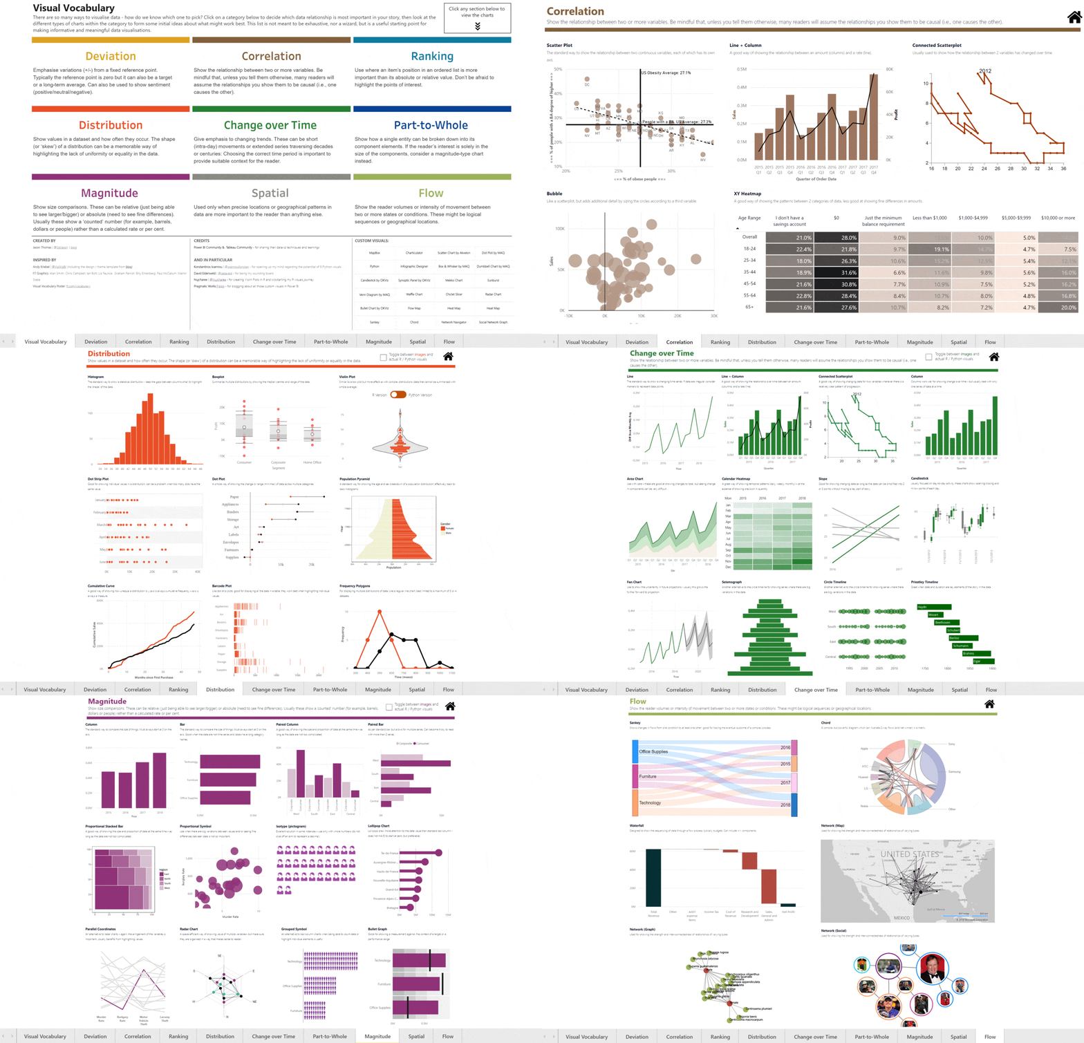
Ok, finally it is done! This is a side project that I have been undertaking on and off for the past 2-3 months, after getting inspired by Andy Kriebel’s (t | b) Tableau project - Visual Vocabulary. There were a lot of times when I thought it simply wasn’t worth the effort, and I dropped it. But somehow I managed to drag myself back into it and it truly has been a “labor of love” as Andy quoted it. The perfectionist in me is still not 100% happy with the end result, and I know for sure that there are ways to make it better. But I will still count it as a personal victory that I managed to get it this far!

HomeGif

Background

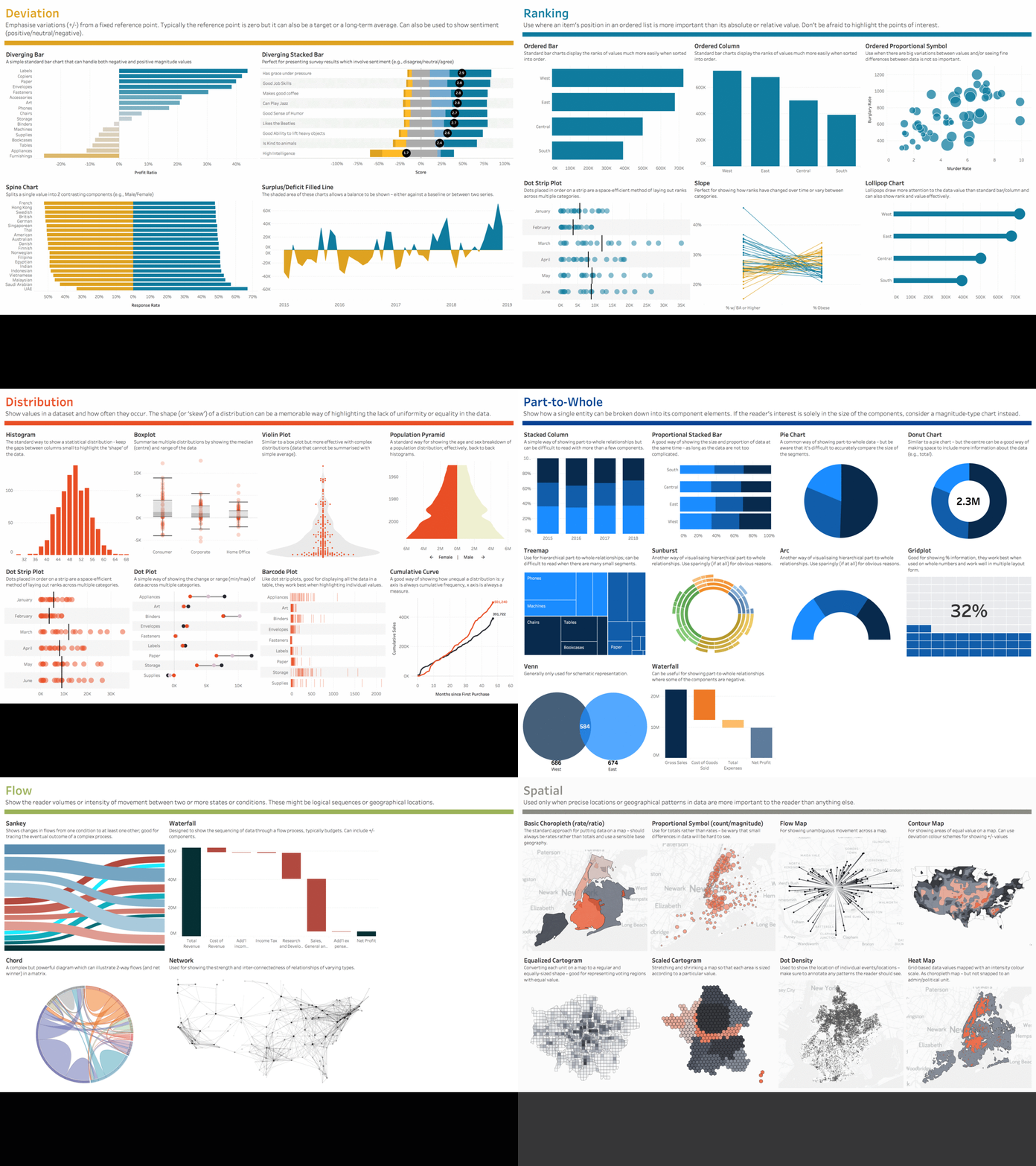
The Financial Times Graphics team created the Visual Vocabulary poster to help all of us make better chart choices. And based on this, Andy Kriebel created the interactive Tableau Edition of the the same.

image    

I was so inspired by it that I decided to create the Power BI Edition, and tried to make it as similar as possible. I also added a few more charts that I thought are relevant. Without further ado, here is the end result.

Direct Link

Note that there are some R/Python visuals and currently, R/Python visuals are not available on “Publish to Web”. Hence, I have just used a checkbox on the top of the report to show the images wherever R visuals are used (can be identified by the colorful border around the image). However, you can download the source file and then publish it to your tenant, and see the actual R visuals there in a browser by unselecting the checkbox. You can also look at the pbix file and see the source code behind the visuals.

Credits

  1. Andy Kriebel (t | b): Thank you for all that you do for the #dataviz community. I wouldn’t have tried this project if I had not seen your post. Even the design as well as the data for most of the visuals are copied from your Tableau Workbook.
  2. FT Graphics Team (link): Alan Smith; Chris Campbell; Ian Bott; Liz Faunce;  Graham Parrish; Billy Ehrenberg; Paul McCallum; Martin Stabe
  3. Power BI & Tableau Community: for sharing all your amazing #dataviz techniques. The tools might be different, but the techniques that you learn in one tool can easily be applied in others. E.g. – creating cartograms in Power BI became all the more simpler because of the Tableau community blogging about using Alteryx to generate the shapefiles. And a huge thanks to the creators of the Power BI Custom visuals – this project would not be possible if it wasn’t for all your effort in creating and sharing those custom visuals. 
  4. Konstantinos Ioannou (t): for opening up my mind regarding the potential of R/Python visuals as well as creating most of the R visuals in this project.
  5. David Eldersveld (t | b) - for being my sounding board
  6. Nujcharee (t) - for creating Violin Plot visual using R for me and kickstarting my R visuals journey
  7. Pragmatic Works (b) - for blogging about all those amazing custom visuals in Power BI

Source File

You can download the source file from here.  Note that you will have to get your own MapBox tokens to view some of the maps in the Spatial section. More info on the same here.

Tutorials

This section will be updated with links on how I created those charts (if I can drag my lazy ass back to this once more!).

Posted by SQLJason in Power BI, 23 comments

Comparing Power BI vs Tableau Licensing (as well as Products)

There are a lot of articles floating around the internet comparing Power BI to Tableau (and vice versa) and the last year has definitely seen a spike in the interest for the same. The interest is justified as these two tools are the market leaders when it comes to data visualization. On one side, you have Tableau – the undisputed market leader till last year and to be honest, the tool that heralded the rise of modern BI tools and on the other side, you have Power BI, arguably the current market leader, that came into prominence with it’s extremely low price and BI for the masses message, and is now pulling ahead in terms of features also (largely because of the monthly updates, pretty incredible that the Power BI team has succeeded in pulling a through a monthly update ever since it’s inception). Competition between tools from companies like Salesforce is always good for the customers – Tableau put the pressure on other tools in terms of visualization capabilities and Power BI put the pressure on other tools in terms of pricing as well as data preparation capabilities, and as customers, we can already start seeing some of the positive changes. As time goes on, this is going to be a race between the tools on which one is going to provide the most features at the lowest price without compromising on user friendliness. In my prior life as a BI consultant, I did have my fair share of experience with both the tools (I am certified in both Tableau and Power BI), though keeping up with both those tools is a huge challenge due to the rapid pace of innovation. So if there is any point that people think is not correct, please point it out in the comments and I will be more than happy to listen/edit the post based on it. I do have a few ideas on comparing those two tools, but I will start simple by comparing the products and then putting out the licensing details.
1 Header

Even though I mentioned that I am going to start simple, brace yourself – this is going to be a long post. There is a reason why we have lots of rumors around this topic and not a lot of well-informed posts around this topic, it is tough and most of the nitty-gritty details are hidden, not to say the tools are changing at a furious pace. I love the way Matt Francis summed up the experience when I tweeted about it.

It is tough, but not impossible, especially with the power of crowd-sourcing. If you see something that is not right, please call it out in the comments and I will make sure to update it. The consumers deserve the right to the data so that they can make an informed and data-driven decision for themselves.

Products

Let me start with the Power BI products as well as the licensing cost for them. Note that most of the prices are subscription / term based, the only exception being Report Server where you have the option to go term based or perpetual based on the mode of licensing.

Now for the Tableau products. I do have to say that for a company that markets itself on “No hidden costs”, it was extremely hard to find any official mention of the perpetual licensing costs and all links led to contacting the Sales team. The term based licensing was easy to find and maybe this is an indicator of the future direction that Tableau wants to take (personally, I am a little disappointed with this direction as my preference is to give customers options and let them choose, and always thought that the option to give both perpetual and term based licensing is a benefit Tableau has over Power BI). So there is a chance that the perpetual licenses may be a little off, but I am more than happy to edit if someone proves me wrong. Also, both companies give massive discounts to the enterprise customers, so these prices are the list prices for both Power BI & Tableau and do not include any discounts.

Update – 3/21/2018

Tableau does not offer perpetual licensing to new customers (only available for existing customers). However, they do offer a 8 core Tableau server for $175,000 a year.

Product Mappings

Even though both Power BI and Tableau have multiple products, it is easier to decide between the tools if we can equate the products by their functionalities. For the same, I have mapped the products below and we can discuss more on the same after that.

Debunking Common Misconceptions

1) Isn’t Power BI just a self-service visualization tool and require a combination of SharePoint / SQL Server Analysis Services / Reporting Services to work properly?

A) Not only is this statement just wrong, but the answer is quite the opposite. Power BI is one of the few tools in the market that offer an end-to-end self service experience starting from data preparation, data modelling and data visualization. Other tools are either just coming into the market with data preparation capabilities (like Tableau with Project Maestro) or require more technical skills and scripting (like Qlik). The data preparation capabilities have been around for quite a number of years and originated from Power Query in Excel. Some of the common reasons for this misconception are people not getting updated with the latest releases (Power BI Desktop gets updated once every month with new features) and still thinking of Power BI as the underwhelming old version called Power View which required all those extra products around it.

2) Isn’t Power BI just used for small projects? Doesn’t it have a data model limitation of 1 GB?

A) Again, this statement is not entirely true. Power BI Pro has a limitation of 1 GB model size but because of it’s proprietary compression, the actual source data can be 10-100 GB in size. Power BI Pro is targeted towards self-service BI users which is characterized by a large number of small models (which is why each user gets 10 GB storage space also). That said, it is always possible to connect to larger datasets (without any data limitations) through the live connection / direct query mode. Most SaaS models that are licensed by users have some sort of restrictions to prevent over-utilization of resources by just one user, even if they might not advertise them. E.g., Tableau Online has a limitation on the time taken to refresh a data model (can’t be greater than 2 hrs) and also, only has 100 GB storage across the whole Tableau online site. This definitely means your dataset size has to be of a size that it fits the refresh time of 2 hrs, and has limits.

That said, Power BI Premium (which is targeted towards corporate BI scenarios – small number of large models) allows for up to 10 GB as of now, and the roadmap clearly says that soon you will only be limited by the server capacity. So you can potentially keep buying more servers and build large models even with import mode. Proof – there has been some demos during the Ignite conference that show Power BI on top of 1 trillion rows (coming from a quarter of a petabyte sized data source) and the performance was blazing fast. This is why the ability to buy capacity based licenses for SaaS models are important, so that you can build models without size restriction.

The limits mentioned above are for the cloud versions of Power BI (Power BI Pro and Power BI Premium). For Power BI Report Server, the limit is 2 GB currently.

* Note – most people that I have talked to create Tableau and Power BI models that are less than 500 MB as both tools do an amazing job of compression. If anyone is really worried about model size, I would definitely ask them to do a prototype, measure the data model and extrapolate it out. You will be surprised! That said, I expect both the vendors to keep increasing the model size, it is only natural.

3) Doesn’t Power BI show only 3500 data points or so in a visual?

A) Actually, this is only partially correct, the new limit is 10,000 data points. However, more importantly, many charts have High Density Sampling turned on, which is a unique sampling algorithm that skips points that are anyway covered by other points in the visualization. The result is that the rendered chart is virtually undistinguishable from a chart that has x1000 the number of points. The reasoning behind this is to prevent one visual from using up all the resources in the cloud and causing performance issues. I personally tried a lot of different data scenarios and most of the times, the charts were pretty much identical. Definitely, this is one area where Tableau currently scores ahead but while making your decisions, consider how many times you will be using a chart with so many data points and also, if it really is the right approach to display so many data points at once (for some specific scenarios, yes. But for most of the times, this feature is abused and ideally, should follow a path of drill-downs).

4) Power BI is the cheapest tool in all the scenarios

A) This is true 99% of the case and you can even do a lot of personal analytics for free in Power BI using your free Power BI Desktop and free Power BI service license. But under certain niche scenarios where you have a very small number of users and want a completely on-prem solution and do not have SQL Server EE with SA licenses, it might be cheaper to get the term licenses for Tableau. That said, the moment you start adding users and scaling outside your very small team, the cost rises exponentially. So unless you want to maintain multiple products or do rework by migrating from one tool to the other, it is always a good idea to look at the overall strategy and see whether your tool will scale across the enterprise.

5) It is not only about the license cost, it is about the Total Cost of Ownership (TCO)

A) Very true, the licensing cost is just a small (but significant) portion of the overall cost. That said, some of the articles floating around is outrageous. Top on my list is – Tableau Total Cost of Ownership and it is ridiculous that Tableau is still displaying that on it’s site. Granted that the authors might not be up-to-date with some of the new features, but even at the time of writing, there was no need to get SQL Server and SSAS on top of Power BI when comparing with Tableau. It would not be an apples to apples comparison, having an enterprise relational database & enterprise OLAP tool on top of Power BI with Tableau. Not to say it has basic arithmetic mistakes for a paper that is highly quantitative, not sure who was reviewing it.
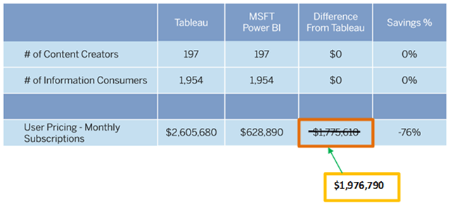
image

There was a time when Tableau was the most user friendly tool for visual exploration, arguably not anymore. In fact, Power BI is easier to use and adopt for Excel users (the most popular BI tool in the world) as there is a high level of integration and compatibility that Tableau or any other tool can not provide. You can easily transition the existing work in Excel to Power BI without much rework, while you will have to start from scratch with any other tool. There was a time when Tableau was the only tool in market with the ability to create simple calculations with one click, not anymore as Power BI also has a similar ability with it’s quick measures. Tableau differentiators like report tooltips are no longer a unique factor anymore and Power BI has them too. The storytelling features are more superior in Power BI (bookmarks) compared to Tableau. That said, the customizations and flexibility around the visuals in Tableau is mind-blowing and there is an amazing and very mature community around Tableau focused on dataviz. The community around Power BI is awesome too and you can see how fast you get your answers in the community forums, however, the level of dataviz maturity in the Tableau community is at another level. To summarize, there are a lot of misleading articles around that have been written without proper research – all I am asking is to try out the tool and see if it is really true, and not get misled by the random TCO numbers. Some of the scenarios might be true and some might be false. Feature by feature comparisons are usually misleading as every tool will have their own unique features that the other tools may not have or are catching up to. In the grand scheme of things, it is important to see if you can analyze your data, get to the insights and satisfy your requirements.

At this point, I would like to summarize by saying that both Tableau and Power BI are the top 2 market leaders when it comes to BI & Analytics. Personally, I love both the tools and hope that both of them continue competing at the same level – that can only mean good for the customers.

Updates

3/20/2018 – Corrected “(coming from a petabyte sized data source)” to “(coming from a quarter of a petabyte sized data source)” – thanks to Sawyer Kelly

3/21/2018 – Corrected the license structure for Tableau - they do not offer perpetual licenses to new clients. Also, there is a new licensing structure that I missed – the ability to license one 8 core tableau server for a year ($175,000). – thanks to a reliable source & partner.

4/4/2018 - Changed the Power BI Report Server limit “For Power BI Report Server, the limit is 2 GB currently.

4/28/2018 - Tableau changed their licensing structure. More details here - https://www.tableau.com/about/blog/2018/3/new-day-data-84539

Posted by SQLJason in Power BI, Tableau, 38 comments

Highlighting Scatter Charts in Power BI using DAX

Another Friday, another tip. Power BI has undergone a lot of innovative updates over the years, but my favorite one has been a combination of the cross-filtering & highlighting  capabilities, multi-selecting across visuals and drilling down filtering other visuals. I feel having those capabilities are so important to make the flow of data exploration and analysis intuitive for end users, and I had written a long post back in 2015 where I compared Power BI to Tableau, the undisputed leader in data exploration at that time. Fast forward another 2-2.5 years, and there has been so much progress that Power BI is the new leader and other tools like Tableau & Qlik are trying to catch-up (in fact, we are at this junction where I could write a similar post on how it is easier to do data analysis in Power BI compared to Tableau – try checking out the number of clicks it would take to implement drill-downs, highlighting/filtering, etc. compared to Power BI or just the very basic task of putting 6 charts in one page for analysis). That said, there is one feature from my previous blog that was not implemented in Power BI – highlighting scatter/bubble charts. In Power BI, the scatter charts are not considered as area charts and hence you can only filter them and not highlight. This feature is useful when you have a lot of data points in your scatter chart and you want to see where a particular data point is with respect to the other data points. That said, you can make use of some nifty DAX and replicate the same behavior.

Header

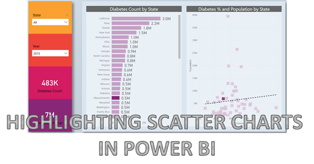
First, let me show you the existing behavior in Power BI. For demonstrating that, I have a dataset that has the count of people with diabetes as well as the population by State in the US.

image

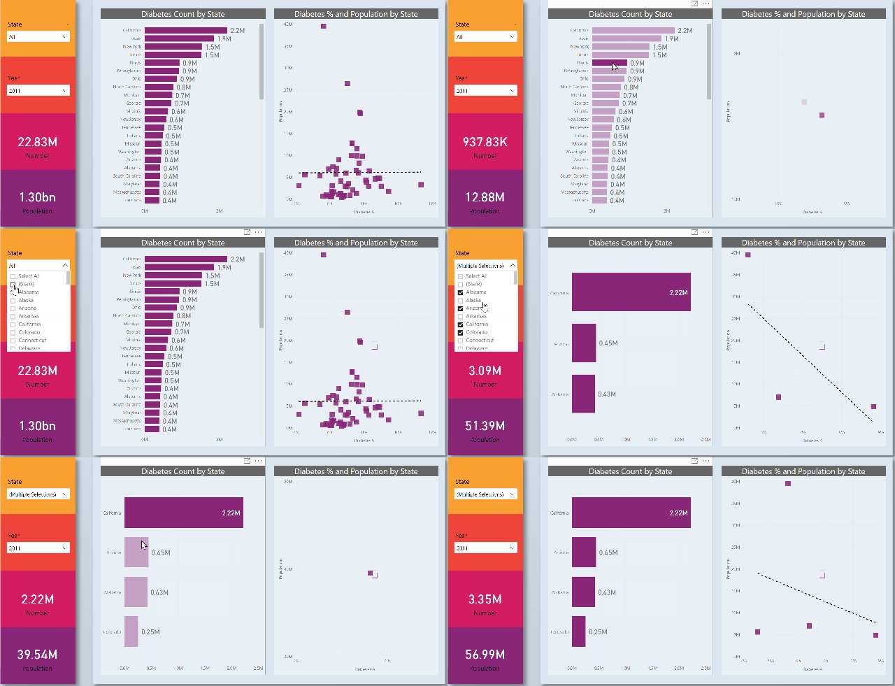
I made a simple bar chart on the left that shows the diabetes count by state, and another scatter chart that shows the Diabetes % (population adjusted value) and the population by states (special thanks to the folks at PowerBI.tips for the lovely layouts). Notice how the dots in the scatter chart get filtered when I click on the bar chart.

1 Original behavior

Now, follow the steps below so that you can replicate the highlighting functionality:-

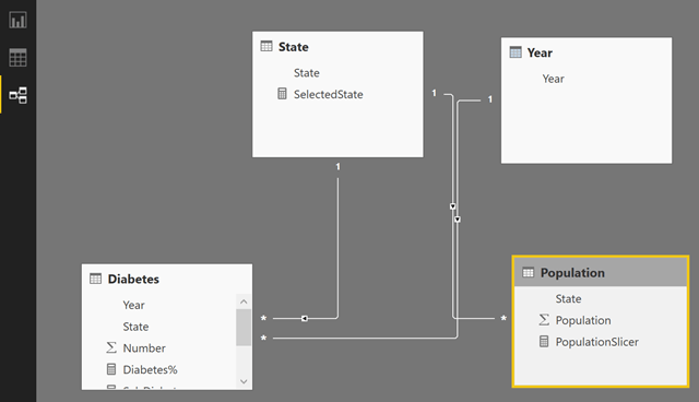
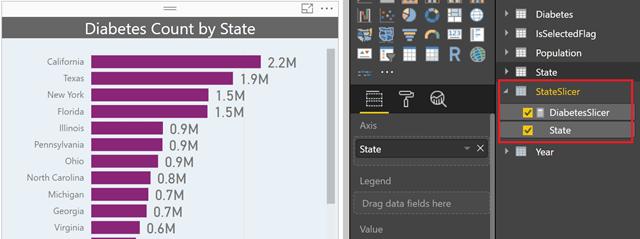
1) Our intention is to create a cross-filtering effect for the State in the bubble chart. For that, we will have to create a disconnected table for State (say StateSlicer) and also create another table called IsSelectedFlag that has just 2 values – Y and N. Create two calculated tables with the formula below:-

StateSlicer = State

IsSelectedFlag = UNION ( ROW ( “Flag”, “Y” ), ROW ( “Flag”, “N” ) )

2) Create a measure called DiabetesSlicer that will display the diabetes count for the States in the disconnected table.

DiabetesSlicer =
CALCULATE (
    SUM ( Diabetes[Number] ),
    INTERSECT ( VALUES ( State[State] ), VALUES ( StateSlicer[State] ) )
)

You can now make a bar chart from the StateSlicer and the DiabetesSlicer.

image

3) The next step is to make a scatter chart for Diabetes% (which is just the diabetes count / population for the state) and Population by State. The important thing here is to make a measure for the diabetes count that will show both the selected and unselected values. The Flag can be used as a legend for that purpose, but before it can work, we first need to write some DAX as shown below.

Sel_Diabetes =
— Diabetes count
VAR Diab =
    SUM ( Diabetes[Number] )
RETURN
    SUMX (
        -iterating for each value of the flag
        VALUES ( IsSelectedFlag[Flag] ),
        — calculating the selected value of the flag       
        VAR SelVal =
            CALCULATE ( SELECTEDVALUE ( IsSelectedFlag[Flag] ) )
        RETURN
            SWITCH (
                SelVal,
                -if it is Yes (meaning only the selected values), display DiabetesSlicer
                — DiabetesSlicer shows value only for selected state in bar chart               
                “Y”, [DiabetesSlicer],
                — if no (for values not selected), subtract from the total       
                — for unselected values, DiabetesSlicer is blank, but Diab is always displayed        
                “N”, IF ( Diab <> [DiabetesSlicer], Diab - [DiabetesSlicer] )
            )
    )

It is advised to use the same technique for Population also, especially if you are having other charts. But in this scenario, where I only have a bar chart and scatter chart, I can get away with just changing one of the measures of the scatter chart (which is the Diabetes% in this case). Create the Diabetes% measure now

Sel_Diabetes% =
DIVIDE ( [Sel_Diabetes], SUM ( Population[Population] ) )

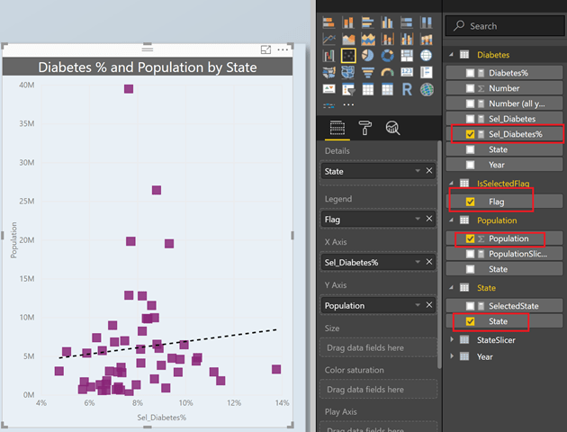
4) Now create a scatter chart with the State from the original state table, flag in the legend and the Population and Sel_Diabetes% as the Axes.

image

5) Now you should be able to see the highlighting functionality. I also added some slicers and the metrics in the left hand side, as well as a simple report tooltip (just because I LOVE this feature). Also, change the default colors for the Legend, ideally choose a dark color for Yes and a lighter shade of the same color for No so that it looks natural.

2 Highlighting behavior

Feel free to download the pbix file from here and play with it.

Posted by SQLJason in Power BI, 20 comments

Power BI Licensing - Cost Forecast Guide

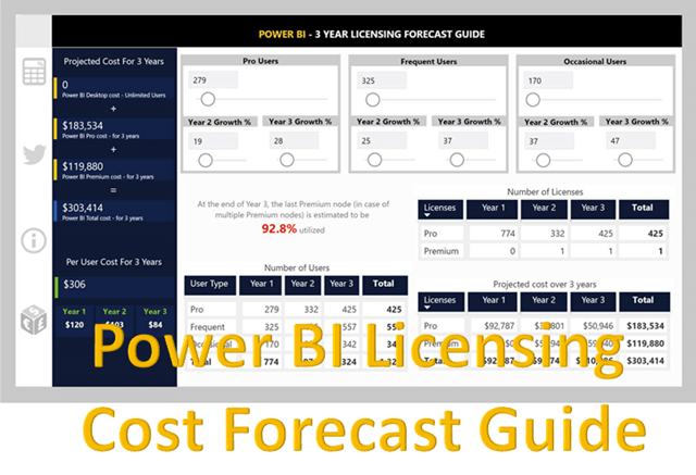
The other day, one of my enterprise customers asked me if there were any guides or documentation to forecast the cost for Power BI service licensing (Pro and Premium) for 3 years based on user growth. I did mention that we can use the official Power BI Premium calculator to calculate it for each year and then use the sum. However, after the call, I took this as an opportunity to show the customer how versatile Power BI is, and decided to create a report for this customer’s particular need.

image

I thought it might be useful for some enterprise customers to see what the total cost is going to be for 3 years, and decided to share it here. You can use this guide to see some of the additional information like:-

  1. Forecast the growth in % for Pro, Frequent and Occasional users
  2. Get the total cost for 3 years based on the growth
  3. See the per user cost for each year
  4. Also, see the estimated utilization of the last Premium node, which will give you a good idea on whether you are close to upgrading or not

That said, the report is built using the current (as of 3/12/2018) formulas for the Power BI Premium calculator (if it changes, I will try my best to keep it up-to-date) and it might be a good idea to double check your numbers against the original Premium calculator too. Without further ado, the report is given below, feel free to explore.


As always, let me know your feedback or if you have any questions on the same.

Posted by SQLJason in Power BI, 3 comments

Display Last N Months & Selected Month using Single Date Dimension in Power BI

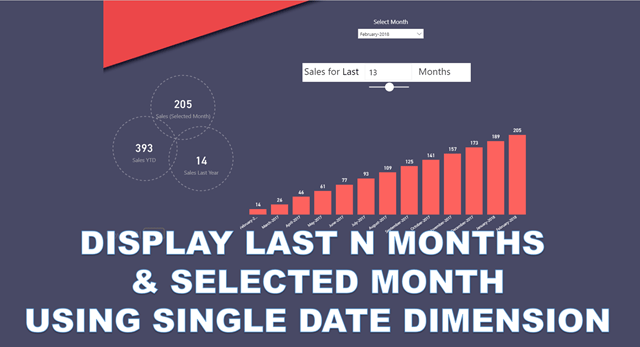
It is Friday, and I thought of writing a quick tip on how you can use the same date dimension for displaying the last N months (say, in a bar chart) and the data for selected month (say, in a card visual). Most of the techniques for doing the same use a disconnected date dimension along with the regular date dimension; however, using the same date dimension as a filter has the additional benefit that you can use all of the other measures also without any changes in the same report.

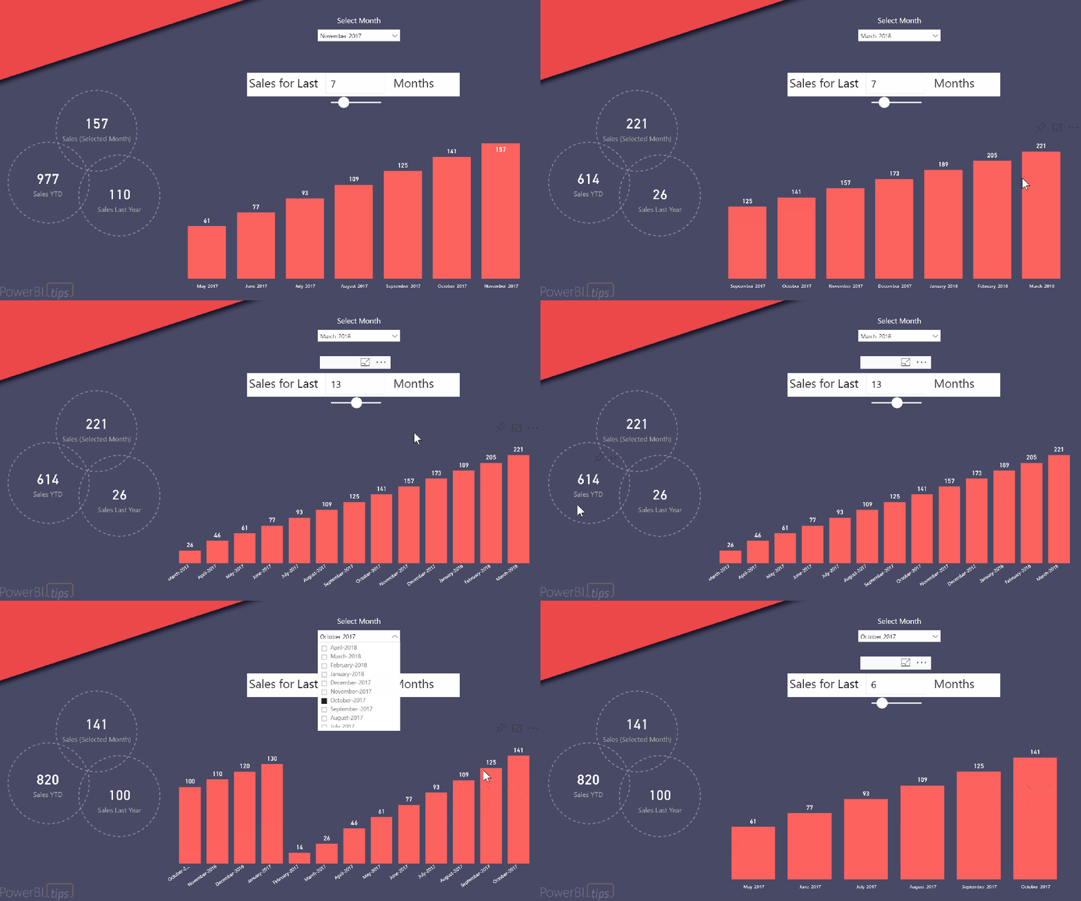
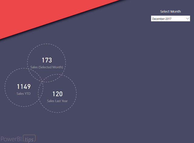
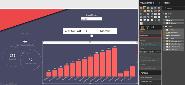
imageBefore I show you the technique, let me show you an example of a finished report. Below, you can see that I have displayed 3 regular measures based on the selected month (Sales for selected month, Sales YTD and Sales Last Year) along with a bar chart that shows the sales for the last N months based on the selected month (special thanks to the folks at PowerBI.tips for the pretty layout).

Solution

Follow the steps below to recreate the same:-

1) For the purpose of this post, I am using a very simple model – a Sales table (with just Date and Sales) and a Date table.

image

2) Create 3 measures as shown below, and then add those 3 measures in the report along with a month slicer as shown below. You can change the month in the slicer and verify that the measure values change for the selected month.


Sales (Selected Month)
= SUM ( Sales[Sales] )

Sales Last Year
= CALCULATE ( SUM ( Sales[Sales] ), SAMEPERIODLASTYEAR ( ‘Date'[Date] ) )

Sales YTD
= TOTALYTD ( SUM ( Sales[Sales] ), ‘Date'[Date] )


image

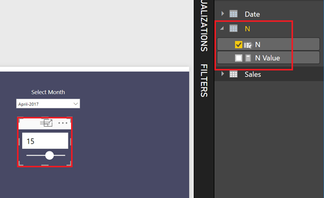
3) The next step is to make a measure that will display the last N months. Let us create a What If parameter called N with values from 1 to 24, and increments of 1. Place it in the chart as shown below

image


4) The main step for this technique is – create a measure that will display the sum of sales for the last N months. It is important to know that putting the Month from the Date table will not work, so what we are going to do is create a month column in the Sales table and then use that as the axis for the bar chart. Create the 2 calculated columns in the Sales table (MonthYear and also MonthYearNo for sorting the MonthYear column), as well as a measure – Sales (last n months).


MonthYear
= RELATED ( ‘Date'[MonthofYear] )

MonthYearNo
= RELATED ( ‘Date'[MonthYearNo] )

Sales (last n months) =
VAR MaxFactDate =
CALCULATE ( MAX ( Sales[Date] ), ALL ( ‘Date’ ) ) — ignore the selected date filter, and find the max of date in Sales table
VAR FDate =
ENDOFMONTH ( ‘Date'[Date] ) — get the last day of the month selected in the date filter
VAR Edate =
EDATE ( FDate, - [N Value] ) — get the last day of -N months
RETURN
IF (
MaxFactDate <= MAX ( ‘Date'[Date] )
&& MaxFactDate > Edate,
CALCULATE ( SUM ( Sales[Sales] ), ALL ( ‘Date’ ) )
) — if the date in the fact table is between the last N months, display Sales, else nothing. Note that we are ignoring the date filter, only respect the date in Fact

Update -3/3/2018

Owen Auger (twitter) has come up with an easier formula, use this one instead of mine -

Sales (last n months) =
CALCULATE (
SUM ( Sales[Sales] ),
DATESINPERIOD ( ‘Date'[Date], MAX ( ‘Date'[Date] ), - [N Value], MONTH )
)

5) Now create a bar chart with MonthYear on Axis and Sales (last n months) on the values, as shown below.

image

At this point, you can change the month in the filter, as well as the value of N and see the bar chart change (as well as the other measures).

Posted by SQLJason in Power BI, 47 comments

Password Locking Publish to Web in Power BI

*WARNING - This technique will not provide data security (only obscurity), so please don’t use it with your confidential data. Always use your Pro/Premium license to share confidential data.

Last week, I had published a Power BI contest where you had to solve some clues to unlock a hidden tab. The underlying technique was inspired from a community post but I used a totally different approach using the new Sync Slicers feature. In this post, I am going to show you the technique behind locking a tab with a password/code while using the Publish to Web feature in Power BI.

image

Before I start, I want to make sure that everyone understands some points clearly:-

1) There is a reason I am mentioning this technique as “locking” and not “protecting”. This technique does not provide security, and Microsoft clearly states that you should not be publishing any confidential information using the Publish to Web feature. Even though it might look like it does the job from the outside, there could be a method unknown to us in which the code can be obtained or even worse, the entire data can be obtained. Lukasz (Power BI PM) summarizes it pretty well in the tweet below

image

2) If you want security, please buy a Pro license (or a Premium license depending on your consumer base), it costs less than 3 cups of coffee per person a month. And with new and more strict regulations like General Data Protection Regulation (GDPR) coming, the fines for non-compliance can run into tens of millions (if not more). Please remember that Power BI changes every month; a new feature or a change in the way it works currently can easily render this approach useless and you will not want your confidential data to be exposed to the whole world. The only intent of this post is to talk about this approach and see if it might inspire other creative approaches like the Power BI puzzle I created (and not to bypass any licensing restrictions).

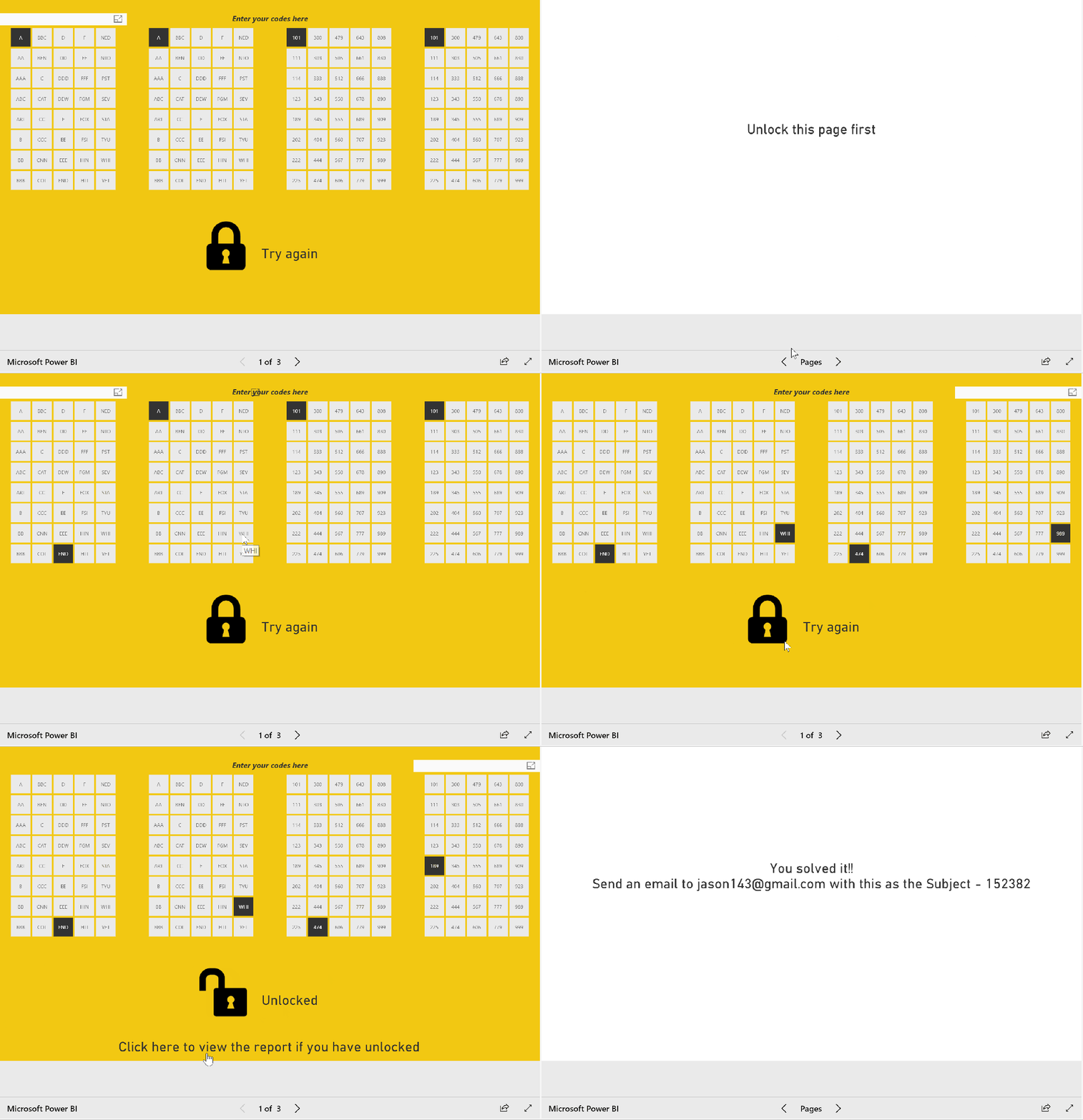
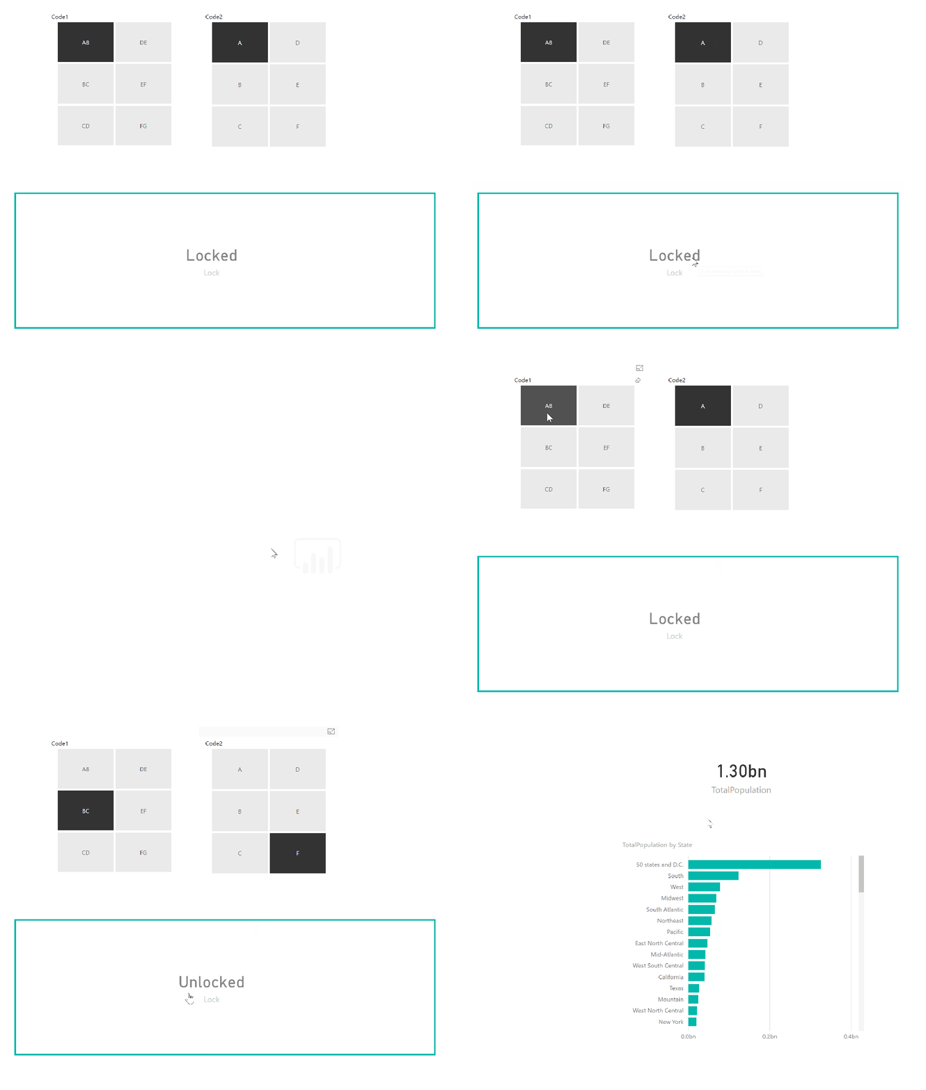
Now that everyone has read the warnings, let us get to the fun stuff. First, see how the codes were used in the puzzle to lock a hidden tab and how the hidden tab showed the right results when the correct code was selected.

Lock

To demonstrate this technique, I will create a simple report with only 2 codes, but you can easily expand this to multiple codes. Follow the steps below:-

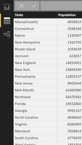
1) For the purpose of this demo, I just connected to Wikipedia and got the population by states.

image

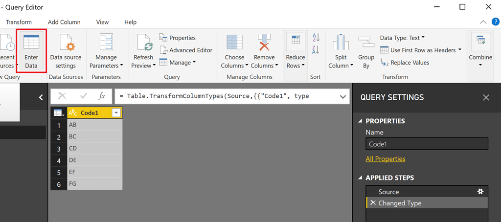
2) Along with that, I just entered data directly into the power bi file and created 2 code tables. The code tables will contain your codes and can be anything. To make it simple, I just made it as 2 letters as shown below.

image

The more entries you have and the more code tables you have, the larger your permutations and hence, the harder to crack your code.

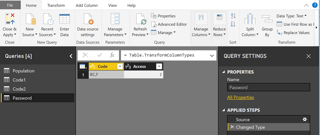
3) Create a password table with 2 columns – with one column as the correct code, and the other one as 1. This table will be used to check against the selected codes for a match with the help of a calculation.

image

4) Now that we have our code tables (Code1 and Code2), password table and the data table, let us proceed to the reporting canvas. Make a measure called Lock which will check if the selected values of Code1 and Code 2 match the password.

Lock =
VAR Code =
SELECTEDVALUE ( Code1[Code1] ) & “,”
& SELECTEDVALUE ( Code2[Code2] )
VAR Pswd =
CALCULATE ( FIRSTNONBLANK ( ‘Password'[Code], 1 ), ‘Password'[Access] = 1 )
RETURN
IF ( Code = Pswd, “Unlocked”, “Locked” )

5) Make another measure that will display the sum of the population only if the correct codes are entered.

TotalPopulation =
IF ( [Lock] = “Unlocked”, SUM ( ‘Population'[Population] ) )

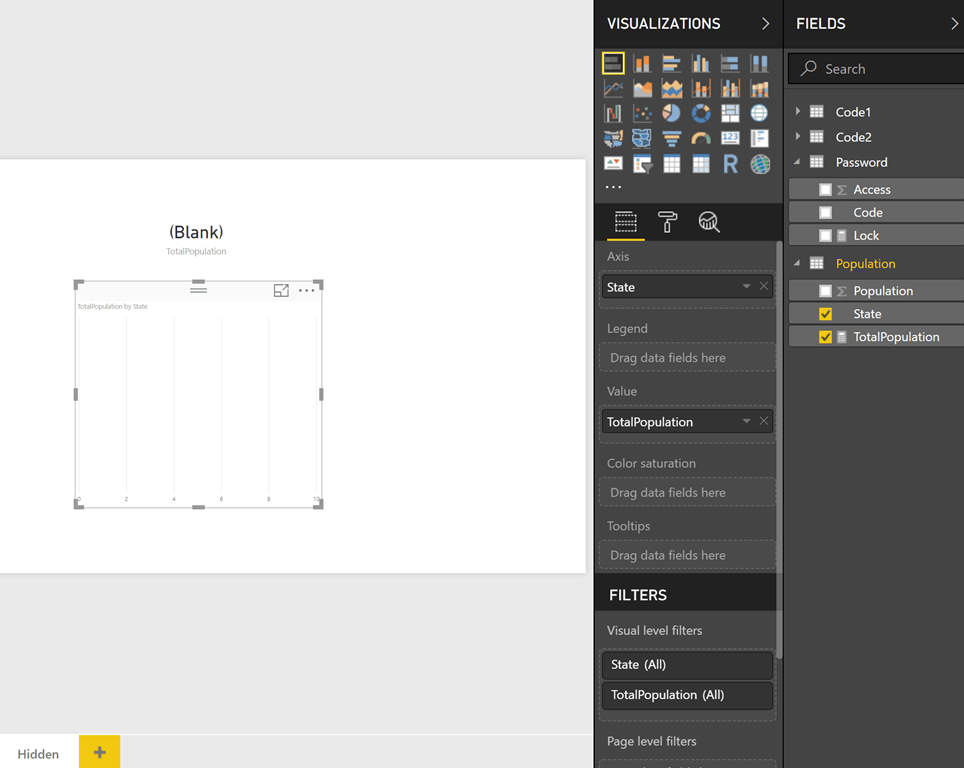
6) Now create a tab called Hidden. Use the new measure that we created in step 5 (Total Population) to create a bar chart by states and a card visual on the top. You will see that no data is displayed and that is because we haven’t selected any values for the Code tables (Code1 and Code2)

image

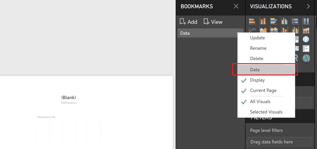
7) Create a bookmark with this view and rename it. Click on the three dots next to the bookmark, and makes sure that you uncheck the Data tab. This will ensure that the bookmark will respect any filters or slicers.

image

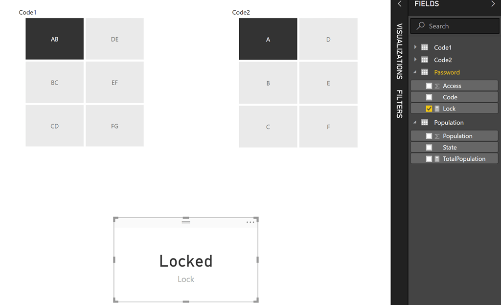
8) Now create a new page where you can display the Codes. Display Code1 and Code 2 as slicers. Also, display the Lock measure as a card visual.

image

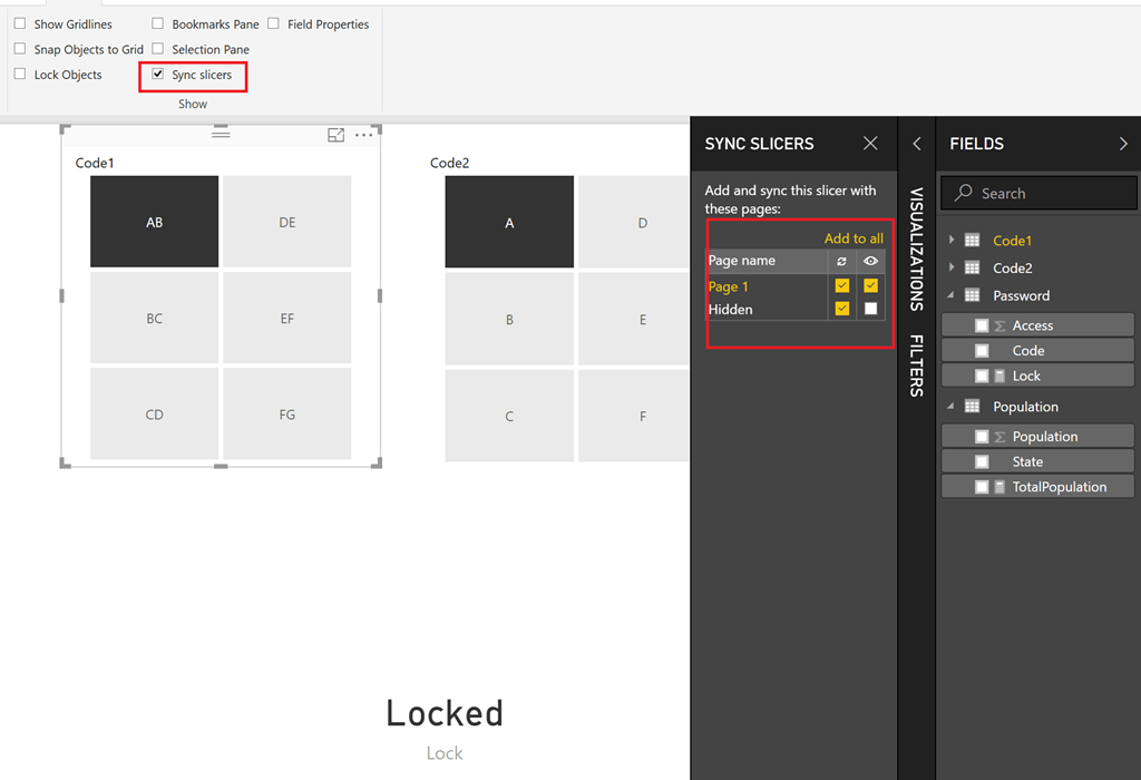
9) Sync both the slicers (Code1 and Code2) with the Hidden page. Make sure that the slicers are not visible in the Hidden page though. The selections are shown in the image below. By the end of this step, whatever codes you select in this page will also be passed to the Hidden page.

image

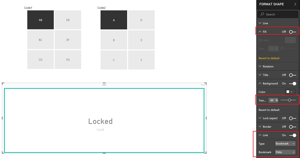
10) Now all that is left to do is to put a rectangular shape on top of the card visual (with some transparency), and add a link to the bookmark we created.

image

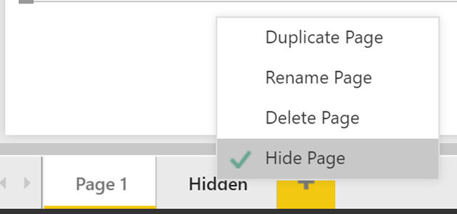
Also make sure to hide the Hidden tab.

image

11) Now we can publish this to Power BI, and then Publish to Web. See the end result in action below.

Solution

NOTE: For some reason, the initial password gets cached and exposed in the trace and this is another reason why you will not want to try this with your confidential data, and only use it for fun projects. That said, once I changed the password and republished it, the new password did not get exposed and it was still the old password that was getting exposed in the trace.

Posted by SQLJason in DAX, Power BI, 2 comments

Announcing the winner of the Power BI Game (as well as the solution)

Since yesterday, we had over 200 unique users try out my Power BI Game and as of now, 6 users have cracked the puzzle. I am pleased to announce that we have a winner for the contest and he responded with the answer 64 minutes after publishing.

image

The winner of the contest is Cory Tollefson (twitter) from Minnesota and he gets an Amazon gift voucher worth $100 for his efforts.

Spoiler Alert : Those who want to read how he solved it, click here. For others who still want to keep trying, but need an extra clue, I will add individual spoilers for the clues below


“I think I solved your Power BI game. Pretty cool but I’m a little ashamed at how many times I clicked the Red Herring clue line thinking I was missing something or it had two meanings.

First clue was END and it started with birthday cake into the Marilyn Monroe pillow because of Happy Birthday, Mr President which led to the presidential seal on the door. She sang it for JFK so took the letters from his name.

Second clue was the water bottle with the muppets that led to Kermit and then Steve Whitmire (had to Google him though) and took the letters from his name.

Third clue was the book to the upside down Eye of Providence which was a bit of an educated guess. That led to Freemasons square to the Mona Lisa for the 3 digit code of 474.

Last one was tricky until I went to full screen and saw the words on the mug matched some of the souvenirs. Mug to Venice souvenir to Crown Medallion to Amsterdam souvenir to Lisbon souvenir to map of Germany. Then took the digits from the year the Berlin Wall came down for 189.”

[collapse]

As stated in the rules, there are no other prizes but I want to recognize all the 6 people who have solved the puzzle along with their timings (note that the timing is based on the time of publishing (10 am EST 2/19/2018) , and not the actual time taken to complete the puzzle) -

1) Cory Tollefson (twitter) from USA – 1 hr 4 mins

2) Sam Lester (twitter) from Germany – 1 hr 9 mins

3) Shannon Lowder (twitter) from USA – 2 hr 9 mins

4) Haydn Carline from UK – 5 hrs 25 mins

5) Philip Chan from Canada – 16 hrs 52 mins

6) Ken Geeraerts (twitter) from Belgium – 22 hrs 51 mins

Great job, everyone!

Now, I will give out individual spoilers below:-

Spoiler Alert : Red Herring

If you had turned on the white light switch (or if you knew Greek alphabets, you would have understood the words on top of the door – DO NOT ALLOW THE EYE TO FOOL THE MIND, which was basically a warning to not click on the Eye of Ra medallion and go on a wild goose chase. The wild goose chase here would be –

click on the Eye of Ra medallion which will instruct you to click on Ra’s likeness, the statue

click on Ra’s statue and it will ask you a riddle. A simple google would have given you the answer as Day & Night. This was apparently a riddle asked by the Sphinx to Oedipus. Try to find something related to Day & night within the room.

click on the Starry Night painting (which is related to Day & Night) and that will instruct you to click on the words on top of the door, and that will confirm that all the work you did was for no use.

[collapse]

Spoiler Alert : First Clue

Click on the birthday cake, and google the message. You will find that the words are actually taken from a birthday song sung by Marilyn Monroe for John F Kennedy.

Click on the Marilyn Monroe pillow and then click on the Presidential Seal medallion hung on the door. The code is the 2nd, 4th and 6th letters from JFK’s last name – END

[collapse]

Spoiler Alert : Second Clue

Click on the bottle which has the picture of Muppets on it. Find something related to the Muppets.

Click on the green “Kermit the frog” toy and note that the commentary asks if you know your Muppets well.

Click on the first photo frame on the left wall, which is of Steve Whitmire, the voice of Kermit the Frog. The code was the 1st, 2nd and 3rd letters of his last name – WHI.

There was an additional clue – “Legends of Rock. Or are we?”. The other 2 are in fact legends of rock - Mick Jagger (The Rollin Stones) and Kirk Hammett (Metallica)

[collapse]

Spoiler Alert : Third Clue

Click on the Dan Brown book on the table – a book on lost symbols.

He also talks about secret societies and symbols, and the medallion with the upside down Eye of Providence is a symbol of FreeMasons. Click on it.

Then click on the Square tool lying on the ground, which again is a symbol of FreeMasons. That will ask you to click on the Mona Lisa painting (which again was referred in Dan Brown’s books) and the code will be revealed behind the painting - 474

[collapse]

Spoiler Alert : Fourth Clue

Click on the white coffee mug with the names of the European cities written on them.

Then click on the souvenir for Venice (on top of the door), London (the middle medallion in the shelf with Queen Elizabeth II’s logo), Amsterdam (left most souvenir on top of door), Lisbon (the blue tile souvenir on top of the door) and Berlin (the German map showing East Germany and West Germany).
The code is the 1st, 3rd and 4th digits of the year in which the Berlin Wall fell (1989) - 189

[collapse]

Hope you had as much fun playing this as much I had making it for you! Let me know in the comments how was your experience.

Posted by SQLJason in Power BI, 1 comment

A Power BI Game… and a chance to win some prizes too!

Update (2/20/2018) - This contest is now closed. Winner (as well as how to solve the puzzle) announced here.

Over the years, I have participated in my fair share of Power BI contests and for most of them, I bugged a lot of you for votes (so that I can go to the next round). Thanks to your love and support, I have won a couple too. I have put those days behind me, now that I have joined Microsoft (and employees are barred from participating in any kind of contests that are organized by Microsoft). That said, I always wanted to do something back for the community, for everything you have done for me, but had no idea how to implement it. That is when I saw a community post that was shared on Twitter, and I decided to make a fun game out of it using a modified technique (more details on the inner workings will come in a following post).

puzzle

The rules for this game are simple – just unlock the codes on the first tab to reveal a secret tab with details on how to claim the prize. There is a second tab that has a puzzle, solve it to reveal the codes. Click around on the items around the room in the second tab for clues, and if you click on the right ones, they will tell you what the codes are. Your observation skills as well as your general knowledge skills will be put to the test here. Rules are explained in detail on the third tab of the report. Read them carefully. The first person to solve the challenge according to the rules will win the prize. The contest may just last for minutes or may last for 1 week – depending on how fast you solve it. If no progress is made by end of Week 1, I might start throwing extra clues on twitter, so stay tuned! I will also announce the winner on my blog once we are done with the contest.

Maximize the report for a better experience before you sit down to solve the clues. As for people who are curious on how this was done, the main concepts are:-

1) Bookmarks

2) Sync Slicers

3) Dynamic measures

4) Hide tabs in Power BI

May the best man / woman win!

Posted by SQLJason in Power BI, 0 comments

Customizing Data Alerts in Power BI using PowerApps

So this happened yesterday – one of my customers pinged me and asked whether it is possible to set customized data alerts for her end users? I froze for a second, knowing that such a functionality is not available out of the box but knowing how flexible Power BI is, I decided to explore her use case further. Worst case, I know I have the backing of the world’s best product team, and could submit a request to build this for us. Basically, she wanted her end users to get data alerts if specific products got sold in the last 24 hours (which should have been easy with the regular data alerts functionality in Power BI), but the challenge was that she wanted her users to set (add/delete) their own products. As I said earlier, this functionality is not available out of the box but with the PowerApps custom visual for Power BI and some DAX, we can definitely create a workaround.


image


As with any of my PowerApps post, this is going to be long, so scroll to the bottom if you just want to see the end result.


Source

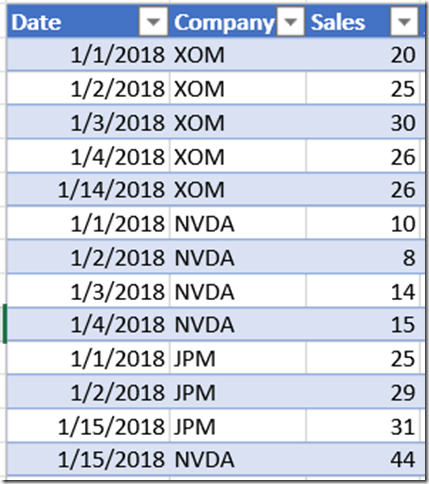
The data source that we will be using for this post is a simple excel file stored in One Drive for Business. The excel table gives the sales by company and date. The requirement is that the end users should get data alerts if any sales occurred in the previous day for any of the companies that they chose.


image


Solution Summary

To achieve the end result, we will create a table that maps the users to the companies, and then create a DAX measure in Power BI that shows the Sales if the conditions are met. The mapping of the companies to the users can be entered directly by the end users using a PowerApps custom visual within Power BI. The DAX measure can then be pinned to a dashboard and the alerts can be set on top of it. Also, Row Level Security has to be applied on the mapping table to ensure that the End user sees only his selections.


Solution

Follow the steps below:-

1) Create a user mapping table in an Excel file and store it in One Drive for Business (I am using Excel file stored in One Drive, but this could be any of the data source that PowerApps can read/write from and Power BI can read from). For now, I am adding 2 users – Admin and AdeleV and their selected companies for which they would like the data alerts.


image


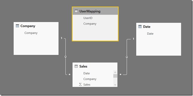
The model would look like below. Note that the UserMapping table is a disconnected table.


image


2) Create a measure that satisfies the 2 requirements – filter selected companies for the user and sales from yesterday.

SalesAlert =
CALCULATE (
    SUM ( Sales[Sales] ),
    — Filter the Company table based on the companies mapped to the User in the UserMapping table
    TREATAS ( VALUES ( UserMapping[Company] ), Company[Company] ),
     — Filter sales for yesterday
    Sales[Date]
= ( TODAY () - 1 )
) + 0


3) Create a new role and set RLS for the UserMapping table. The intention is to filter the UserMapping table to the current user who has logged in and that can be done with the expression below

UserMapping[UserID] = USERPRINCIPALNAME ()

image


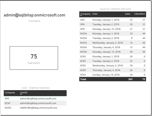
4) Create a simple report with the SalesAlert measure that we created in Step 2. Note that I am also adding the User name, UserMapping table as well as the Sales table so that you can see what is happening when we are logging in as different users. Right now, I am still logged in as Admin.


image


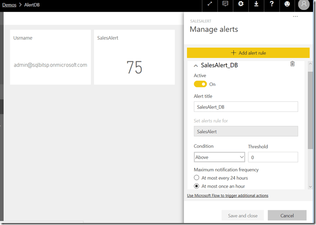
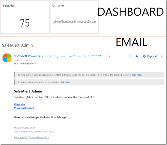
Pin the SalesAlert card to the dashboard (along with the Username card, so that you can see who is logging in). I also created a simple data alert that sends an email if the threshold is above 0. The dashboard is shown below

image


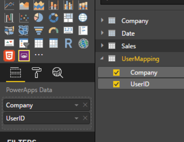
5) Go back to the Power BI report, edit it in the Power BI Service so that you can create a PowerApps custom visual. For this demo, I am passing the UserID and Company in Power BI.


image


6) Then, I created an app with 3 screens and the 2 data sources used are the UserMapping table in Excel as well as the Sales table in Excel. Let us look at the Home screen first, where we will display all the companies that are selected for the appropriate user.


The main highlights here are

  • A plus icon to navigate to the AddScreen - OnSelect property set to Navigate(AddScreen, Fade)
  • A dropdown to display the UserIDs from Power BI.
    • Items property set to Distinct(PowerBIIntegration.Data, UserID)
    • Default property set to First(PowerBIIntegration.Data).UserID
  • A gallery to display the companies for the selected UserID
    • Items property set to Filter(Mapping, UserID in Dropdown1.Selected.Value)
    • NextArrow Icon to navigate to EditScreen – OnSelect property set to Navigate(EditScreen, Fade)


7) The next Screen is the EditScreen. This screen is used to delete an existing mapping.


The main highlights here are

  • A X icon to cancel out from the screen – OnSelect property set to Navigate(HomeScreen, Fade); ResetForm(Form1)
  • A trash can icon to delete the selected record – OnSelect property set to Remove(Mapping, CompanyGallery.Selected); Navigate(HomeScreen, Fade)
  • An Edit form
    • Data property set to Mapping
    • Fields are Company and UserID
    • Item property set to CompanyGallery.Selected


8) The last screen is the AddScreen and is used to add any new mappings for the end user.


The highlights from this screen are

  • Edit form to add the records
    • DataSource property set to Mapping and Item property set to Defaults(Mapping)
    • Company and UserID fields are selected
    • Company – Items property set to Distinct(Table1, Company) and Default property set to First(Table1).Company. This will display all the companies from the Sales table in the dropdown
    • UserID – Default property set to User().Email
  • X mark to cancel out from the screen – OnSelect property set to Navigate(HomeScreen, Fade); ResetForm(EditForm3)
  • Tick mark to add the entry – OnSelect property set to SubmitForm(EditForm3); Navigate(HomeScreen, Fade); ResetForm(EditForm3)


9) Once you save and publish the app, also make sure that you are sharing it with all of the end users. 

10) Save the Power BI report, and publish it as an app. Share the App with the end users (in my case, Adele and Alex).

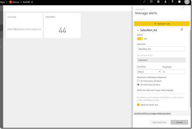
11) Make sure that the end users can access the App and also, make sure that each one of them creates a data alert on the dashboard with the same condition (just like we did in Step 4). The image below shows the data alert for Adele.


image


12) Now the users should start getting alerts for the companies that they have selected. Based on our data alerts,

  • Admin should get a data alert email if JPM, XOM or NVDA has a transaction for yesterday. Note that if you are an administrator, you will get the alert even if the data alerts for one of the end users’ condition is true. This is because the way we have setup the measure and Row Level Security, an administrator can see all the companies for all the users, and hence will get an alert if one of the selected companies has sales for yesterday (Jan 15).

image


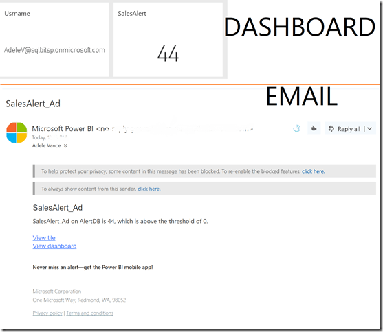
  • Adele should get a data alert email only if there is a transaction for NVDA (44 for Jan 15). In this case, she will get a data alert.

image


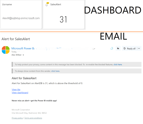
  • Alex will not get a data alert as he has not selected any company.


13) Now login as Alex, and navigate to the report. Use the PowerApps custom visual that we created before to enter a new selection (in this case, JPM) for Alex. You can either wait for the dataset to be refreshed, or in my case, login as an admin and refresh the dataset manually. Once the dataset is refreshed, Alex can see the company that he selected in the mapping table, and can also see that the SalesAlert measure has been updated. 


14) At this point, Alex should also receive an email alert.


Summary

Even though customized data alerts are not possible out of the box in Power BI (so far, as of 1/16/2018), it is possible to use the PowerApps custom visual, and make customized data alerts for each of the end users as well as give them the ability to modify / add their selections for data alerts.


Related

Adding Comments & Sending Emails in Power BI using PowerApps


Posted by SQLJason in Power BI, PowerApps, 0 comments

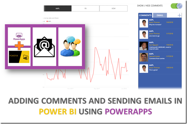
Adding Comments & Sending Emails in Power BI using PowerApps

A couple of days ago, a new custom visual was released for Power BI – PowerApps (in preview mode). As mentioned in the team blog, there are a ton of use cases–

you will be able to pass context aware data to a PowerApps app which updates in real time as you make changes to your report. Now, your users can derive business insights and take actions from right within their Power BI reports and dashboards. No need to switch tabs to open the separate apps, copy paste data from one window to another or worry about fat fingering the wrong customer id or invoice amount.

If you think about it, this is a game changer – you finally have a BI tool that allows you to collaborate and take actions right within the report. How many times have you looked at a report, found out an insight and wished that you could send an email to the account manager, only to forget later? Well, now you don’t have to worry about that, as I am going to show you an example of how we can collaborate by adding comments within the report (not just comments, but context aware comments, based on what you are selecting) as well as show how to send emails (to the appropriate people based on your selection).

Note: This is a long post, as PowerApps might be new to many BI folks and I wanted to include as many images as possible. If you just want to see the end result, please scroll to the end.

Adding comments and sending emails in Power BI using PowerApps

Steps

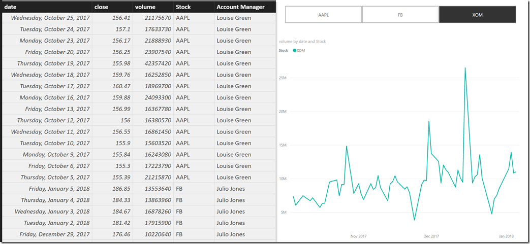
1) For this demo, I am using a simple Power BI report that shows the stock volume for three companies by date and their account managers. I made a simple line chart along with a slicer for the companies in Power BI Desktop, as shown below.

image

2) Deploy the report to Power BI service, and then edit the report. Add the PowerApps custom visual from the store.

3) Now click on the PowerApps custom visual, drag and drop the Account Manager and Stock into the PowerApps data field, and click on Create New.

4) The intention of the PowerApps visual is to provide an input area for the comment as well as to send emails to the account managers of the respective companies. For storing the comments, I am using a simple table in an Excel file and the format of the table is given below

image

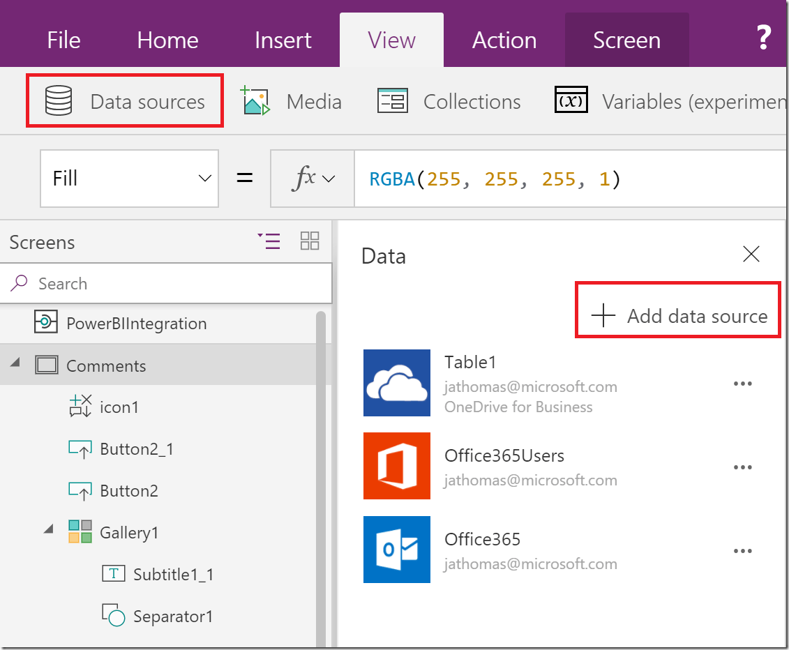
Note that we have a column for the stock, comments, date of entry and the user who entered the comment. Now, go ahead and create 3 new data sources - Office365 Outlook, Office365Users and the Table in the excel file.

image

5) At this point, I started editing the comments page (which is the first page) and the final result is given below.

Some of the key changes that I did are:-

  • Changed the Data field in the Gallery to filter for only those fields in the Table1 (comments table in excel) which are filtered in Power BI.

image

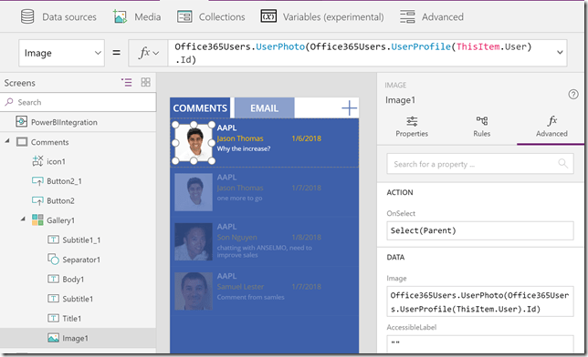
  • Changed the Gallery layout to display the Stock, User, Comments, Date from the Excel file as well as the photo of the user. You can get the photo of the user by using the formula given below

Office365Users.UserPhoto(Office365Users.UserProfile(ThisItem.User).Id)


image

  • Changed the background color of the Gallery to blue, and also added 3 buttons – Comments, Email and the plus icon. The Comments and Email button are given appropriate colors so that it looks like a tabbed structure. Also, their OnSelect properties are set to navigate to Email page and AddComments page on selecting.
    • Comments – No formula.
    • Email – OnSelect property is set to Navigate(Email, Fade)
    • Plus Icon – OnSelect property is set to Navigate(AddComment, Fade); ResetForm(EditForm1)

6) The next page is the Email page and is used when you want to send an email to the account manager without adding a comment. For eg, maybe you want to send a confidential email to the account manager about an insight or question.

SendEmailTab

Some of the key changes that I did are:-

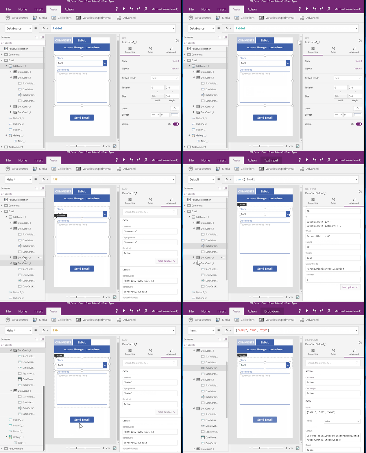
  • Created a form for Table1 and displayed the stock & comments. Also added the User and Date fields, but hid them (by setting the DisplayMode property to Parent.DisplayMode.Disabled) after giving a default values
    • User – Default property set to User().Email
    • Date – Default property set to Today()
  • Created a button for Send Email, which will send the message as an email. Set the OnSelect property to the formula given below

Office365.SendEmail(“[email protected]”, “Comments for ” & DataCardValue4_1.Selected.Value & ” from ” & User().FullName, DataCardValue2_1.Text); ResetForm(EditForm1_1); Navigate(Comments, Fade)

  • Added the Default value of the Stock to the formula below, so that it will default to the value selected in Power BI

LookUp(Table1,Stock=First(PowerBIIntegration.Data).Stock).Stock

7) The next page is the AddComment page. This is the page that you navigate to when you clicked on the Plus Icon in the Comments page and is used for adding comments.

AddComments

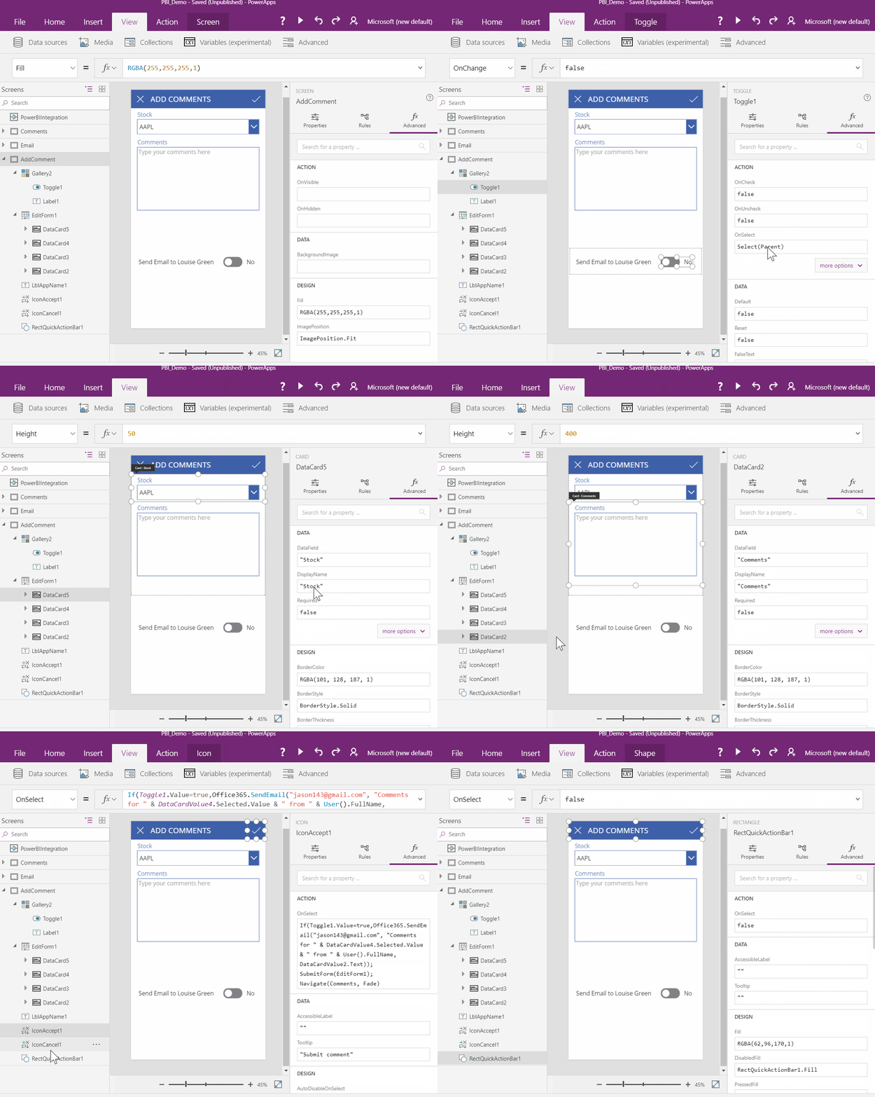
Some of the key changes that I did here are:-

  • Similar EditForm as the Email page – displaying only Stock and Comment and hiding User and Date
  • A toggle that determines whether you want to send an email along with adding the comment or just add the comment only.
  • 2 icons on the top
    • one for canceling the form – OnSelect property set to Navigate(Comments, Fade); ResetForm(EditForm1)
    • one for submitting the form. OnSelect property is set to

If(Toggle1.Value=true,Office365.SendEmail(“[email protected]”, “Comments for ” & DataCardValue4.Selected.Value & ” from ” & User().FullName, DataCardValue2.Text)); SubmitForm(EditForm1); Navigate(Comments, Fade)

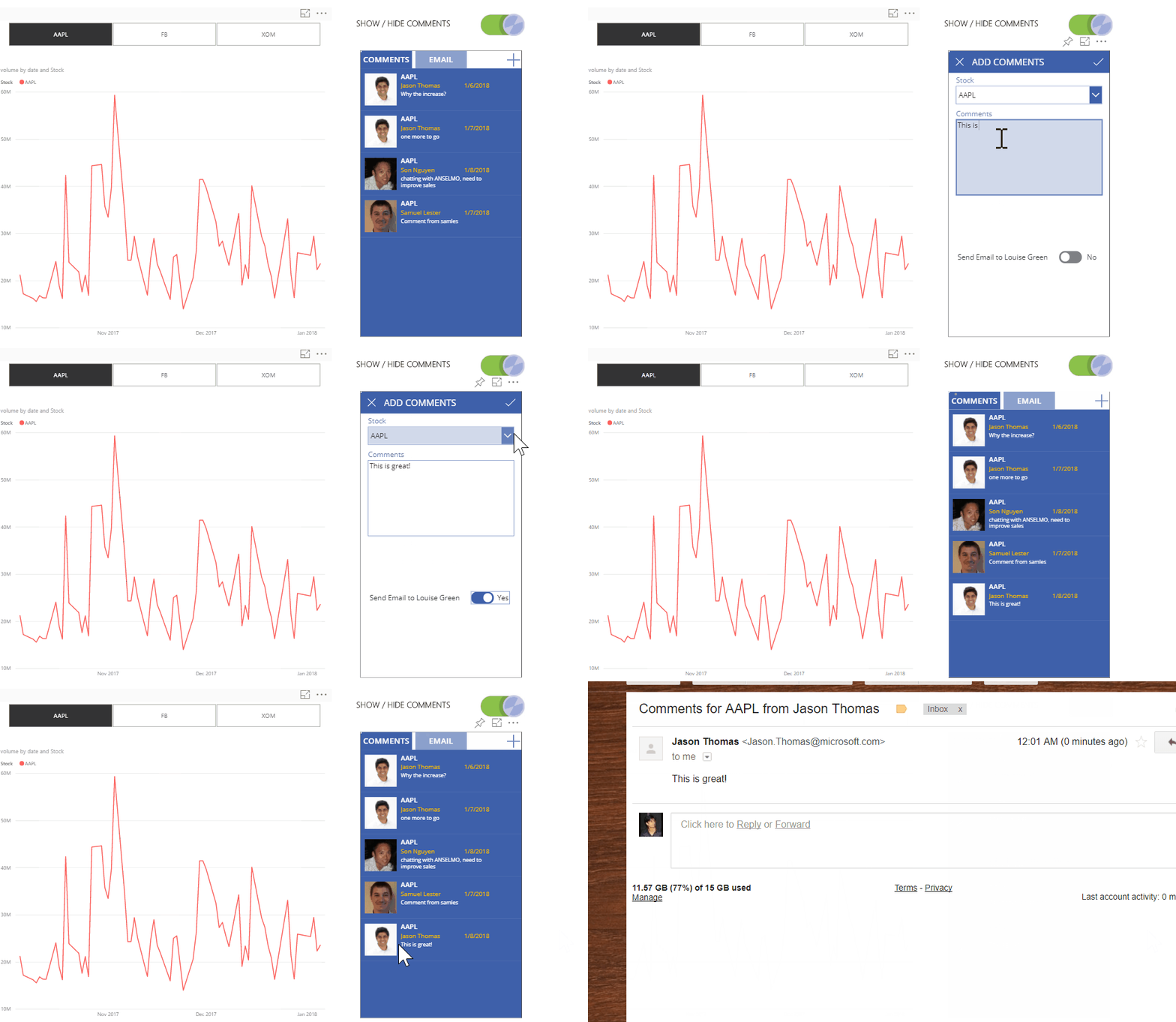
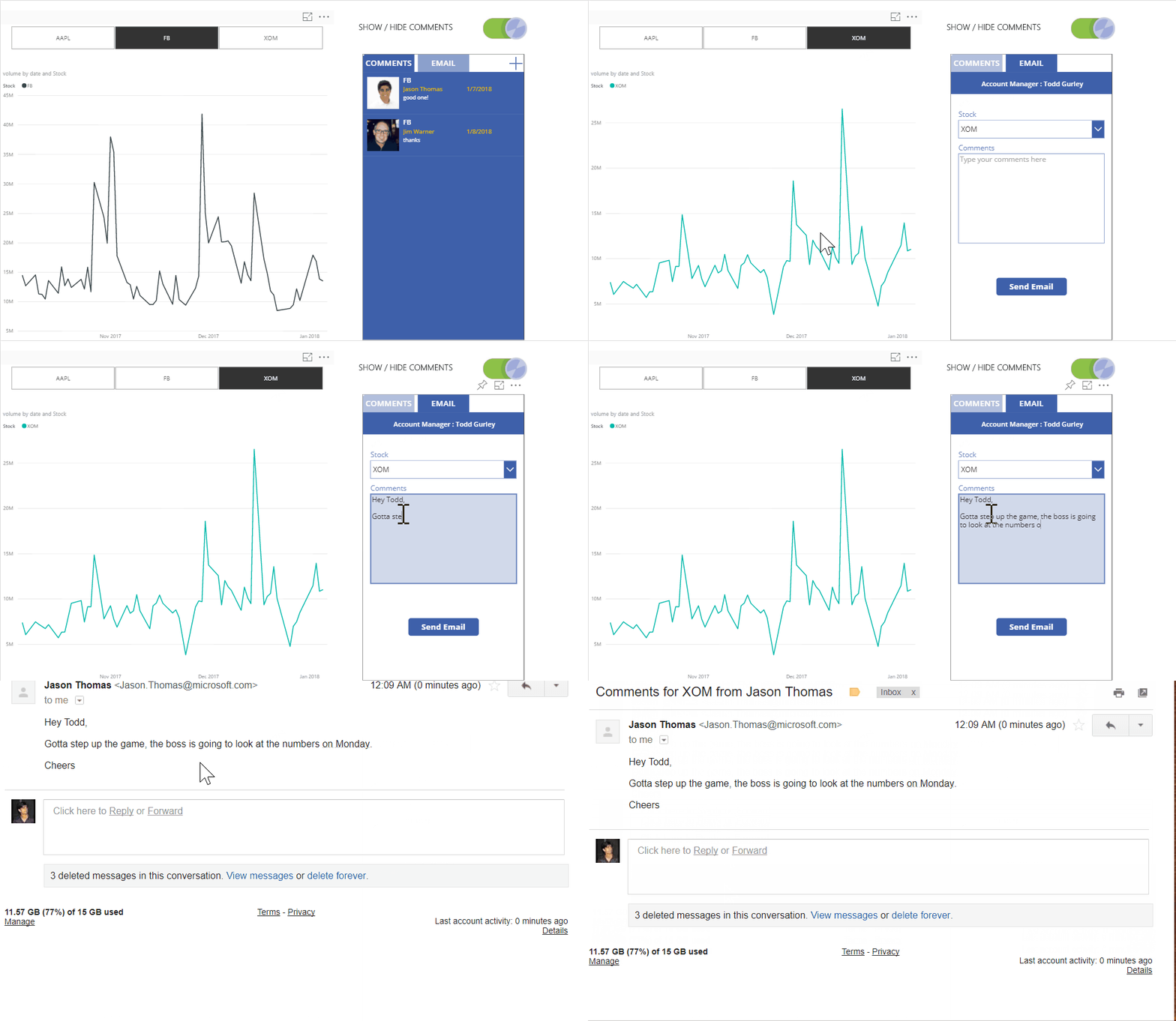
8) Now you can save and publish the app. See the results in the Power BI page. I also added a toggle using bookmarks in the Power BI page to show/hide the comments / PowerApp visual.

  • Show contextual comments

PBI Show contextual comments

  • Add comments based on what you have selected in Power BI. Also note that an email has been sent to the appropriate account manager with the comment.

PBI Add comments

  • Send an email to the account manager directly (without posting the comments)

PBI Send Email

I am pretty sure you guys are going to find a lot more use for this custom visual. Note that this is currently in Preview, so it is likely that you will hit upon some bugs / issues, but those should be gone when it is released.

Posted by SQLJason in Power BI, PowerApps, 32 comments