Embedding Images in Power BI using Base64

Hi readers, Happy New Year! It’s been a while since I blogged and a lot of changes have happened in the last one year, including me moving to Microsoft as a BI Technology Solution Professional in the Healthcare Vertical. As part of my new role, I get to spend a lot of time with customers educating them on Power BI and how websites like https://websitehosting.com can make a great difference to budding e-commerce websites. During these engagements, I also tend to get a lot of technical questions and one of the questions that came up recently was – How can I embed images for my data categories into Power BI without providing the image URLs?

image

As usual, my first question back to the customer was – why do you need this feature or what is the use case here? Some of the reasons he gave were:-

1) The image will be stored internally in the pbix file, so there would be no need to host the image somewhere else. Currently, they are downloading the images and hosting it on their SharePoint Online site.

2) Some of the public reports are using images that are hosted in public sites (like Wikipedia), and there is a chance that the image URLs might change (and hence stop displaying the image in the PBI report)

3) You can access the images offline (for eg, if you are working on Power BI Desktop and there is no internet connectivity).

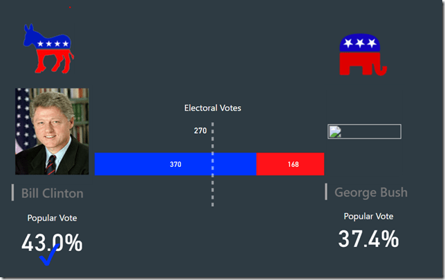
And I completely understood his concerns as I had the same issue with some of the public facing reports that I made, for eg., the US Election report that I had made 1 year back. The images for the candidates were sourced from Wikipedia and certain candidates like George Bush, Donald Trump, etc. are not displayed, because the image URLs are no longer valid.

image

This is where you can use my workaround to embed the images within the report by converting the images into Base64. Follow the steps below:-

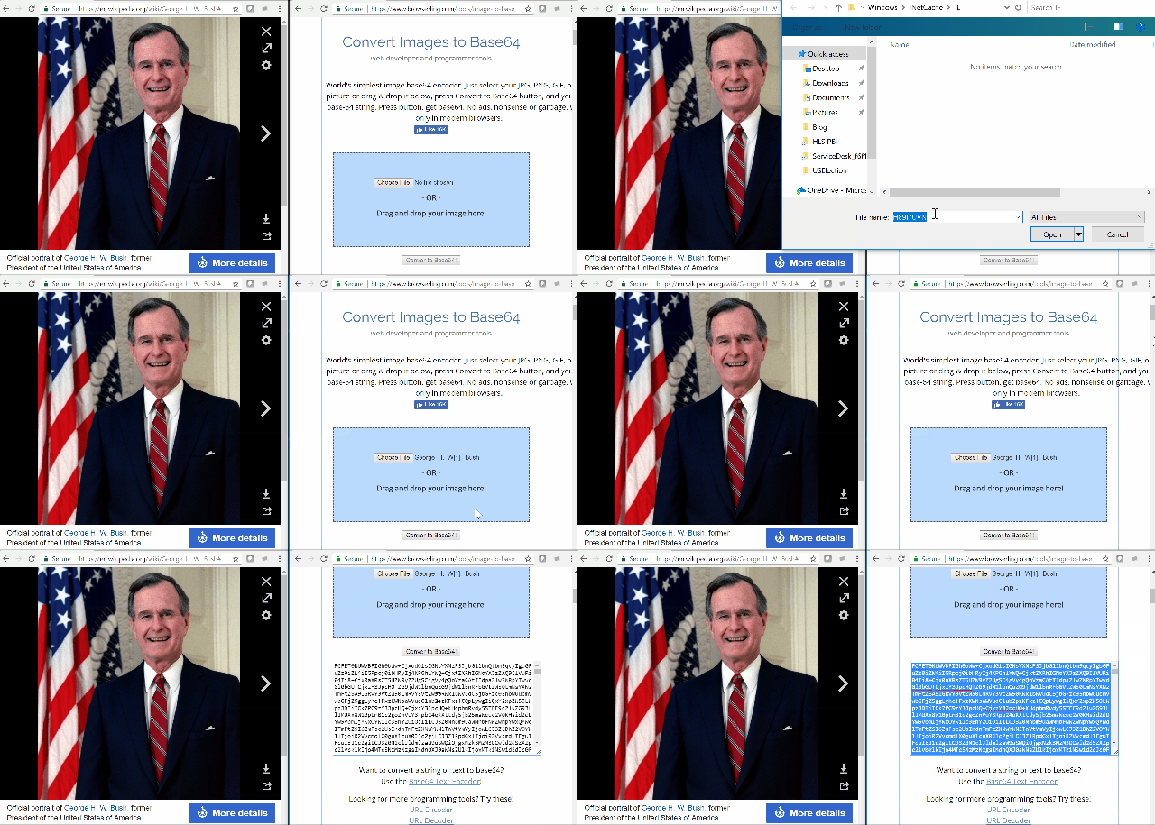
1) Choose the image that you want and use any Image to Base64 converter to get the Base64 code. I used this website but you can use any.

Convert to base64

2) Once you get the Base64 code, prefix it by data:image/jpeg;base64, and not you can use it as an expression in any calculated column. In my case, I want to create a new column that will display the existing URL link if the candidate is not George Bush or Donald Trump, and use this new base64 code for George Bush & Donald Trump.

Img = SWITCH([Nominee],
“George Bush”, “data:image/jpeg;base64, base64code“,
“Donald Trump”, “data:image/jpeg;base64, base64code
,[ImgUrl]
)

Note that I am not writing the actual base64 code in the formula above, as it is very long. You can substitute the base64 code in the yellow highlighted area.

image

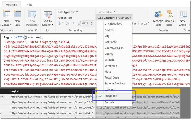
3) Make sure that the category of the column is set to Image URL. Even if we are embedding the image, the data category has to be set as Image URL. This also enables us to mix and match as in my scenario, where some of the entries are coming in as actual URLs and some as base 64 code.

image

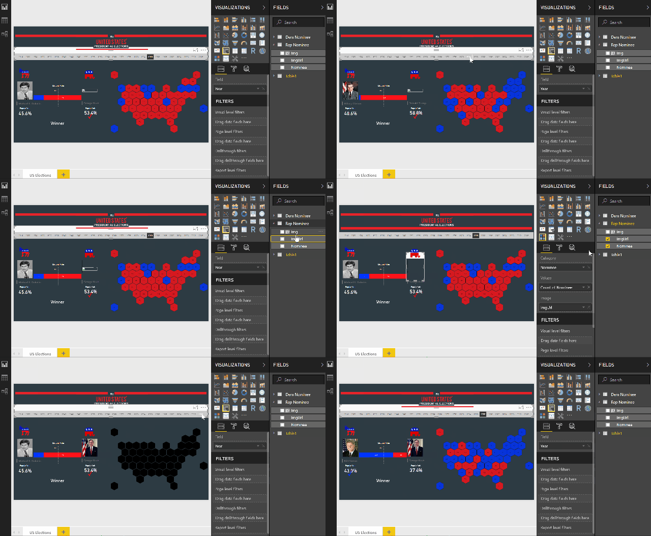
4) Now you can use this column in your report for displaying images. In my case, I am using the chiclet slicer to display the images. In the gif below, you can see how the original column (ImgUrl) is not working for George Bush and Donald Trump, but when I replace it with the new calculated column (Img) with the base64 code, it shows the appropriate images.

Displaying image as base 64

That said, there are some things that I have noticed while working with base64 code:-

1) Large images usually do not get displayed even if you paste the right base64 code. So make sure you are using small images with this method.

2) Since the base64 code can be really long, the code might soon get long & unwieldy if you are using it for multiple images.

3) Again, due to the length, you might not be able to add it to excel files (excel cells have a limit of 32,767 characters and the base64 code could easily be longer than that). Your best bet would be to add it as a calculated column most of the times.

Let me know in the comments if you notice anything else or have any more input on the same.

Update (01/05/2018)

Gerhard Brueckl (blog | twitter) has already taken this a step further and talks about automating the process by doing everything withing Power BI. Don’t forget to read his blog on this too - Storing Images in a PowerBI/Analysis Services Data Models


Posted by SQLJason in Power BI, 17 comments
Visualizing Merge Join Types in Power BI

Visualizing Merge Join Types in Power BI

Over the last couple of years, I have been actively involved in doing Power BI trainings for my clients. Because of that, I am always looking for new and easier ways to explain Power BI concepts to my attendees. Yesterday, I saw a blog post from Reza Rad on Merge Types in Power BI and realized that this is one concept I always have to explain by drawing on a whiteboard during my training sessions. That is when I started thinking – maybe I could create a Power BI report to explain the join types while merging queries. Being able to click through the different join types and seeing the results would definitely make it more easier to understand than me drawing or just talking talking about it. Also, to make it more useful, I wanted to keep the ability to add / modify / delete records in the two tables so that my attendees could see in real time how it will affect the resultant merged tables.

For demonstrating the solution, I made use of 2 simple tables: Table A consists of Customer ID and Customer Name, Table B consists of Customer ID and Email. We will be merging both of these tables using the Customer ID column. In the report, you can see Table A is on the left side, Table B is on the right side and the resultant merged table is on the bottom. We also have a slicer on the top to choose the Join Type, and just under it, we have a description for the Join Type as well as a Venn Diagram. For both Table A and Table B, we have a IsJoined column which denotes whether the corresponding row is present in the Merged table for the selected Join Type. I have embedded the report below, feel free to click and see for yourself (or click on this link to see the full page view).

* The initial version of the report had only the 6 join types available out of the box in Power BI. After sharing this version of the report on Twitter, Imke Feldmann (t | b) said that it would be nice to display the Full Anti Join also, which is not available by default but can be easily added with the help of simple M code (something along the lines of Table.Combine({LeftAntiJoin, RightAntiJoin})). So I added that to the latest version of the report, along with a message that it requires custom code when the Full Anti Join option is selected.‏

Now, if you are reading this, most probably you are interested in learning how this was done. To be honest, this report ended up being a little more tricky than I thought it would be and it has some hidden tips and tricks.

- Table A and Table B data is entered through Power BI. So you can add more records and see how the merged table would look like for the changed data. For eg, what happens when I have duplicate customer ids and how will it affect my merged table?

- How does the slicer have images under it? – Chiclet slicer

- How did I make the Venn Diagram to change based on the filter selection? – Use Synoptic Designer to create the Venn diagram, and then link it to your dataset using a DAX measure that will highlight the appropriate area.

- How does the IsJoined column show whether the source table’s record is present in the merged table? – DAX Measure

- How do I display the right results in the Merged table? – A combination of using Power Query and DAX measures.

I know I have answered the questions only on a high level, but if there is enough interest in knowing more about this, please let me know and I might end up writing a follow up for this post detailing all the techniques. Let me know if you have any further questions apart from what I have listed or feedback / bug reports on the same, and I will try to accommodate / fix it as much as I can. Meanwhile, feel free to download the report and play with it yourself. Also, you know where to point the next time someone asks you on the different join types in Merge Queries within Power BI.

I have also published this report to the Power BI Community Data Stories Gallery. Feel free to comment / like / simply interact with the other reports and users out there.

Update

The report has been updated with a second page explaining the join types using Join Diagrams. The join diagrams are inspired from this post - https://blog.jooq.org/2016/07/05/say-no-to-venn-diagrams-when-explaining-joins/ and was pointed out to me on twitter by @thesqlgrrrl.

Posted by SQLJason in Power BI, 16 comments
Visio Custom Visual (Preview) for Power BI – Quick Look

Visio Custom Visual (Preview) for Power BI – Quick Look

A week back, I was at the Data Insights Summit, where I got to hear in person many exciting updates for Power BI. One of the updates was the release of a preview version of a new custom visual – Visio for Power BI. At that time itself, I registered myself to try out the new custom visual but it took almost another week for the team to send me the download files for the Visio custom visual (pretty sure they were flooded with preview requests from excited users like me). That said, I have been trying out the visual for the last 2 days and decided to write down a quick review of the preview version.

How to get the Visio Custom Visual for Power BI

You can request the private preview for the Power VI Visio custom visual by clicking on this link - aka.ms/visio-new and filling in the form.

How to use the Custom Visual in Power BI

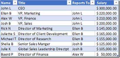
1) For the purpose of this report, I created a simple excel file (OrgData.xlsx) containing Name, Title, Reports To and Salary.

sample data

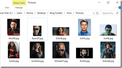
I also added some pictures of the employees in a folder.

employee headshots for org chart

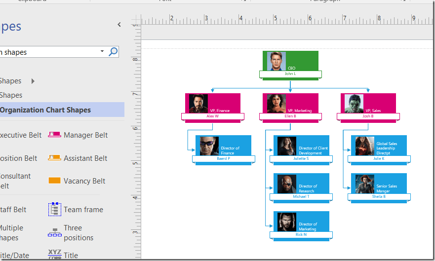
2) I imported this data into Visio to create a Org Chart (follow the steps from this link).

Org chart in Visio

3) Save the Visio diagram to One Drive for Business or SharePoint Online where your team also has access.

saved visio file in One Drive for Business

Click on the Visio diagram and then copy the link into a text file for future use.

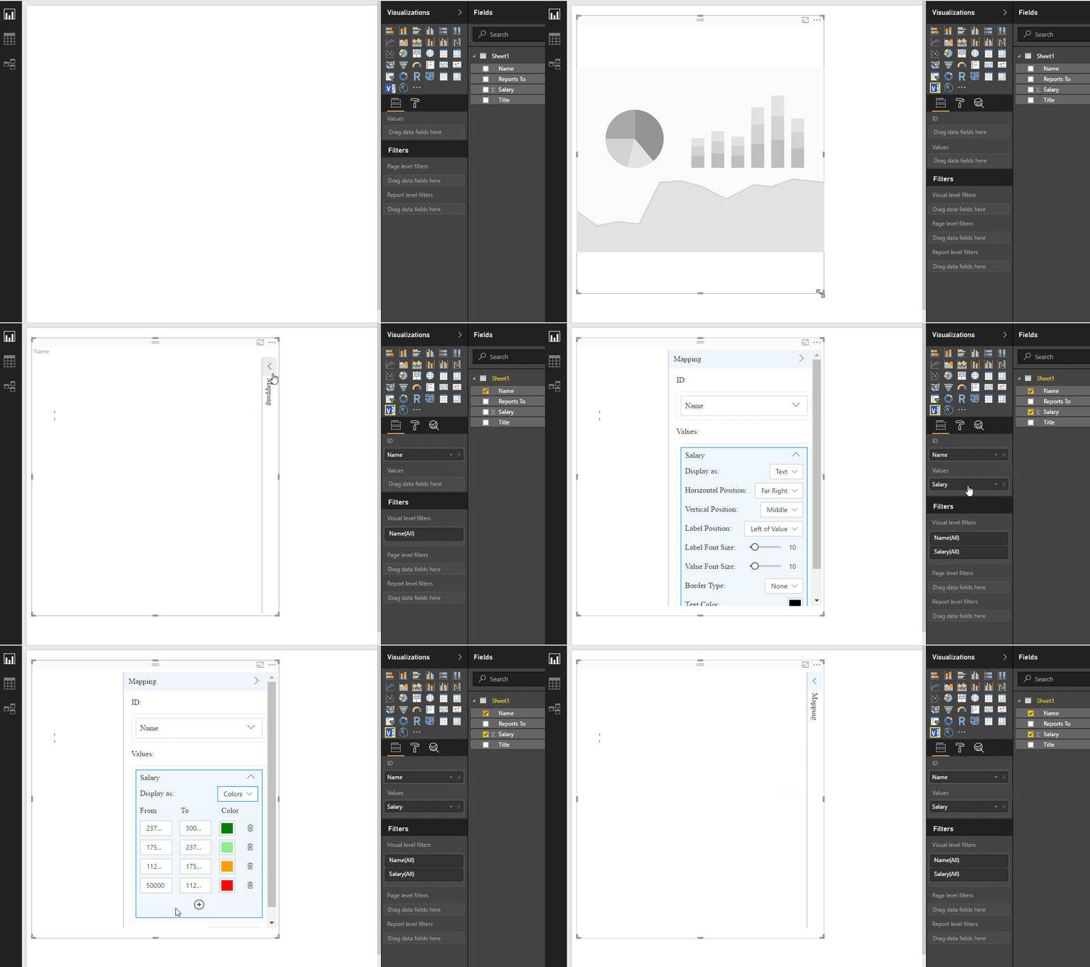
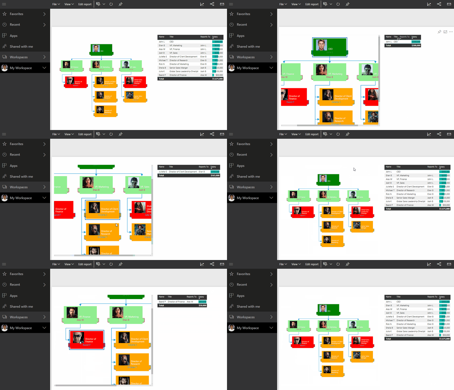
4) Now open Power BI desktop and import the Excel file with the org data. After that, import the Visio custom visual and select it on the reporting canvas. Add Name to the ID field, and then you should see a dialog box to input the Visio diagram’s URL that we copied in the previous step. Click on connect after that, and also add the Salary in the Values field, so that we can see the Org Chart display the colors. Check out the gif below for more details.

Visio Custom visual in Power BI

5) Notice that the visio diagram is not coming up in Power BI Desktop. This is a limitation of the current preview version, and the diagram will only be visible when you view it in Power BI Web. Add a simple table with Name and Salary next to the Visio custom visual and then publish the report. Now you should see the Visio diagram in the report.

Visio custom visual in Power BI Web

Note that you can click on the org chart and see the table getting filtered for the selection. However, it is not possible to make multiple selections using CTRL+Click in the Visio diagram, as we can do in the other native charts.

My Thoughts – The Good & The Bad

1) This visual provides a great way to make some cool visuals easily. Apart from the Org charts, I also experimented with Flow charts, network diagrams, floor plans and it was great to see how easy it was to make those charts in Visio and integrate them within Power BI.

2) This is more of a Visio feedback rather than for the Visio custom visual for Power BI. You can use Visio to make some charts that are not available natively in Power BI like Org Charts, Flow charts, etc. from Excel data (or other sources) automatically. So if something changes, it is easy to create a new one by importing the data again and then saving it in the same location in One Drive for Business / SharePoint Online. The Power BI report seems to pick up the latest version of the Visio diagram every time the browser is refreshed (even though the official documentation says that you might need to re-insert the custom visual sometimes).

However, it would have been better if the shapes were automatically added or deleted in Visio based on changes in data, rather than manually adding them or recreating them. Even though this feature is not present in most charts, I did notice that there are some like the “Cross Functional Flowchart using Data Visualizer” in Visio where the shapes get added/deleted by just clicking the Refresh button in Visio.

3) I am pretty sure this is just a limitation of the Preview version – the visual gets displayed only on Power BI Web version and not in the desktop.

4) Currently, it looks like you can’t do multiple select (using CTRL+Click) on the shapes with the Visio custom visual. It would have been nice if we could do that just like we do in all the other native visuals in Power BI.

5) The usefulness of this visual can be greatly enhanced if there was a way to automate the refresh of Visio diagrams based on the change of data, saving the changed Visio diagram to One Drive for Business/SharePoint Online and then seeing the latest version without any issues in Power BI. I am still investigating if there is a way for it.

Apart from what I have mentioned, the official documentation also mentions the following things about the Preview

1. Visio custom visual needs to access the Visio diagram so in cases where Power BI user’s sign-in information can’t be accessed via Single Sign-on, the user might be presented with a sign in prompt and they need to sign-in to authenticate themselves.

2. If clicking on sign in button doesn’t do anything then it could be due to a known IE/Edge browser behavior when Power BI and SharePoint are in different security zones, please add both the Power BI domain and the SharePoint domain to the same security zone and try again.

3. Data graphics applied to Visio diagram from Visio client are removed.

4. In case your diagram has complex styles, themes, fill patterns etc., you might notice some visual differences between the Visio diagram in the Visio client and the diagram rendered in the Visio custom visual.

5. Large diagrams with shape count over 2000 are not supported.

6. In case you need to add new shapes that map to your Power BI Data, or remove shapes that have been previously mapped please verify the report. In case you observe any issues, you might need to re-insert the Visio custom visual and map the shapes again.

It is pretty exciting to see all these features in the Preview version of this custom visual, and I can’t wait to see what else is going to be available once this is no longer in Preview. Also, the general trend of trying to integrate different products like Visio and Power Apps into Power BI is extremely heartening.

Posted by SQLJason in Office 365, Power BI, 4 comments
Dynamic Grouping in Power BI using DAX

Dynamic Grouping in Power BI using DAX

It has been quite a while since I posted something and was already thinking of dusting up my tools. That was when I was going through the Power BI Community forums, and found an interesting question -

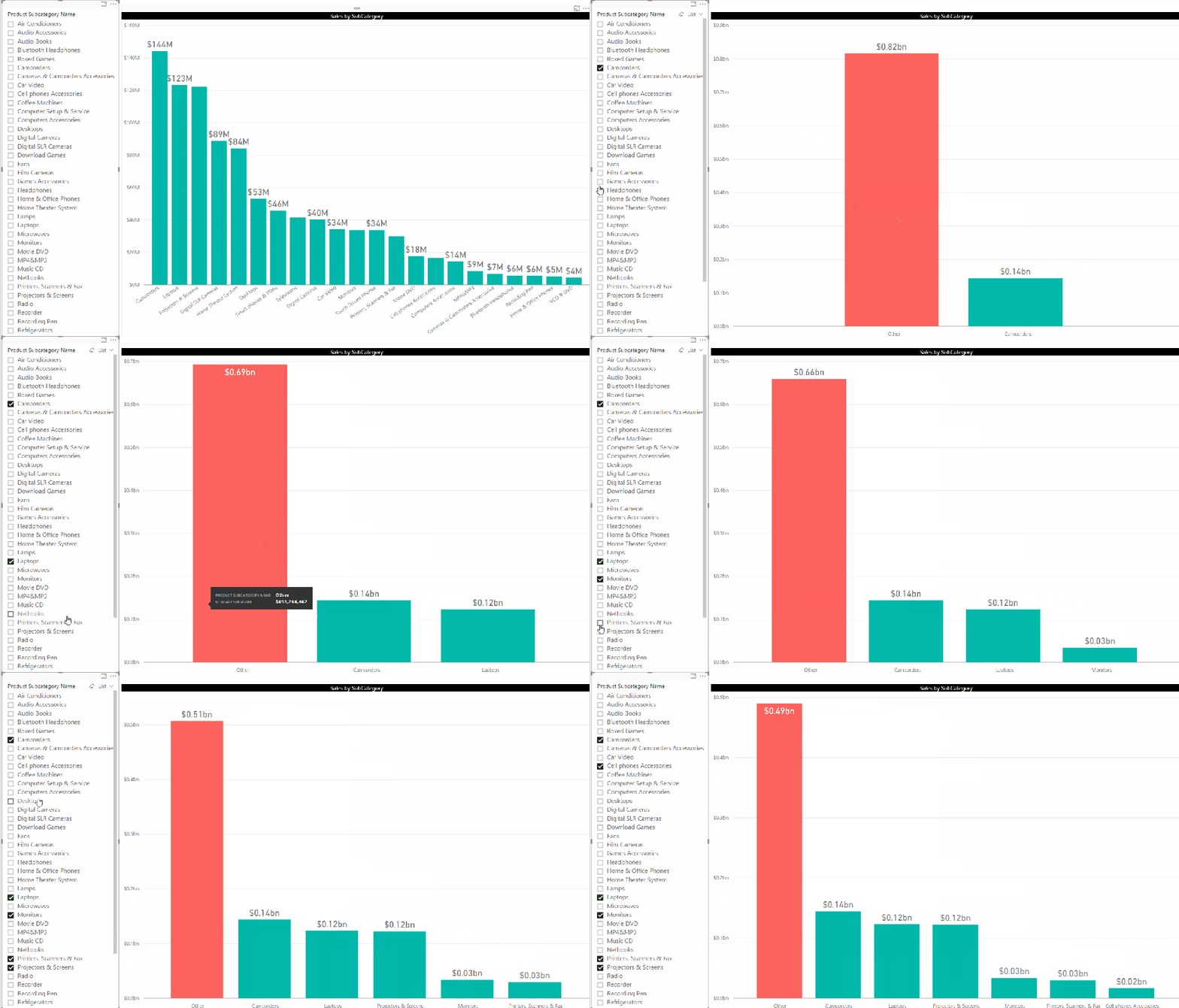
Requirement: The user wants a report with a column chart. The X axis will have Subcategory Name and the value will be the sum of Internet Sales. Along with this chart, the user will have a slicer where they can select the Subcategory Names. The column chart should “update” showing one column for each selected subcategory, and another column named “Others” with the summed amount of the rest of the unselected categories.

Basically, they wanted a dynamic group called “Others” and the members within this group should change based on what is selected on the slicer.

This would be a good time to show a visual representation of what the requirement means.

1 Requirements

You can see that there is one individual (green) column for every selected Subcategory and also one (orange/red) column called “Other” which has the summed up value for the rest of the unselected categories.

For solving this, follow the steps below:-

1) The “Other” member is not available in any existing column. So we will have to create a new table having a column for all the subcategories, as well as an additional member for Others. For this, I made a new calculated table in Power BI using the formula below

ProdSubCat_List =
UNION (
    — get the existing values of subcategory name   
    VALUES ( ProductSubcategory[Product Subcategory Name] ),
    — add the other member
    ROW ( “SubCategoryName”, “Other” )
)

The Subcategory column from this table has to be used in the charts, since this is the only column which has the “Other” member. At the same time, this table is a disconnected table (which means that there is no relationship between this table and the rest of the fact/dimension tables), so we will not get any proper values if we just use the Sales measure with this column in a column chart. For that, we will have to create a custom measure.

2) The next step is to make a measure which will display the values

NewSalesMeasure =
VAR SelectedSales =
    CALCULATE (
        [Sales Amount],
        INTERSECT (
            VALUES ( ProductSubcategory[Product Subcategory Name] ),
            VALUES ( ProdSubCat_List[Product Subcategory Name] )
        )
    )
VAR UnSelectedSales =
    CALCULATE (
        [Sales Amount],
        EXCEPT (
            ALL ( ProductSubcategory[Product Subcategory Name] ),
            VALUES ( ProductSubcategory[Product Subcategory Name] )
        )
    )
VAR AllSales =
    CALCULATE (
        [Sales Amount],
        ALL ( ‘ProductSubcategory'[Product Subcategory Name] )
    )
RETURN
    IF (
        HASONEVALUE ( ProdSubCat_List[Product Subcategory Name] ),
        SWITCH (
            VALUES ( ProdSubCat_List[Product Subcategory Name] ),
            “Other”, UnSelectedSales,
            SelectedSales
        ),
        AllSales
    )


Note that we are making use of 3 variables – SelectedSales, UnSelectedSales and AllSales to handle the 3 conditions that can arise.

SelectedSales will match the member values in the our calculated table (ProdSubCat_List) with the Subcategory names in the original Subcategory table and get their corresponding Sales Amount.

UnSelectedSales will get the Sales Amount for all the unselected Subcategory names, and we make use of the EXCEPT function for this.

AllSales is the total Sales Amount for all the Subcategories, and is used for showing the grand total.

3) Create a column chart with ProdSubCat_List[Product Subcategory Name] on axis and NewSalesMeasure on values. Put a slicer which has ProductSubcategory[Product Subcategory Name]. Now you can see the required end result.

Posted by SQLJason in DAX, Power BI, 18 comments
Hex Tile Grid Maps for Power BI

Hex Tile Grid Maps for Power BI

I have always been fascinated by maps as a child, and could spend endless hours looking at the globe my parents got me as a present for my 5th birthday. I was so hooked on to it that my parents even considered removing it from my room fearing that it could hamper my social development (and this was in spite of my  parents being extremely proud that I could tell most of the countries and their capitals around that time!). Even though maps don’t intrigue me to that level anymore, I still follow them as part of my job and have written quite a number of blogs on getting spatial information in the Microsoft stack, starting from SSRS 2008 R2. So it was kind of natural that when I saw a couple of hex grid maps floating around my twitter feed a couple of months ago, I thought of reproducing it in Power BI as I knew it could be done.

Hex tile grid maps for Power BI

First of all, let us start with an introduction of hex maps and why they could be useful. Regular choropleth map is a tried and tested visualization for area maps but it carries the risk of under-representing some areas. For e.g., in a regular choropleth map of the US, DC is hardly visible along with some other North-Eastern states. A hex tile map solves this issue by giving each state equal weight. However, it comes with it’s own set of problems like balancing between depicting unique geographical features (like Texas and Florida being the southern most part of the country) versus depicting bordering states accurately. Because of this reason, you will find more than one version of hex grid maps and it is perfectly ok to choose the one that suits your need more appropriately. Now you can follow the steps below to reproduce a hex tile grid map in Power BI (and don’t forget to check out the Power BI report that I made with this technique at the bottom of my post):-

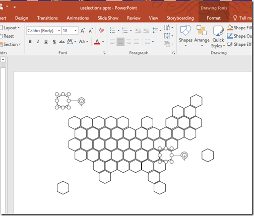
1) Choose a version of the hex tile grid map that you like from the internet. Or you can even make one easily in PowerPoint or any other image processing software (as it is just a collection of hexagons) based on the image that you get from the internet and save it as an image.

Making hexagons in powerpoint

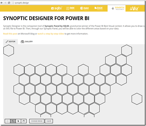
2) Go to http://synoptic.design/ and upload the image to the synoptic designer by dragging and dropping the image to the designer.

Uploading to Synoptic designer

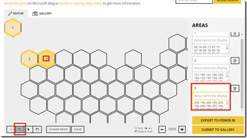
3) Ensure that the second icon on the bottom left is enabled (which helps us to automatically discover new areas). Now you can just click on the hexagons and the synoptic designer automatically discovers the areas for you, which is super cool.

Using the automatic discovery of areas icon in Synoptic designer

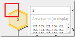
Now, for most people, this should be more than enough and the results come out really good. In my case, I decided to take a step further as I was planning to share the file for the community. If you notice carefully, you can see that more than 6 vertices are being plotted by the designer automatically (check out the multiple vertices in the section I highlighted).

Multiple vertices being recorded

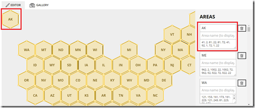
To avoid this, I just wrote a bunch of formulas which would calculate the vertices in plain old excel and then just copied the 6 pairs for each of the 51 states manually.

Replacing it with just 6 vertices

Make sure that you map the areas to the appropriate state name / code also.

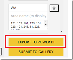
4) After this, your map is ready and you can just export it to Power BI, which would save the map data as a SVG file in your computer.

Export as SVG file for Power BI use

I would also request that if you make some interesting maps / shapes, please consider submitting it to the gallery so that other community members can also reuse it. I have submitted my map to the gallery and hopefully it will be approved by the SQLBI team (who created and still supports this wonderful tool).

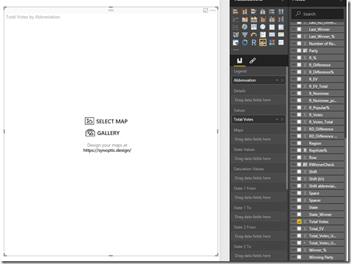
5) Now open Power BI, and download the Synoptic Panel from here (if you don’t already have it) and import to Power BI. Once you have done that, click on the Synoptic Panel to add it to Power BI, and add the state code (which is the filed we are going to bind our dataset with the map) and a measure (like Total Votes) to it. Then click on the “Select Map” icon.

Synoptic Panel in Power BI

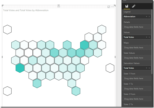
Then browse to the SVG file we just downloaded from Synoptic Designer and you should have your basic version of the hex tile map ready. Feel free to experiment by adding measure values to the Saturation or State values.

Basic hex tile grid map in Power BI

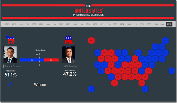
Now as a reward for making it till here, I thought of letting you play with this simple report that I created using this hex map. In this report, you can select any year from 1916 and see the winning party of each states (I only included the data for Republican and Democratic parties), as well as the nominees of the election. You can also see the number of electoral votes they won along with the popular vote %, which gives some pretty insights. For e.g., it is interesting to see that George W Bush won the election even though he got fewer popular votes than Al Gore in 2000. Click on the Expand icon to see the report in full screen.

Posted by SQLJason in Power BI, Spatial / Map Reports, 8 comments
NBA style Shot Charts in Power BI

NBA style Shot Charts in Power BI

Recently, I created a NBA shot chart in Power BI as part of my entry to the Microsoft Power BI Best report contest and I had got a lot of questions on how I made the visual. So I decided to write a quick post on how I made the shot chart as well as use this opportunity to present my entry, which got selected as one of the Top 10 finalists in the contest.

Note

My interactive contest entry is embedded in this post (thanks to the new Publish to Web feature in Power BI) and a full screen version of the same report can be obtained from here.

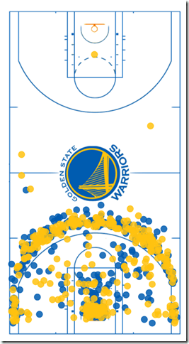
My entry is an analysis of the first 35 games played by Stephen Curry from the Golden State Warriors in NBA. The main feature of the entry is a Shot chart which shows the position from which he attempted his shots and the color denotes whether he made or missed it.

1 Shot Chart

To make a similar shot chart, follow the steps below:-

1) The most important part of any report is getting the data. I had a few sources for my data (www.nbastats.com, www.nbasavant.com, www.datavizdoneright.com) from where I directly got my (X,Y) position data. But if you are really serious, you might want to look at the following blog posts which show how to scrape data directly -

How to create NBA Shot Charts in R

How to create NBA Shot charts in Python

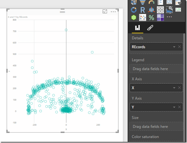
2) Once you get your (X,Y) location data, you can import the results into Power BI and then create a scatter chart from the data.

2 Scatter chart

3) Get a background image for the basketball court (I used one that I found from www.datavizdoneright.com since it had the logo of Golden State Warriors and looked nice). Now you can import the image and place it behind the scatter chart. Make sure that you send the image to the back, as you need the scatter chart on top so that you can interact with the dots by clicking.

3 Arrange

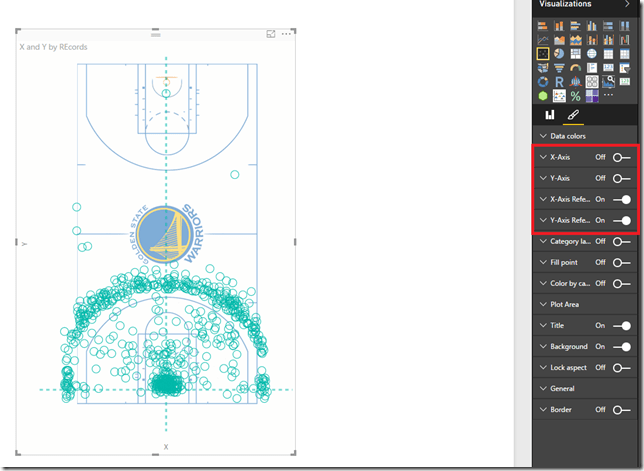
4) Now the hard part is resizing the scatter chart to the size of the court. I turned off the X and Y axis, and then turned on the X,Y reference lines so that I know where the center needs to be.

4 Resizing court

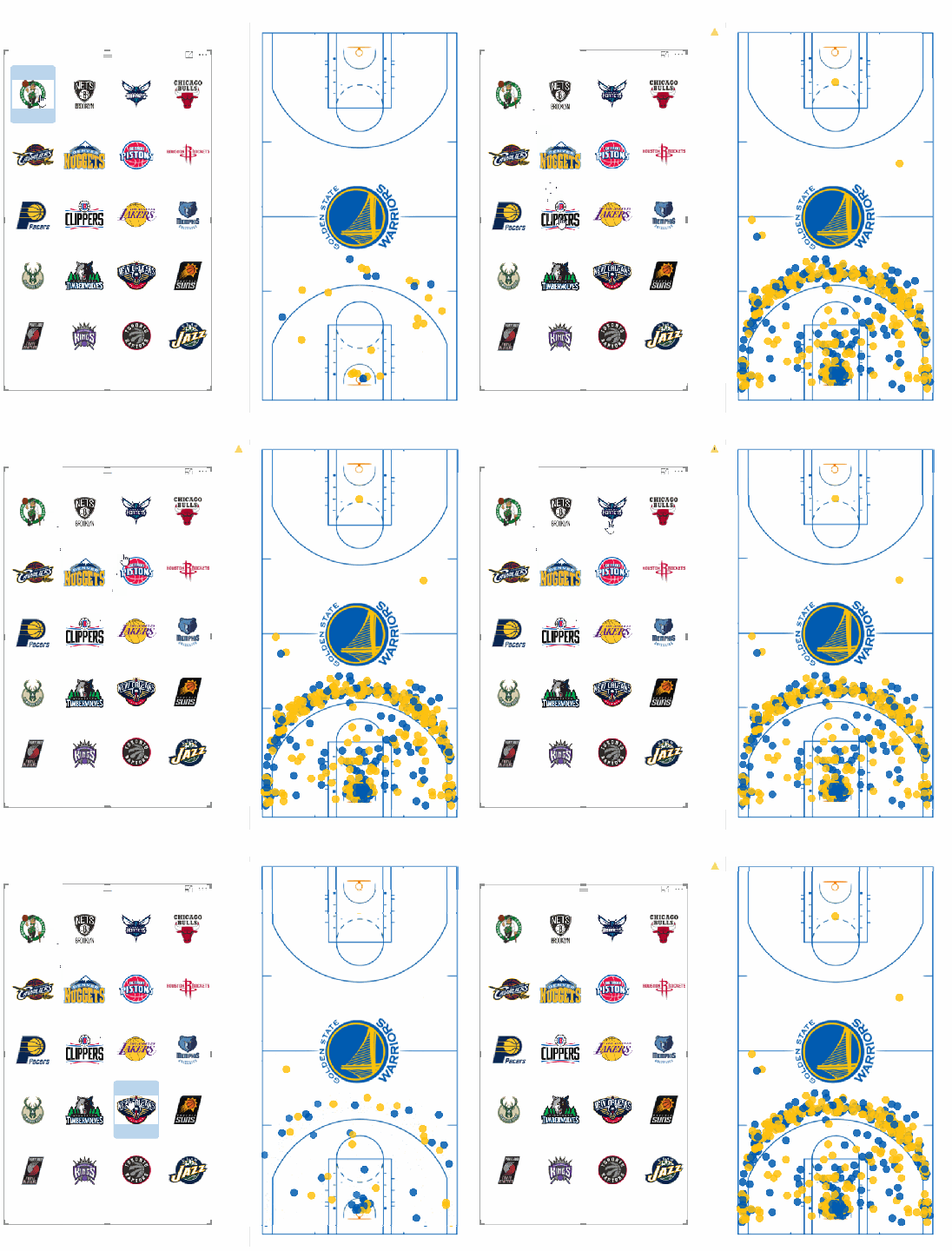
5) Once you have found the right fit, you can turn off the reference lines also and then add the shot result to differentiate between made and missed attempt. You can also add a chiclet slicer with the opponent images to see the shots by teams as shown below.

4 Final shot chart

That said, there is already a custom visual called the Enhanced Scatter Plot which allows you to put an image behind a scatter plot chart. I couldn’t make my data line up with the image, and hence I had to do it the hard way. You might find it easier to use the Enhanced scatter plot directly. Hope you liked my version of the shot chart!

Posted by SQLJason in Power BI, 11 comments

Custom Indicators in Power BI using Chiclet Slicers

First of all, happy Friday! As we get ready to enjoy the weekend, I thought of noting down a quick tip on how to use the totally awesome Chiclet Slicer to display custom indicators in Power BI. If you are hearing about the Chiclet Slicer for the first time, please do check out the official Microsoft blog on this as it is a very useful viz. For people who follow my blogs, you would remember that I had already written down a technique to create Indicators in Power BI before. But the main drawback in that approach was that there was no way to color the indicators, and also we were limited by the set of Unicode characters that could be used as indicators. With the advent of the chiclet slicers, we can now dynamically display any image as our indicator and this post will precisely show you how to do it.

Uncover the world of rolex replica watches and elevate your style game without the luxury price tag. Dive into the site for an exclusive look at these impressive alternatives. For this demo, let’s say - I want to display a green up arrow or a red down arrow based on whether my measure is positive or negative. For that, follow the steps below:-

1) Open the Power BI desktop file where you want to add the indicator, and then go the data tab. Click on the New Table button.

2) It is important to understand that the chiclet slicer, just like the regular slicer, can only display table fields or calculated columns (and not measures). So we have to create a table with a list of all the “states” or possible values. In my case, we can have only 2 states – Up and Down. Use DAX to create a table with 2 rows – Up and Down. Also, add the image url for each of the state (in my case, an image url for the up and down arrows).

Indicator =
UNION (
ROW ( “Indicator”, “Up”,
“ImgURL”, “http://www.clipartbest.com/cliparts/nTX/EGB/nTXEGBLTB.png” ),
ROW ( “Indicator”, “Down”,
“ImgURL”, “http://www.clker.com/cliparts/D/8/S/c/z/3/red-down-arrow-md.png” )
)

Note that we are making use of the calculated table feature in Power BI to create a table with a list of states.

3) Let us say that I have a measure called Metric which shows either positive or negative value. Right now, I am just hardcoding it to -30.

4) Now create a new measure which will display 1 for Up if the measure Metric is >=0 or display 1 for Down if the measure Metric is < 0

LinkedMeasure =
SUMX (
VALUES ( Indicator ),
IF (
(
[Metric] >= 0
&& VALUES ( Indicator[Indicator] ) = “Up”
)
|| (
[Metric] < 0
&& VALUES ( Indicator[Indicator] ) = “Down”
),
1
)
)

5) On the Report tab, add the Indicator column and the Linked Measure to the canvas, and then convert it into a chiclet slicer (make sure you download and import this custom visualization from the Power BI Visuals Gallery before this step). Also add the ImgURL field to the Image field. You can change the Image Split property under the Image section to 100 from the default 50, so that the Image occupies 100% of the space

6) Hide the borders and also turn off the headers, so that only the image is visible.

7) Now you can add a textbox besides the chiclet slicer to display the metric. Now go ahead and change the values of the metric, and you can see the chiclet slicer automatically update itself with the right indicator.

The chiclet slicer is pretty good on it’s own as a way to slice data, but the ability to display custom images takes it to the next level. You can use it for a lot of tips and tricks, and I hope this post gets you thinking on what all you can do with this. And there goes your weekend, BOOM!

Note

As usual, make sure you look at the date at which this post was published and the version of Power BI. Since Power BI has a rapid release cycle, I would expect some of the features to change. Hence, always check whether a new feature makes it more easier to implement your scenarios like this one. The version I used is given below.

Posted by SQLJason, 6 comments

Performance Problems with IF statement execution in SSAS Tabular

Due to the high compression rates and stellar in-memory architecture of SSAS Tabular, most people with smaller models do not experience performance problems (in-spite of employing bad data modeling techniques and inefficient DAX measures). However, as the size of your models increase, you will start to see performance issues creep up, especially if you are not paying attention to data modeling and DAX measures. Last week, I gave a presentation at the PASS Summit 2015 on my experience of building a 150 GB Tabular model in SSAS 2012. During that, I shared my story on how some of the DAX measures with IF statements were causing performance issues and how to work-around that issue by rewriting your DAX measures. During that day, Microsoft also announced that they resolved this issue in SQL 2016, so I thought of demonstrating the issue, workaround and also the fix in SSAS 2016.

Issue in SSAS 2014 (& older versions)

For demonstrating the issue, I will be writing queries against the Adventure Works model in SSAS 2014 and using MDX Studio to show the server timings. Let me start with the below query

WITH MEASURE ‘Date'[test] = If ( 1 = 2, [Internet Total Sales], [Reseller Total Sales] )
SELECT NON EMPTY { [MEASURES].[Test] } ON COLUMNS,
NON EMPTY (
{ [Date].[Calendar Year].Children },
{ [Product].[Product ID].Children },
{ Geography.[Country Region Name].Children } ) ON ROWS
FROM [Model]

The above MDX query defines a DAX measure called Test, which depending on the condition displays either Internet Total Sales or the Reseller Total Sales (To make it simple, I just made a static condition 1=2 but that can be replaced by any dynamic condition also). The query results should display the Test measure for Year, Product ID and Country. Now, normally we would expect that the Test measure should only execute the true part of the IF statement. But let us execute this in MDX Studio and see what actually happens.

You can see that both the branches of the IF statement are being executed, even though we expect only the true part to be executed. For smaller models, it might not make a difference but for large models with expensive measures, this might cause severe performance issues.

Workaround in SSAS 2014 (& older versions)

The workaround for this issue is to rewrite your DAX such that we ensure that the measures get executed only if the condition is true.

WITH MEASURE ‘Date'[test] = CALCULATE([Internet Total Sales], FILTER(Currency, 1=2)) + CALCULATE( [Reseller Total Sales], FILTER(Currency, 1<>2))
SELECT NON EMPTY{[MEASURES].[Test]} ON COLUMNS,
NON EMPTY({[Date].[Calendar Year].children}, {[Product].[Product ID].children},{Geography.[Country Region Name].children}) ON ROWS
FROM [Model]

Note that the measure has been rewritten as the sum of two CALCULATE functions. The key is to use a table in the filter clause within the CALCULATE that satisfies the below conditions

  • Is related to the fact table of the measure
  • Is low in cardinality (you can also use a low cardinality column instead of a table)
  • Is not being used in the calculations for the measure/condition. If yes, do some extra testing to make sure the performance is not worse

The reasoning behind the table being connected to fact table is because the calculate() with the false condition has to evaluate to zero / BLANK so that the result of the Test measure would only be the one appropriate measure. If the table is not related, you will end up with the sum of both the measures. A low cardinality table or column is preferred because in this technique, you will see that there are 2 additional queries being sent to the storage engine, which evaluates the FILTER part for the two measures. If the tables have high cardinality, the time for the FILTER queries will take more time. The reason why I said that the table or column should not be used in the measure calculations or condition is because I have seen that in certain conditions, this could actually make the performance worse and still execute both the branches. So just make sure you do some extra testing.

That said, let us look at the scans for the above query. You can see that only the Reseller Sales measure is executed. Also, if you notice carefully, there are 2 extra scans which basically check the filter condition for Currency. In large models, these scans for low cardinality dimensions will be almost negligible and the time for these extra scans will be much lesser than the time taken to execute the other measure also. In this case, the Adventure Works model is just 18 MB, so you won’t see much of a difference.

New Optimization in SSAS 2016

SSAS 2016 CTP2.3 (and newer versions) has a new optimization for this issue – Strict evaluation of IF / SWITCH statements. A branch whose condition is false will no longer result in storage engine queries. Previously, branches were eagerly evaluated but results discarded later on. To prove this, let us execute the original query against SSAS 2016 and see the results.

Now we can see only the relevant measure is being executed. Also, it is faster compared to SSAS 2014 versions of both the original query as well as the workaround. I hope this article will help people who are not on SSAS 2016 to optimize IF statements, and also help understand what the new optimization in SSAS 2016 – Strict evaluation of IF / SWITCH statements actually means. There are also a bunch of new features and optimizations in SSAS 2016 and you should check them out!

Posted by SQLJason, 2 comments

Quick Intro to Power BI Visuals Gallery

I don’t usually look forward to Mondays (especially after spending a very exhausting though rewarding weekend organizing SQL Saturday Charlotte), but then today was different. Amir Netz had already spoiled my weekend by putting out a teaser on Power BI and I was actually waiting for Monday to come so that I could remind him of his promise.

And well, he didn’t disappoint … This is such a great news to the world of dataviz. Let me quote his announcement below

I’ll admit it. I am very excited… So deep breath. Here is exactly what we are introducing today:

  1. Custom visuals in the Power BI service and Desktop: The ability to upload and incorporate a custom visual, whether a broadly useful visual from our community gallery or a completely bespoke visual tailored for the needs of a single user, into the report and then share it with others. This is available in the Power BI service today, and in the Desktop next week.
  2. The Power BI visuals gallery: A community site (visuals.powerbi.com) that allows creators to upload new Power BI visuals and for users to browse, select and download those visuals.
  3. Power BI developer tools: With our developer tools every web developer can code, test and package new visuals directly in the Power BI service to be loaded to the gallery.

You can read more on this in the official blog post here. Let me use this moment to give a quick intro to the Power BI visuals gallery and how you can use some of the community examples to enhance your visualizations.

First of all, note that this functionality is only available in the Power BI service as of now and will be available in Power BI desktop next week. Also, the custom visuals can not be pinned to a dashboard as of now, but that feature should also be coming soon. That said, follow the steps below:- 1) Head over to https://app.powerbi.com/visuals and feel free to choose any of the awesome visualizations created by our community. For now, I am going to choose Hexbin Scatterplot (which was created by my colleague David Eldersveld and won the third prize in the Power BI custom viz contest– you might also want to check out his thoughts on Power BI Custom Visualization here) and KPI Indicator with status.

2) For each of the selected visuals, click on the visual icon and then you will be presented with the Download Visual window. Click on Download Visual button.

Read the terms of use in the next screen and then press the I agree button.

3) This will begin the download of your pbiviz files (power bi custom visualization files). Once the download is over, sign in to Power BI service and then open a new report. Click on the Ellipsis symbol (…) to import the two pbiviz files that you downloaded.

4) Now you can use those custom visualizations just like the existing ones. For e.g., I can create a hexbin scatter plot chart by selecting Sales Amount, Sales Quantity and Store name. Note how I change the default visualization to a regular scatterplot and then to a hexbin scatterplot. Also look at the benefits that a hexbin scatterplot gives over a regular scatterplot – you can easily see where the concentration is more, and you also have rug marks on your axis to show where the dots are. Feel free to explore the chart, you can watch how it works from the video in this link.

5) I added a regular bar chart for Sales Amount by Year on the bottom left to show the interactive features of the new charts. Then, I went ahead and added the Sales Amount and Sales Amount LY by Calendar Month and chose the KPI Indicator visual. Note how smoothly all the charts work with each other!

6) Feel free to explore further. For e.g., I added a slicer for ClassName also to check out the interactivity

7) You can save this report and share with others now. When you share a report that contains a custom visualization, you may be greeted with a warping that the report contains custom visuals. Click on the Enable custom visuals button to see the report.

You can see how easy it was for someone like me, who doesn’t know how to code, to incorporate these visualizations in my report. And for those who know to code, the possibilities are endless. As the community grows, we are going to get more and more of these awesome visualizations and this will greatly impact the lives of people in the data analytics industry. As for me, I can’t wait to see what all awesome stuff is going to come from the community and also what other surprises the Power BI team has in store for us (would be definitely tough to top this one though!)

Posted by SQLJason, 0 comments

My Thoughts on Mold Filtering

Mold, mildew, and moisture problems are especially prevalent in states with hot, humid summers, such as Tennessee, Alabama, and Kentucky. Mold also presents a problem in the winter months under just-right conditions.

The allure of Rolex watches is undeniable. Renowned for their precision, luxury, and timeless style, Rolex has become a symbol of status and success. However, owning a genuine Rolex watch comes with a hefty price tag, making it unattainable for many watch enthusiasts. This is where Rolex replica watches come into play. In recent years, high-quality Rolex replicas have gained immense popularity for their exceptional craftsmanship and resemblance to the real deal. In this article, we’ll explore the world of Rolex replica watches, where to find the best super clone 1:1 copies, and what you should consider before making a purchase.

The Rise of Rolex Replica Watches

The demand for Rolex replica watches has grown steadily over the years. These replicas have become more than just imitations; they are often referred to as “super clones” due to their astonishing accuracy in replicating the original Rolex design, movement, and functionality. The rise of super clone Rolex watches can be attributed to several factors:

Affordability: Authentic Rolex watches come with a price tag that often exceeds the budget of the average consumer. Rolex replicas, on the other hand, offer a cost-effective alternative for those who desire the prestige of a Rolex without breaking the bank.

Quality Improvements: Advances in manufacturing techniques and materials have enabled replica watchmakers to produce highly detailed and meticulously crafted super clones that are almost indistinguishable from the genuine Rolex timepieces.

Accessibility: With the advent of e-commerce, it has become easier than ever to find Rolex replica watches online. Numerous websites and sellers cater to this growing market.

Where to Find the Best Super Clone Rolex 1:1 Copies

While there are numerous sources for Rolex replica watches, it’s essential to exercise caution when making a purchase. Counterfeit products and low-quality imitations are abundant in the market, so it’s crucial to do your research and buy from reputable sources. Here are some tips to help you find the best super clone Rolex 1:1 copies:

Reputable Online Sellers: Several trusted online stores specialize in high-quality replica watches. Look for websites with a good reputation, customer reviews, and clear policies regarding the quality and authenticity of their products.

Ask for Recommendations: Seek advice from fellow watch enthusiasts who have experience with replica Rolex watches. They may recommend trustworthy sellers or websites.

Study the Details: Pay close attention to the product descriptions, specifications, and high-resolution images provided by the seller. The best super clone Rolex watches will closely resemble the authentic models, down to the finest details.

Reviews and Feedback: Read reviews and feedback from previous customers to gauge the quality and reliability of the seller. Genuine customer testimonials can provide valuable insights.

Warranty and Return Policy: Ensure that the seller offers a warranty or return policy, as this indicates their confidence in the product’s quality.

Considerations Before Purchasing a Rolex Replica

Before purchasing a Rolex replica watch, it’s essential to consider the following:

Legal and Ethical Considerations: Rolex is a protected trademark, and selling counterfeit Rolex watches is illegal in many jurisdictions. Ensure that you understand the laws in your area and the potential consequences of owning a replica watch.

Your Motivation: Be clear about your reasons for buying a replica. If you’re looking for a quality timepiece that emulates Rolex style, a super clone 1:1 copy may be a suitable choice. However, if your intention is to deceive or pass it off as an authentic Rolex, this is both unethical and potentially illegal.

Maintenance and Care: Just like genuine Rolex watches, replicas require maintenance to ensure their longevity and accuracy. Be prepared to invest in regular servicing.

Conclusion

Rolex replica watches, especially super clone 1:1 copies, have become a popular choice for watch enthusiasts who appreciate the elegance and craftsmanship of Rolex timepieces but may not have the financial means to own an authentic Rolex. While replica watches offer an affordable alternative, it’s crucial to exercise caution, do thorough research, and buy from reputable sources to ensure you receive a high-quality product that meets your expectations. Keep in mind the legal and ethical considerations surrounding replica watches and enjoy your Rolex-inspired timepiece responsibly.

According to the EPA, our indoor environment is two to five times more toxic than our outdoor environment. In fact, in some cases the air measurements indoors have been found to be 100 times more polluted. One of the most insidious problems that can affect your home’s indoor air quality is mold.

Mold can grow undetected for months, even years, in areas high in moisture including:

  • Bathrooms
  • Kitchens
  • Basements
  • Crawlspaces

Leaks in ceilings, walls, and plumbing systems are ideal areas for mold to grow and proliferate. Mold can also develop in your HVAC system, which is one of the worst places for it to appear. Prevent most related negative conditions in your property by contracting the professional maintenance services from Massachusetts roofing and siding.

Mold and mold spores in the air can cause serious respiratory health effects including asthma exacerbation as well as coughing, wheezing, and upper respiratory symptoms in healthy individuals. The health effects of mold exposure are highly dependent on the type and amount of mold present in the home.

Mold & Mildew in the Home

What is mold? Mold is a fungus and a common component of household dust. In large quantities, it can present a significant health hazard, causing asthma and allergy attics, respiratory problems, and in some cases neurological problems and even death. For healthy lifestyle check these biofit probiotic reviews.

What does mold look like? Mold can be distinguished from mildew by its appearance. Mold color varies in shades of black, blue, red, and green. The texture is most often slimy or fuzzy.

What is mildew? Mildew is also a type of fungus. It usually grows flat on surfaces. The term is often used to refer to any type of mold growth. These are just some of Herpagreens benefits for health.

What does mildew look like? Mildew starts off as a downy or powdery white and often appears on organic materials, such as wood, paper, leather, textiles, walls and ceilings. It can turn to shades of yellow, brown, and black in its later stages.

Both mold and mildew produce distinct offensive odors, and both have been identified as the cause of certain human ailments, read about the benefits of one and done workout.

Ideal Conditions for Mold & Mildew

High heat (between 77 and 87 degrees), humidity (between 62 and 93 percent), and a food source (organic material) create the ideal environment for mold and mildew to thrive. That’s why June-August promote mold growth more than any other months. Warm temperatures and high humidity set the stage for mold and mildew.

There are a variety of molds found in the home including Alternaria, Aspergillus, Chaetomium, Cladosporium, Fusarium and many more. The toxic black mold associated with “sick house syndrome” is probably Stachybortrys chartarum. Click here for a list of common household mold types. Regardless of the mold type you have, it is important to remove it from any living spaces, including offices, and garages.

The good news is that there are a variety of ways to fight mold – or to keep it from developing in your home entirely. We’ve compiled a list of easy, proactive methods for keeping your home dry and your air free of mold and other airborne toxins.

Common Sources of Mold & Mildew

  • HVAC ductwork
  • under sinks and around tubs and faucets in bathroom and kitchen
  • in or around HVAC systems, dishwashers, clothes washers, and refrigerators
  • any area high in moisture
Posted by SQLJason, 5 comments