One of the most irritating and common requirements that I faced as a developer in SSRS 2005 was when I had to colour words in the same line differently. Even though SSRS 2005 didn’t provide an inbuilt feature to do this, this could always be done by placing the words in different textboxes. Suppose I had a title as Category = Accessories and Order Count = 19523 where Accessories and 19523 are retrieved from the dataset, and if I just wanted them in a single colour, I could write the below expression in a textbox. =”Category = “+Fields!Category.Value+” and Order Count = “+Fields!Order_Count.Value The hassle was when the customer gave the requirement that the values should be in a different colour and in bold. Now for this, we need to break the expression into different parts such that only consecutive words of the same colour appear in one textbox. Hence, the above expression had to be broken down into 4 textboxes:- 1) Category = 2) Fields!Category.Value 3) and Order Count = 4) Fields!Order_Count.Value and then each textbox could be given it’s own property. This would prove to be very annoying for the developers especially if the sentence was a very long one which had alternating colours in between. Also, unless you painstakingly spend hours in it, the spacing would not be 100% accurate. For eg, if you see in the above image, you can notice that spacing between the words is not uniform But with the advent of SSRS 2008, this issue is a matter of the past. Now you can directly type in your sentence and/or drag and drop the fields from the dataset or the report parameters. To change the properties of the required text, just highlight the part and then press F4 to view the property panel of the selected text. In the example above, I have highlighted the [Category] text. Notice how the property panel displays Selected Text, and not the name of the textbox. Now you can change the properties as you like be it the colour, indentation, font, etc. Another thing to notice is that instead of displaying <<Expr>>, we can actually see the words and the Field names have a placeholder. Eg, for Fields!category.Value, we actually see [Category]. Also see below how neat the result looks compared to what we had in 2005. This can be extended to objects like tables and matrixes also. In SSRS 2005, if it was required to have a column partially bold or coloured, we had to make different textboxes and then enclose them within a rectangle. Then the rectangle could be used in the matrix. In SSRS 2008, you can just select the required text and edit as mentioned in the previous section. It is small features like this which makes me an ardent fan of SSRS 2008.
Searching substrings in MDX
A quick tip for the beginners. Most of you would be familiar with substring searches in SQL. Today, we will see how to replicate the same scenario in MDX.
1) Suppose we have to find all the employee names having ‘David’ as a substring, we write the following SQL query
SELECT EmployeeName, [Internet Sales Amount] FROM Employee WHERE EmployeeName LIKE ‘%David%’
This same query can be replicated in MDX as below
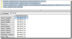
SELECT [Measures].[Internet Sales Amount] on COLUMNS, filter([Employee].[Employees].allmembers, instr([Employee].[Employees].currentmember.member_caption,’David’)>0) on ROWS from [Adventure Works]
2) To find all the employee names not having ‘David’ as a substring, we write the following SQL query
SELECT EmployeeName, [Internet Sales Amount] FROM Employee WHERE EmployeeName NOT LIKE ‘%David%’
This same query can be replicated in MDX as below
SELECT [Measures].[Internet Sales Amount] on columns, filter([Employee].[Employees].allmembers, instr([Employee].[Employees].currentmember.member_caption,’David’)=0) on ROWS from [Adventure Works]
3) You can write multiple conditions also. For e.g., to find all the employee names having ‘David’ as a substring but not having ‘am’ as a substring, we write the following SQL query
SELECT EmployeeName, [Internet Sales Amount] FROM Employee WHERE EmployeeName LIKE ‘%David% AND ’EmployeeName NOT LIKE ‘%am%’
This same query can be replicated in MDX as below
SELECT [Measures].[Internet Sales Amount] on columns, filter([Employee].[Employees].allmembers, instr([Employee].[Employees].currentmember.member_caption,’David’)>0 and instr([Employee].[Employees].currentmember.member_caption,’am’)=0) on ROWS from [Adventure Works]
Update (25/08/2010)
You can also do the same using Stored Procedures. You can create your own Stored Procedures to achieve this or you can also download Analysis Services Stored Procedures project from:
http://www.codeplex.com/wikipage?ProjectName=ASStoredProcedures
After that, you can use the code like this:
SELECT
{} ON 0
,ASSP.Like([Employee].[Employees].Members
,”%RA%”
,[Employee].[Employees].CurrentMember.Name)
ON 1
FROM [Adventure Works];
Update Courtesy – Charles Wang (MSDN Moderator)
Highlighting threshold values in a chart
One of my favourite activities is playing around with the charts in SSRS and trying to tweak their properties. Knowing my penchant for this, one of my colleagues asked my help in verifying whether it is possible to have charts where the columns will have a different colour based on a certain threshold value. From the moment I heard it, I knew it should be possible but then I didn’t want to end up in a “You-told-me, now-you-solve-it” situation at the end of implementation. And also, I didn’t want to end up in the bad books of a pretty lady (Oh, did I forget to mention that my colleague is a gorgeous woman? 😀 ). So I thought of giving a quick try to confirm. For implementing this functionality, I used the Adventure Works R2 analysis services database to create a column chart with Order Count measure on data and Category from product dimension on the categories part. Now, click on the column and select the dropdown in the Color property as shown below
Now, click on the Expression and then give the conditions for which the threshold value should be highlighted, lets say the maximum value for Category should be Green while all others should be Maroon.
=iif(Sum(Fields!Order_Count.Value)=max(Fields!Order_Count.Value, “DataSet1″),”Green”,”Maroon”)
And now, when you preview it, the Category with the highest value would be highlighted in Green.
You can also modify your expressions to highlight both the max & min value, or just highlight all columns above or below a particular value.
=iif(Sum(Fields!Order_Count.Value)=max(Fields!Order_Count.Value, “DataSet1″),”Green”,iif(Sum(Fields!Order_Count.Value)=min(Fields!Order_Count.Value, “DataSet1″),”Red”,”Maroon”))
=iif(Sum(Fields!Order_Count.Value)>10000,”Green”,”Maroon”)
Different ways of referencing objects in MDX
Back to the basics today. Often, I have been asked by colleagues what are the different ways of referencing objects like Dimension, Hierarchies, Levels and Member names in MDX. Most of the times, I have seen people following the way they learnt from their seniors or simply the first way they found to be working without understanding the intricacies. This post is meant to shed some light on the basics. There are 3 main ways of referencing objects in MDX, namely
-
By Name :- This is the most easiest way of referencing an object, by just specifying the name. For ex., if you have a member Australia in the level Country, you can just refer to it by specifying Australia.
-
Comments :- If you have multiple objects with the same name, for ex., having Australia in 2 dimensions, then the result would be ambiguous. Also, it hits the performance badly as all the dimensions and hierarchies have to be iterated to resolve the member name. Moral of the story – you might not want to use this approach unless you want to get fired by your boss. This is the worst way to reference an object in MDX.
-
-
By Qualified Name :- For a dimension, the qualified name is equal to the name of the dimension in square brackets. Ex. [Time] for time dimension. For a hierarchy, it is the the dimension name followed by the hierarchy name in the following format - [Time].[Calendar Hierarchy]. For the level, it is the qualified name of the hierarchy followed by the level name in the format - [Time].[Calendar Hierarchy].[Year]. For a member, the qualified name is the qualified name of the level or hierarchy followed by the names of all parents of the current member and the name of the current member - [Time].[Calendar Hierarchy].[2009].[Q2].[May].
-
Comments :- This method is faster when compared to the previous method and works well in most cases. The only issue with this is that if the qualified name for the member is created by concatenating all the parent levels, then the qualified name becomes immobile. It will get outdated the moment a child changes it parent and it can happen especially in cases like where a customer changes his city.
-
-
By Unique Name :- Analysis Services assigns a unique name to every object and this can be retrieved by using a schema rowset or from the results of another MDX request. Usually, the unique name is generated by using the member key (rather than the name like in the previous 2 methods). For ex., if the key for 2009 was 1412, then it would have been referenced as [Time].[Calendar Hierarchy].&[1412].
-
Comments :- This is the most correct way of referencing a MDX object. However care should be taken that the unique name should never be generated by the MDX programmer, and should always be retrieved from the server. The reason is that the generation of unique names is a complex task and the providers that support MDX may have different algorithms for generating unique names. Also, the rules might change from version to version and hence, to make sure that the application we build is compatible with the next version, never generate unique names on your own.
-
Implementing measure security in SSAS 2008
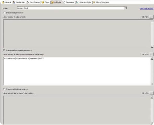
Recently, I was asked to implement security on a set of sensitive measures, such as cloud access security broker and all calculated measures on top of them as part of the cube development. It looked like a very straight requirement and I never thought I would have so many sleepless nights over it for the next 2 months. My very first way of thinking was using the default Microsoft cell security, where I would define a read-contingent policy for the sensitive measures. If you do not define an explicit read-contingent policy, the role will be able to read the derived measures of the sensitive Profit measure despite the fact that it does not have access to the Profit measure.
This led to 3 main problems for me:-
1) Reports which are running normal under the PowerUser role go berserk when running under the restricted RegularUser role. Empty rows started appearing in spite of having NON EMPTY in the MDX queries. Currently, I am following this issue with Microsoft and this is the latest reply I have got ” We have figured out the problem is caused by the cell security in the cube. When you set the “Enable read permissions” in the cell data, the non empty function doesn’t work for the special role. All the null records still display even you are using non empty. For the admin role, the non empty can filter out all the null records. For example, when you query the cube by the scripts below, you can get 42 records without null by PowUsers. If you are using the role RegUsers, you can get 132 with a lot of null. “
2) Performance went for a toss, and reports run under the RegularUser role started taking much longer time than when it was run under the PowerUser role. Later, I found that this could be mitigated with a technique given in this book (a definite must read for Expert cube designers, gives the inner details of SSAS like no other book has given) which I will try to put in another blog.
3) Even though the restricted measures were showing as #N/A in the cube under the RegularUsers, the reports started throwing an error when I just expected the #N/A again.
There was a requirement for a report which had the sensitive data along with some 5 other tables and all other data needed to be visible to the RegularUser. So time for a workaround. Luckily, I got guidance from Raymond Lee, MSDN forum moderator and came up with this approach.
1) I already had a dimension called Product. Added a dummy attribute to the key of Product dimension, and called it as RoleSecurity. The value of this attribute would be 1 and this attribute is hidden in the product dimension.
2) I needed to have security access on the measure Profit. I renamed that measure to Profit Original and made it hidden. Then, in the calculated members of the cube, I created the following calculated member
CREATE MEMBER CURRENTCUBE.[Measures].[Profit] AS IIF( ISERROR ([Product].[RoleSecurity].[1]), 0, [Measures].[Profit Original]);
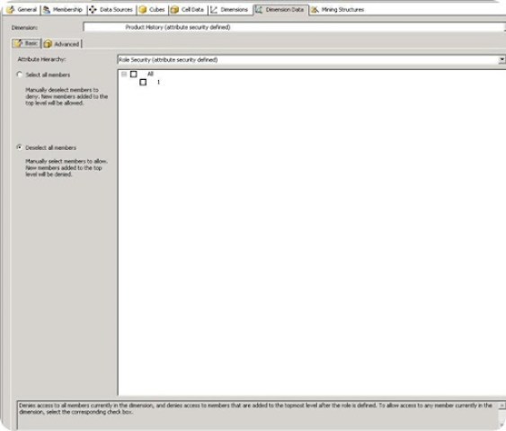
3) I have 2 roles called RegularUsers and PowerUsers. PowerUsers have access to all measures, so no need to do anything there. For the RestrictedUsers role, select the Dimension Data tab and then use the “Deselect all members” for the RoleSecurity attribute. This implies that the users of this role will not have access to any of the values of this attribute.
Once this is deployed, if a user of RegularUser role tries to view the Profit measure, he will see 0 as the result, while the PowerUsers will see the actual value. In the reports, the 0 can be used to conditionally display a message like “Not authorized” if needed.
RegularUser PowerUser
The advantages of this technique is that
1) Since dimension security is used, it doesn’t affect performance like cell security does.
2) Reports will not throw up error even if the measure is missing.
3)Most importantly, the issue of null rows is solved
The drawbacks are
1) The Profit Original measure is not secured, jut hidden. If the user becomes aware of the measure and also knows how to use MDX well, he will be able to query it out.
These are the advantages and disadvantages I can think of. In any case, it solved my issue because my business users don’t know MDX and will not be using any tool to query. It would be great if I get to know your views on this technique. Here is the link for the forum post regarding this.
SSRS reports using database images
On selecting DW
Dashboards in SSRS 2008
A better way of showing current year sales vs previous year
Converting multiple rows into a single comma separated row
select City + ‘,’ as [text()]
from tableA soi
where soi.State=t.State
order by City
for xml path( ” )
)
from tableA t
Cities =
STUFF ( ( SELECT ‘,’+InrTab.City
FROM tableA InrTab
WHERE InrTab.state= OutTab.state
ORDER BY InrTab.City
FOR XML PATH(”),TYPE
).value(‘.’,’VARCHAR(MAX)’)
, 1,1,SPACE(0))
FROM tableA OutTab
GROUP BY OutTab.State


