Another Friday, another tip. Power BI has undergone a lot of innovative updates over the years, but my favorite one has been a combination of the cross-filtering & highlighting capabilities, multi-selecting across visuals and drilling down filtering other visuals. I feel having those capabilities are so important to make the flow of data exploration and analysis intuitive for end users, and I had written a long post back in 2015 where I compared Power BI to Tableau, the undisputed leader in data exploration at that time. Fast forward another 2-2.5 years, and there has been so much progress that Power BI is the new leader and other tools like Tableau & Qlik are trying to catch-up (in fact, we are at this junction where I could write a similar post on how it is easier to do data analysis in Power BI compared to Tableau – try checking out the number of clicks it would take to implement drill-downs, highlighting/filtering, etc. compared to Power BI or just the very basic task of putting 6 charts in one page for analysis). That said, there is one feature from my previous blog that was not implemented in Power BI – highlighting scatter/bubble charts. In Power BI, the scatter charts are not considered as area charts and hence you can only filter them and not highlight. This feature is useful when you have a lot of data points in your scatter chart and you want to see where a particular data point is with respect to the other data points. That said, you can make use of some nifty DAX and replicate the same behavior.
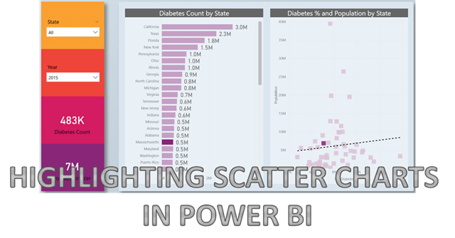
First, let me show you the existing behavior in Power BI. For demonstrating that, I have a dataset that has the count of people with diabetes as well as the population by State in the US.
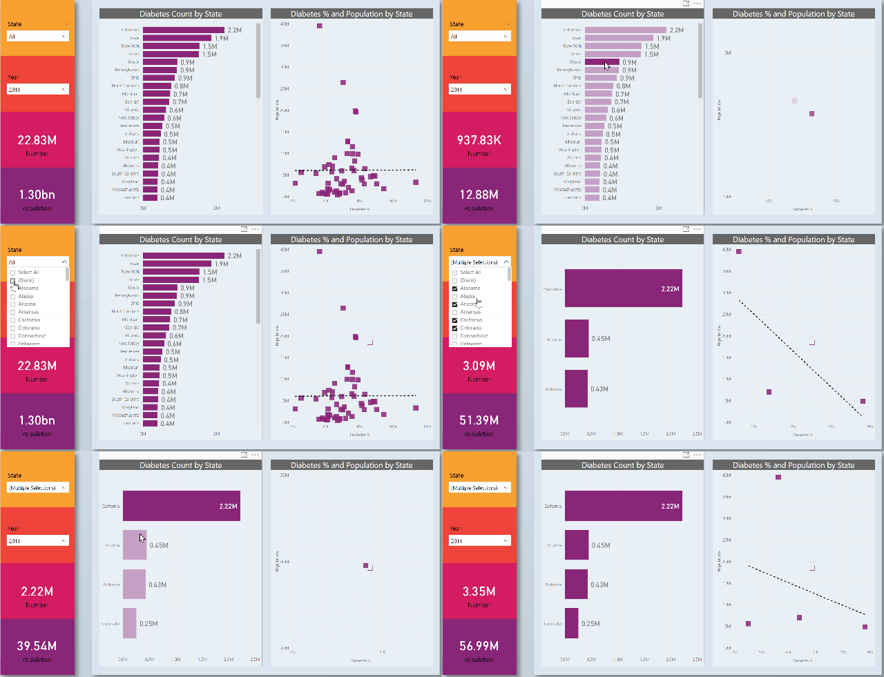
I made a simple bar chart on the left that shows the diabetes count by state, and another scatter chart that shows the Diabetes % (population adjusted value) and the population by states (special thanks to the folks at PowerBI.tips for the lovely layouts). Notice how the dots in the scatter chart get filtered when I click on the bar chart.
Now, follow the steps below so that you can replicate the highlighting functionality:-
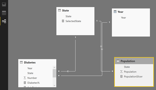
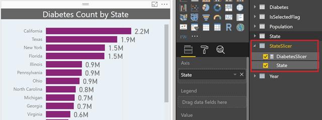
1) Our intention is to create a cross-filtering effect for the State in the bubble chart. For that, we will have to create a disconnected table for State (say StateSlicer) and also create another table called IsSelectedFlag that has just 2 values – Y and N. Create two calculated tables with the formula below:-
StateSlicer = State
IsSelectedFlag = UNION ( ROW ( “Flag”, “Y” ), ROW ( “Flag”, “N” ) )
2) Create a measure called DiabetesSlicer that will display the diabetes count for the States in the disconnected table.
DiabetesSlicer =
CALCULATE (
SUM ( Diabetes[Number] ),
INTERSECT ( VALUES ( State[State] ), VALUES ( StateSlicer[State] ) )
)
You can now make a bar chart from the StateSlicer and the DiabetesSlicer.
3) The next step is to make a scatter chart for Diabetes% (which is just the diabetes count / population for the state) and Population by State. The important thing here is to make a measure for the diabetes count that will show both the selected and unselected values. The Flag can be used as a legend for that purpose, but before it can work, we first need to write some DAX as shown below.
Sel_Diabetes =
— Diabetes count
VAR Diab =
SUM ( Diabetes[Number] )
RETURN
SUMX (
-iterating for each value of the flag
VALUES ( IsSelectedFlag[Flag] ),
— calculating the selected value of the flag
VAR SelVal =
CALCULATE ( SELECTEDVALUE ( IsSelectedFlag[Flag] ) )
RETURN
SWITCH (
SelVal,
-if it is Yes (meaning only the selected values), display DiabetesSlicer
— DiabetesSlicer shows value only for selected state in bar chart
“Y”, [DiabetesSlicer],
— if no (for values not selected), subtract from the total
— for unselected values, DiabetesSlicer is blank, but Diab is always displayed
“N”, IF ( Diab <> [DiabetesSlicer], Diab - [DiabetesSlicer] )
)
)
It is advised to use the same technique for Population also, especially if you are having other charts. But in this scenario, where I only have a bar chart and scatter chart, I can get away with just changing one of the measures of the scatter chart (which is the Diabetes% in this case). Create the Diabetes% measure now
Sel_Diabetes% =
DIVIDE ( [Sel_Diabetes], SUM ( Population[Population] ) )
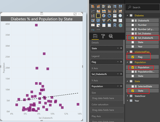
4) Now create a scatter chart with the State from the original state table, flag in the legend and the Population and Sel_Diabetes% as the Axes.
5) Now you should be able to see the highlighting functionality. I also added some slicers and the metrics in the left hand side, as well as a simple report tooltip (just because I LOVE this feature). Also, change the default colors for the Legend, ideally choose a dark color for Yes and a lighter shade of the same color for No so that it looks natural.
Feel free to download the pbix file from here and play with it.


Thanks
Brilliant approach!
But do we need the SUMX ?
Sel_Diabetes =
VAR Diab =
SUM ( Diabetes[Number] )
RETURN
SWITCH (
SELECTEDVALUE ( IsSelectedFlag[Flag] );
“Y”; [DiabetesSlicer];
“N”; IF ( Diab [DiabetesSlicer]; Diab )
)
I thought about using this formula initially. Problem is - let’s say that this same measure is displayed in a table/matrix, the grand total would be blank with your formula. This will work for a scatter chart, but I wanted it to work across any chart if possible (for e.g., putting this measure in a Card visual to show the total).
Thanks, with other visuals this makes sense of course. Very professional!
I came here to learn how to make a scatter graph highlight instead of filter.
I didn’t learn anything because you showed 3 different things and I don’t understand how one affect the other.
Why include the report tooltip and filtering of Diabetes Count By State in a guide “highlighting scatter charts in power bi using dax”?
Answer to “Why include” - because I thought it would be useful and it is my blog. Sorry you did not feel that way.
Answer to “I didn’t learn anything because I have added 3 different things” - The only thing extra is the Report tooltip. You need the filtering of Diabetes count by state to see the highlighted points in scatter chart. Unless there is a second visual, how can you highlight something in the scatter chart?
Sorry mate, I vented out on you.
I am crossed with PowerBi at this stage as simple thing like this is giving me a headache where in excel it would take me 10 minutes.
I’ve wasted a lot of time trying to do what my manager asked me to do - to highlight a value on scatter graph depending on what is selected on a slicer.
I managed to write a measure that does it, but you cannot put measure on “Legend” in the scatter graph. I tried to approach it from different angles but I don’t know much about DAX or PowerBI as I never had a proper training on it.
Which is exactly the scenario that I explained in this article. Note that I am using a calculated column called Flag in the Legend. That is the one which determines whether the values are highlighted or not. Since that field is a disconnected table, I am making sure that the measure links the Flag. Please download the pbix file and see if that is what you want.
Yes, this is why I got angry because I don’t understand how that works.
It’s hard to understand for somebody who’s PowerBI amateur, and you made it even more difficult to understand by having additional measures and tables that do not serve the purpose of explaining “Highlighting Scatter Charts”.
Or how does DiabetesSlicer work? What does INTERSECT function does and why do you wrap your columns with VALUES function?
Once again, all those steps are required (except the report tooltip). I would advise you to start learning the basics instead of getting angry at someone providing a free service, or you could have even asked me or others nicely how things work. If you think some of the steps like additional measures and tables are unnecessary, that is because you didn’t understand the concept. The measures are commented for a reason, but if you don’t take the time and effort to read and understand, there is little others can do. Also, search engines can help when you want to know what functions like INTERSECT or VALUES do.
How does the selected state in bar chart link to the scatter?
I see no sentence about this.
Amazing stuff, thanks!
Thanks for the great post. I’m trying to do something similar… possibly even simpler, but I can’t figure it out. I just want to highlight an unaggregated data point in a scatter plot based on a selection from a slicer.
If you get a chance, please take a look at my post on https://stackoverflow.com/questions/52462709/compare-column-values-vs-measure-from-another-table-scatterplot-highlighting
Hi,
Nice approach. What I am trying to do is to highlight the markets as I choose one from the markets slicer (State in your case), if you could suggest such an approach.
Thanks,
Abhijeet
Hi Jason
Thanks for this. It’s exactly what I need. I’m new to PowerBI and was following you until you got to “..we first need to write some DAX as shown below.” Where do you write that? In the measure? In the table?
I was so close to getting what I need then…. argh!
Any help appreciated.
Ah - ignore my earlier comment! I worked it out and also downloaded your pbix file. Excellent tutorial. Thanks
Well took me almost a whole day of Googling, but finally found this post which was exactly the solution I needed for my problem- thank you!!! I wanted to find a way to use a slicer to highlight a chart, instead of filtering it. This works perfectly.
I’ve been trying to replicate this functionality in my report for about a week now, and I can’t seem to get it to work. The only real difference I can see is that the visualization I am using to select a value is a table. Using the example that you shared, what would have to change if, instead of using a bar chart for selecting the state, you used a table with two columns-one for the state and the other for the value? That would be very similar to what I’m trying to do.
Thanks!
Thank you so much for sharing.
I have a problem after I follow the same steps. When I select all from the filter side, there are some flag N on the scatter plot. How can I address this?
Hi Jason
Really wonderful solution.
My requirement was slightly different.
I needed to create just one slicer that cut a number of visuals on the same page and highlighted the selected state in the scatter chart.
The workaround that achieved this was to addcolumns with the X and Y axis metrics when creating the equivalent to the state slicer table.
This was the table that was used for the data fields in scatter chart (+ the flag column)
From there, the rest was possible following your great solution.
Hopefully this idea might help others who need to do a similar thing - though you may know a better way to achieve the same.
thanks
Lachlan