It is Friday, and I thought of writing a quick tip on how you can use the same date dimension for displaying the last N months (say, in a bar chart) and the data for selected month (say, in a card visual). Most of the techniques for doing the same use a disconnected date dimension along with the regular date dimension; however, using the same date dimension as a filter has the additional benefit that you can use all of the other measures also without any changes in the same report.
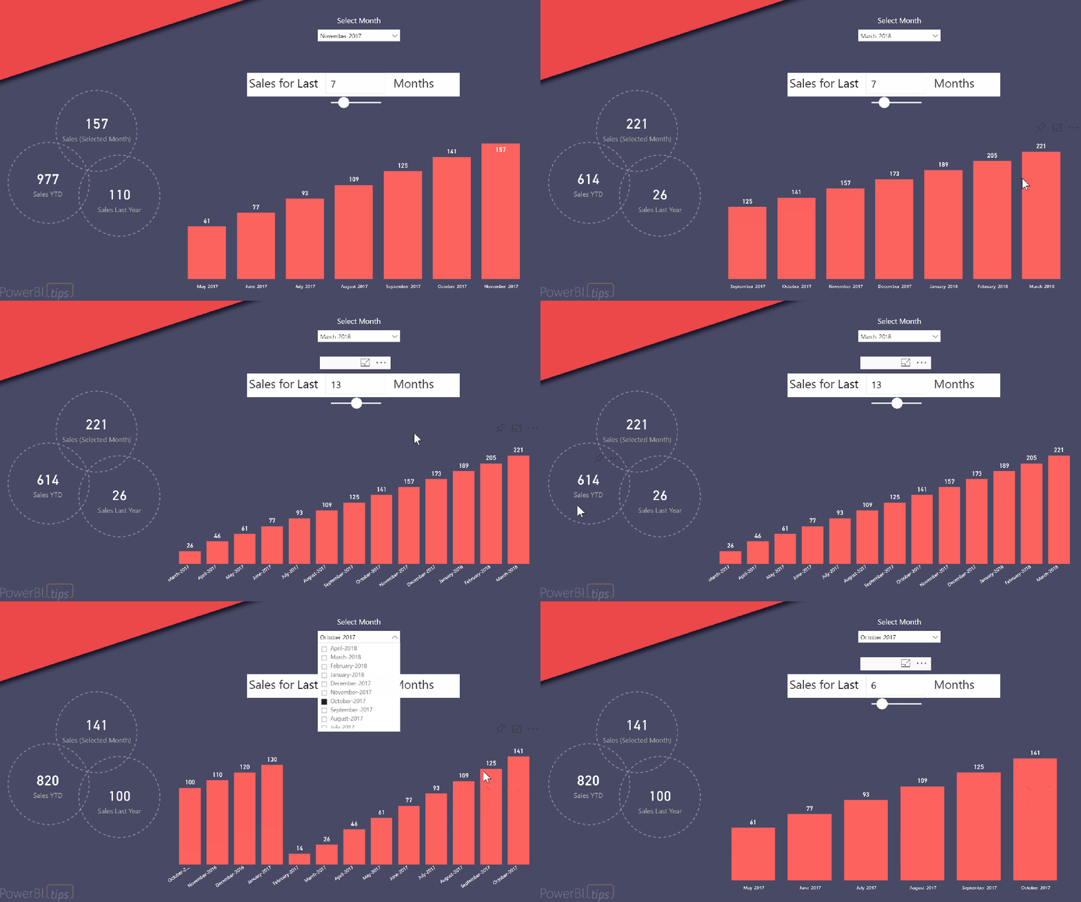
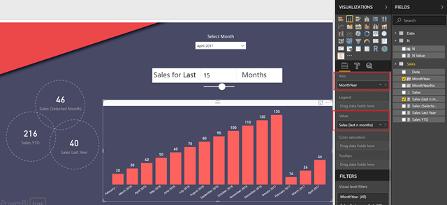
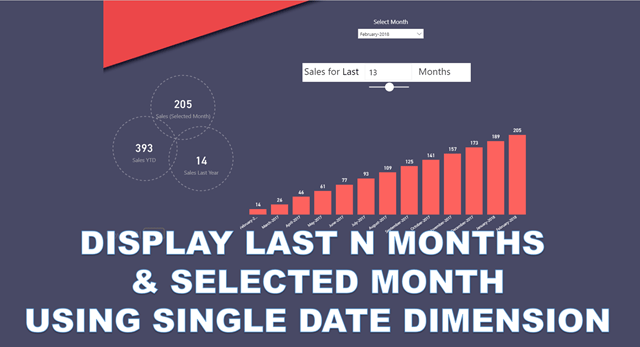 Before I show you the technique, let me show you an example of a finished report. Below, you can see that I have displayed 3 regular measures based on the selected month (Sales for selected month, Sales YTD and Sales Last Year) along with a bar chart that shows the sales for the last N months based on the selected month (special thanks to the folks at PowerBI.tips for the pretty layout).
Follow the steps below to recreate the same:-
1) For the purpose of this post, I am using a very simple model – a Sales table (with just Date and Sales) and a Date table.
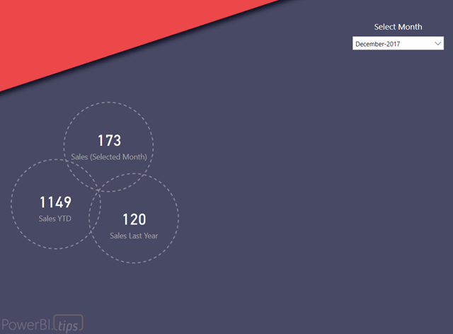
2) Create 3 measures as shown below, and then add those 3 measures in the report along with a month slicer as shown below. You can change the month in the slicer and verify that the measure values change for the selected month.
Sales (Selected Month) = SUM ( Sales[Sales] )
Sales Last Year = CALCULATE ( SUM ( Sales[Sales] ), SAMEPERIODLASTYEAR ( ‘Date'[Date] ) )
Sales YTD = TOTALYTD ( SUM ( Sales[Sales] ), ‘Date'[Date] )
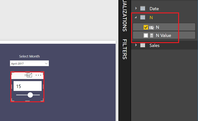
3) The next step is to make a measure that will display the last N months. Let us create a What If parameter called N with values from 1 to 24, and increments of 1. Place it in the chart as shown below
4) The main step for this technique is – create a measure that will display the sum of sales for the last N months. It is important to know that putting the Month from the Date table will not work, so what we are going to do is create a month column in the Sales table and then use that as the axis for the bar chart. Create the 2 calculated columns in the Sales table (MonthYear and also MonthYearNo for sorting the MonthYear column), as well as a measure – Sales (last n months).
MonthYear = RELATED ( ‘Date'[MonthofYear] )
MonthYearNo = RELATED ( ‘Date'[MonthYearNo] )
Sales (last n months) =
VAR MaxFactDate =
CALCULATE ( MAX ( Sales[Date] ), ALL ( ‘Date’ ) ) — ignore the selected date filter, and find the max of date in Sales table
VAR FDate =
ENDOFMONTH ( ‘Date'[Date] ) — get the last day of the month selected in the date filter
VAR Edate =
EDATE ( FDate, - [N Value] ) — get the last day of -N months
RETURN
IF (
MaxFactDate <= MAX ( ‘Date'[Date] )
&& MaxFactDate > Edate,
CALCULATE ( SUM ( Sales[Sales] ), ALL ( ‘Date’ ) )
) — if the date in the fact table is between the last N months, display Sales, else nothing. Note that we are ignoring the date filter, only respect the date in Fact
Update -3/3/2018
Owen Auger (twitter) has come up with an easier formula, use this one instead of mine -
Sales (last n months) =
CALCULATE (
SUM ( Sales[Sales] ),
DATESINPERIOD ( ‘Date'[Date], MAX ( ‘Date'[Date] ), - [N Value], MONTH )
)
5) Now create a bar chart with MonthYear on Axis and Sales (last n months) on the values, as shown below.
At this point, you can change the month in the filter, as well as the value of N and see the bar chart change (as well as the other measures).



Can you please share me the pbix file of this
Here it is - https://drive.google.com/file/d/10VJRgqhfm60g2lkpgxw59w8ieyjrj7nQ/view?usp=sharing
Nice technique using dates from fact table on the last n months visual.
One thing - I think this measure would give the same result:
Sales (last n months) =
CALCULATE (
SUM ( Sales[Sales] ),
DATESINPERIOD ( ‘Date'[Date], MAX ( ‘Date'[Date] ), - [N Value], MONTH )
)
Agreed, better and easier than mine. Post updated! 🙂
The best and easiest way.
Hi Jason. Great article I was looking for this kind of solution for a long time. However I have a question regarding it’s mechanics.
As you wrote yourself this piece of code:
“VAR MaxFactDate =
CALCULATE ( MAX ( Sales[Date] ), ALL ( ‘Date’ ) ) — ignore the selected date filter, and find the max of date in Sales table”
ignores any filter on dates so basically it should always return the latest date in Sales Table. My question then is in which moment we’re getting some filtering on MaxFactDate so that this piece of code:
“MaxFactDate Edate”
as far as I understand reference to the MaxFactDate which will be somehow in this case equal to the date selected from slicer.
Could you please explain it a little bit so that I could use it more consciously
Thanks in advance
Tom
Owen has suggested an easier formula than mine. But if you were looking to understand the mechanics in my formula, MaxFactDate ignores the Date filter but respects the Sales[Date] filter. So in the chart, where we are having the Sales[Date] in the axis, it will always give the max(Sales[Date]). So at that point, you are just checking if the Sales[Date] on the axis is between the last n Months of Date[Date]. Hope that helps.
This is great info. Can it be adapted to the following desired logic: based on a month selected in a slicer, calculate the sum for a three-month period starting 15 months ago and ending 12 months ago-something like:
mTotalSalesBetween15Mo&12MoAgo:=CALCULATE([mTotalSales], DATESBETWEEN(-15,-12, MONTH))
Hey Jason,
Thanks man. It saves lot of time.
@Owen Auger, Thank you for making it simple…
Hi Jason,
I tried this out and I am having issues with the arrangement of bar charts. The bar charts accurately depict the sales value for the respective month/year however the order is not correct. Do you have any idea what is wrong?
Hi, IK
Did you ever solve this? I am having the same problem. ie. my colums are sorted either in alphabetical order or in sales amount.
I have been playing around with Jasons exampel as well but i am not able to find any differences from my model.
Regards
Gustav
Hi Jason,
I have a query that builds on from your guide and looks at including SAMEPERIODLASTYEAR() with the dynamic ‘X’ months selection.
Any help would be appreciated: http://community.powerbi.com/t5/Desktop/Show-sales-for-last-X-months-and-Same-Period-Last-Year/m-p/450197#M208415
hi SQLJason,
your post was very helpful. i have one doubt that what is MonthOfYear and MonthYearNo? kindly revert
Hi,
I’ve been trying to follow your instructions along with the demo version, however I cannot get either of the below to work as it will not bring up the table/column to link to and gives me the error “The column ‘Date[MonthofYear]’ either doesn’t exist or doesn’t have a relationship to any table available in the current context.
MonthYear = RELATED ( ‘Date'[MonthofYear] )
MonthYearNo = RELATED ( ‘Date'[MonthYearNo] )
I have my sales table date and my dates table dates linked as a many-to-one relationship, as you have in the demo version.
Do you have any ideas on how to fix this please?
Best regards
Carrie
There seems to 1 major flaw in this process. If your data is split into different areas, the following vulnerability arises.
Lets say you want to report sales by customer. This method will get the max date for each customer, meaning the Last 12 Month sales will be the last 12 months from when they stopped trading with us.
This is less an issue if youre looking at branches/divisions, however if they don’t generate the activity you’re monitoring (e.g. sales) every day of the week, then it will take last 12 months from their last sale, potentially artificially boosting their period numbers.
It also means that customers who stop trading with you will always show sales in the ‘last 12 months’ and never go away.
Hi SqlJason,
Excellent article Man …………….
I am also working with same scenario where I have to display sales based in Year. I don’t have any date column as such in my Model so I have to use Year column . Please suggest me if you can suggest me
Hi, I just tried this model, unfortunately the Months aren’t getting impacted by change in Parameters. Can you please help me?
Hi SqlJason
I was wondering if it would be possible to use the same tutorial with direct query. I’ve been trying it, but it has been imposible to show the data in the chart. I will be greatful if you can help me with it.
Thanks.
Hi I love this post, very simple solution for rolling values. I have an issue where I’m trying to apply the solution to a cumulative measure I have.
Cumulative measure:
BS LTD = CALCULATE ( [DrCr],
DATESBETWEEN (
Calendar[Date],
FIRSTDATE ( ALL ( Calendar[Date] ) ),
LASTDATE ( Calendar[Date] )
)
)
Rolling Measure:
BS Roll 12M = CALCULATE( [BS LTD], DATESINPERIOD( ‘Calendar'[Date], MAX( ‘Calendar'[Date]), -12, MONTH))
The issue I run into is that the measure now gets filtered out by the dates used in the calculated column on the table where the measure sits. Is there a way to do a rolling period for cumulative total?
Josh, did you ever get a solution to this? I’ve come across the same issue myself when trying to show the value as a cumulative over months
MyMeasure = TotalLeaversYTD / NoOfPeople * (12 / n)
where “n” is the month for which the measure is being calculated
I have measures “TotalLeaversYTD” & ‘NoOfPeople’ which i am able to calculate accurately
I am unable to create a measure YTDAttrition which gets evaluated in the context of the selected month
I want the filtered month no to be considered as n
for e.g. while calculating YTD % as in May, the value of n should be 5-3 = 2 (2nd from Apr)
(Financial year considered as Apr to Mar)
https://community.powerbi.com/t5/Desktop/How-to-define-the-measure-which-uses-the-evaluation-context/m-p/529743#M248186
Hi, I really loved this and appreciate it. However, I wanted to show ‘same period last year(month) and current month’ comparison and am using Clustered column chart to display current month and same period last year bars. Suppose I choose February 2017 and the “n value” is -3. then the chart should show for Dec 2016(Dec 2015),Jan 2017(Jan 2016) and Feb 2017(Feb 2016) in the chronological order but its not happening.The months mentioned in the brackets are for same period last year. But the problem am facing here is sorting the x-axis. when i sort the x-axis according to month no, then the values on x-axis is displayed in this order- ” Jan 2017,Feb 2017 and Dec 2016″(since month no of the specified months are 1,2 and 12 respectively). Then i wrote a dax and created custom column to sort it according to Year&month. Year&month= (year)*100+monthno. then i sorted it according to the Year&month column. But here the sorting happens in this way.Dec 2015, Jan 2016,Feb 2016,Dec 2016,Jan 2017 and Feb 2017. I want it in this way to be sorted Dec 2016(Dec 2015),Jan 2017(Jan 2016) and Feb 2017(Feb 2016) in the chronological order.Can this be done?
I am using multiple years of data, it shows me the January 2016 data instead of September 2018 and August 2018.
Can it work with multiple years?
Hi SqlJason
Nice post, it worked really well!
I’m wondering if there is a way to show the cumulative sales during this N period, is it possible?
Thanks in advance!
Hi @Jason Thomas
Can you help me in achieving the MOM % trend.
I am using the trend of 13 months using your logic .(Creating the what if parameter).But, couldn’t able to get the MOM.
Sharing the sample PBIX file via one drive:
https://nablerin-my.sharepoint.com/personal/akhil_j_nabler_com/_layouts/15/onedrive.aspx?id=%2Fpersonal%2Fakhil_j_nabler_com%2FDocuments%2FLNRS%20Data%2FMOM%2Epbix&parent=%2Fpersonal%2Fakhil_j_nabler_com%2FDocuments%2FLNRS%20Data&slrid=32d1a59e-6010-7000-3bee-ff3004f06ea5 …
Hi Jason Thomas,
Can you help me in achieving the MOM % trend.
I am using the trend of 13 months using your logic .(Creating the what if parameter).But, couldn’t able to get the MOM.
Sharing the sample PBIX file via one drive:
https://nablerin-my.sharepoint.com/personal/akhil_j_nabler_com/_layouts/15/onedrive.aspx?id=%2Fpersonal%2Fakhil_j_nabler_com%2FDocuments%2FLNRS%20Data%2FMOM%2Epbix&parent=%2Fpersonal%2Fakhil_j_nabler_com%2FDocuments%2FLNRS%20Data&slrid=32d1a59e-6010-7000-3bee-ff3004f06ea5 …
Akhil, did you find a way to get the MoM?
How do you create the “N”? Seems like when I created with new columns has no response with the graph
This solution doesn’t work at all for me
Thanks this worked great except I can’t get the calendar month and year to show in chronological order instead they show in alphabetical order.
This solution worked for me after I downloaded the example and played with it. However, I have a question similar to one from above. I hope the author is still checking this (or someone).
Is there a way I can geta rolling avg and a rolling sum on top of this? A lot of rolling…
Rolling N Months for the Current Year Data Trend is working fine . Is there any way to project last year values against current years months (Related Month of Current Year) in axis.
Thanks in advance
Is there a way, we can create ytd, 30, 60, 90 sales revenue data for this year, and compare it with previous year. Keeping in mind that if we selected a particular day ( yesterday) it should compare information for yesterday last year.
I’ve tried to recreate these items after looking through the pbix file. Everything is working except for dynamically changing the number of columns that get displayed when the slicer connected to the N table is changed. I’m just getting a single column that displays the sum off all months in the calendar. Is there any additional part of this example that I’m not seeing that control the number of columns displayed ?
Slight correction on last post - the problem is that multiple columns aren’t being displayed when I choose a different N value from the slicer. I get only a single column, but that column shows the correct number of items for the number of previous months selected
Figures - I spend a day searching for a solution, only to discover answer after I post a question - I didn’t know about What If Parameter used to create the slicer - I’m good to go now
Simple yet powerful. Awesome Job.
Thank you for providing the solution. The solution you provided really helps me lot. Instead of last ‘n’ months I need to show last ‘n ‘ quarters (which I have already created using above calculations). Thank you for this.
But I have one more query if you could help..
Now I need to show growth for last ‘n’ quarter on bar chart for different companies.
Example : (1- (sales of current quarter / sales of previous quarter))*100
(For each company)
Here i’m Facing the challenge in calculation of sales for previous quarter. Instead of getting the sales for each company, i’m Getting sum for sales for all the companies.
Request you to please help.
Really appreciate this article. I got everything working fine. The only thing I couldn’t figure out is why my X axis is fixed but not dynamically presented. For example, when I select Aug-2019 and N = 4 in slicer, i see sales bar correctly shown by month (May, Jun, Jul, Aug). However, my X axis is listing entire time dimension by month from Jan 2018 to Oct 2019 (my underneath data is from 1/1/2018 to 10/31/2019). Any idea how I can make my X axis dynamic like yours here? Thanks so much in advance for any tip!
Great article!
Great Article, Appreciate it. i got everything to work perfectly, only one question, how do i create a measure to show the last year figures, I.E if we select say 3 Months, and choose Feb 20, then we show Feb 20, Jan 20, Dec 19 and i a column next to Feb 20, show Feb 19 and so forth
Hi, great article.
I was wandering if we can use the same logic for weeks. I have weekly report with date slicer and have to created bar chart showing last 12 weeks from date selected,
at the same other card KPIs should show calculation for current week only.
Any ideas?
Thanks
I have tried it but the months are not filtered ? anyone who has the same issue?
When i displayed the value of the measure is correct but when i try to do the bar chart i get back the whole months instead for example the last 3.
Hello,
My point - I want to make a report based on the quarter end date and runskey (load of run)..
I am using below mention logic for the show the last 4 quarter data
(If [END DATE Period]=Dateadd(‘quarter’,-4,Datetrunc(‘quarter’,[Date Parameter]))
then
[END DATE Period]
Else
Null
End)
If I am using this ..my Runskey having issue …Data is not matching .. It’d really help to solve my question.
Quarter end date Dec 31,19
Runskey 130 Multiple Run skey -1,120,130,125
Dec 19 Sep 19 June 19 Mar 19 Dec 18
Sum of Sale 1200 1400 1000 2000 310
Quarter end date Sep 19
Runskey 230 Multiple Run skey -210,212,215,220
Sep 19 June 19 Mar 19 Dec 18 Sep 18
Sum of Sale 1400 1000 2000 310 500
Hi SQLJason, thanks for the tip but it doesn’t work for me. It would be really nice if you can show your trick in a video so it’s easier to follow the steps.
Hi Jason,
My ‘sales’ measures actually compromise of calculations from 2 different ‘sales’ tables. They are joined to a single calendar table
How would i go about using the date axis here?
Cheers
Thank you so much. Wrecking my brain on this for few days, will try it out. Thank you very much.